QML
← All components

Breadcrumb

Show the path to the current page and let users return to a parent level.

import Syidax.Core.Breadcrumb

Supported QML types

TypeDefinition / role
Container that lays out breadcrumb items and their separators.
One labelled destination in a SyBreadcrumb path.

Learn by example

Previews are images of native Qt runs. Use the buttons below each image to view a result.

01 Basic composition

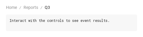
SyBreadcrumb shows the path to the current page: the SyBreadcrumbItem steps declared inside it in a row, a separator between them and none after the last.

Qt capture · image
Basic composition · Default
Default execution
QML code
import QtQuick
import Syidax.Core

Item {
    component EventLog: Rectangle {
        id: logBox
        property var lines: []
        implicitWidth: 440
        implicitHeight: Math.max(56, logText.implicitHeight + 24)
        radius: 4; color: Theme.semantic.backgroundBold
        function log(value) { lines = lines.slice(-3).concat([String(value)]) }
        Text {
            id: logText; x: 12; y: 12; width: parent.width - 24
            text: logBox.lines.length ? logBox.lines.join("\n") : "Interact with the controls to see event results."
            wrapMode: Text.Wrap; color: Theme.semantic.textDefault
            font.family: Theme.monoFontFamily; font.pixelSize: 12
        }
    }

    implicitWidth: Math.max(360, childrenRect.width)
    implicitHeight: childrenRect.height
    id: story

    property QtObject settings: QtObject {
        id: storyArgs
        property string separator: "slash"
    }


    Column {
        spacing: 12
        SyBreadcrumb {
            separator: storyArgs.separator
            onSelected: (index) => output.log(("selected: %1").arg(index))
            SyBreadcrumbItem { text: "Home" }
            SyBreadcrumbItem { text: "Reports" }
            SyBreadcrumbItem { text: "Q3"; active: true }
        }
        EventLog { id: output }
    }

}

02 separator

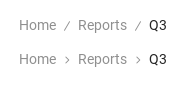
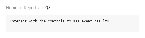
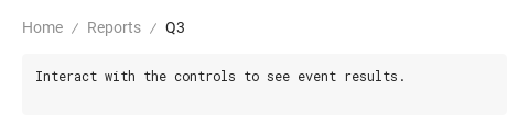
separator on SyBreadcrumb chooses the glyph drawn after every step but the last: "slash" (the default) or "arrow".

Qt capture · image
separator · Default
Default execution
QML code
import QtQuick
import Syidax.Core

Item {
    implicitWidth: Math.max(360, childrenRect.width)
    implicitHeight: childrenRect.height
    readonly property string items: [
        "SyBreadcrumbItem { text: " + JSON.stringify("Home") + " }",
        "SyBreadcrumbItem { text: " + JSON.stringify("Reports") + " }",
        "SyBreadcrumbItem { text: " + JSON.stringify("Q3") + "; active: true }"
    ].join("\n")

    Column {
        spacing: 12
        SyBreadcrumb {
            SyBreadcrumbItem { text: "Home" }
            SyBreadcrumbItem { text: "Reports" }
            SyBreadcrumbItem { text: "Q3"; active: true }
        }
        SyBreadcrumb {
            separator: "arrow"
            SyBreadcrumbItem { text: "Home" }
            SyBreadcrumbItem { text: "Reports" }
            SyBreadcrumbItem { text: "Q3"; active: true }
        }
    }
}

03 active · disabled

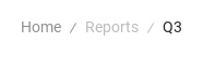
active: true marks the current page: the item is drawn in the current-page color, is not clickable, takes no keyboard focus and never emits selected.

Qt capture · image
active · disabled · Default
QML code
import QtQuick
import Syidax.Core

Item {
    implicitWidth: Math.max(360, childrenRect.width)
    implicitHeight: childrenRect.height
    // Focused Gallery routes: keep only the selected API and its prerequisites.
    id: featureStory

    property QtObject settings: QtObject {
        id: storyArgs
        property bool disabled: true
    }


    SyBreadcrumb {
        SyBreadcrumbItem { text: "Home" }
        SyBreadcrumbItem { id: featureTarget0; text: "Reports"; disabled: storyArgs.disabled }
        SyBreadcrumbItem { id: featureTarget1; text: "Q3"; active: true }
    }
}

04 selected

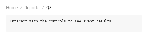
Compare the configuration and result of selected.

Qt capture · image
selected · Default
Default execution
QML code
import QtQuick
import Syidax.Core

Item {
    component EventLog: Rectangle {
        id: logBox
        property var lines: []
        implicitWidth: 440
        implicitHeight: Math.max(56, logText.implicitHeight + 24)
        radius: 4; color: Theme.semantic.backgroundBold
        function log(value) { lines = lines.slice(-3).concat([String(value)]) }
        Text {
            id: logText; x: 12; y: 12; width: parent.width - 24
            text: logBox.lines.length ? logBox.lines.join("\n") : "Interact with the controls to see event results."
            wrapMode: Text.Wrap; color: Theme.semantic.textDefault
            font.family: Theme.monoFontFamily; font.pixelSize: 12
        }
    }

    implicitWidth: Math.max(360, childrenRect.width)
    implicitHeight: childrenRect.height


    Column {
        spacing: 12
        SyBreadcrumb {
            id: path
            onSelected: (index) => {
                output.log(("selected: %1 · %2").arg(index).arg(path.items[index].text))
                for (let i = 0; i < path.items.length; i += 1) path.items[i].active = i === index
            }
            SyBreadcrumbItem { text: "Home"; onSelected: output.log(("%1 clicked").arg("Home")) }
            SyBreadcrumbItem { text: "Reports" }
            SyBreadcrumbItem { text: "Q3"; active: true }
        }
        EventLog { id: output }
    }
}

05 Arrow separators

Arrow separators, configured with separator.

Qt capture · image
Arrow separators · Result
Default execution
QML code
import QtQuick
import Syidax.Core

Item {
    component EventLog: Rectangle {
        id: logBox
        property var lines: []
        implicitWidth: 440
        implicitHeight: Math.max(56, logText.implicitHeight + 24)
        radius: 4; color: Theme.semantic.backgroundBold
        function log(value) { lines = lines.slice(-3).concat([String(value)]) }
        Text {
            id: logText; x: 12; y: 12; width: parent.width - 24
            text: logBox.lines.length ? logBox.lines.join("\n") : "Interact with the controls to see event results."
            wrapMode: Text.Wrap; color: Theme.semantic.textDefault
            font.family: Theme.monoFontFamily; font.pixelSize: 12
        }
    }

    implicitWidth: Math.max(360, childrenRect.width)
    implicitHeight: childrenRect.height
    id: story

    property QtObject settings: QtObject {
        id: storyArgs
        property string separator: "arrow"
    }


    Column {
        spacing: 12
        SyBreadcrumb {
            separator: storyArgs.separator
            onSelected: (index) => output.log(("selected: %1").arg(index))
            SyBreadcrumbItem { text: "Home" }
            SyBreadcrumbItem { text: "Reports" }
            SyBreadcrumbItem { text: "Q3"; active: true }
        }
        EventLog { id: output }
    }

}

06 Slash separators

Slash separators, configured with separator.

Qt capture · image
Slash separators · Result
Default execution
QML code
import QtQuick
import Syidax.Core

Item {
    component EventLog: Rectangle {
        id: logBox
        property var lines: []
        implicitWidth: 440
        implicitHeight: Math.max(56, logText.implicitHeight + 24)
        radius: 4; color: Theme.semantic.backgroundBold
        function log(value) { lines = lines.slice(-3).concat([String(value)]) }
        Text {
            id: logText; x: 12; y: 12; width: parent.width - 24
            text: logBox.lines.length ? logBox.lines.join("\n") : "Interact with the controls to see event results."
            wrapMode: Text.Wrap; color: Theme.semantic.textDefault
            font.family: Theme.monoFontFamily; font.pixelSize: 12
        }
    }

    implicitWidth: Math.max(360, childrenRect.width)
    implicitHeight: childrenRect.height
    id: story

    property QtObject settings: QtObject {
        id: storyArgs
        property string separator: "slash"
    }


    Column {
        spacing: 12
        SyBreadcrumb {
            separator: storyArgs.separator
            onSelected: (index) => output.log(("selected: %1").arg(index))
            SyBreadcrumbItem { text: "Home" }
            SyBreadcrumbItem { text: "Reports" }
            SyBreadcrumbItem { text: "Q3"; active: true }
        }
        EventLog { id: output }
    }

}

API 25

Hover or select an item for its QML example and copy button.

Properties · SyBreadcrumb

PropertyTypeDefaultDescription
list (default property)—The SyBreadcrumbItem steps, in order
string"slash""slash" · "arrow", handed to every item; an item's own separator wins
list (read-only)—The items inside, in order (what selected(index) indexes)

Properties · SyBreadcrumbItem

PropertyTypeDefaultDescription
string""The step label
boolfalseThe current page: current color, not clickable, not focusable
boolfalseDimmed to 60 %, not clickable, not focusable
string"""slash" · "arrow" for the glyph after this item; empty = the breadcrumb's
string"slash"Set by the breadcrumb: the inherited separator
boolfalseno glyph after this item
bool (read-only)—Neither active nor disabled
string (read-only)—The separator in effect for this item

Methods

MethodDescription
Emits selected as a click would; ignored when the item is active or disabled

Signals

SignalArgumentsWhen
index: intAn interactive item was clicked, or Enter / Space pressed on it while focused; index is its position from 0
—This item was clicked (or Enter / Space); emitted just before the breadcrumb's. Never for an active or disabled item

Behavior

ItemBehavior / conditions
The step label
The breadcrumb hands every item the separator (parentSeparator) and tells the last one it is last (isLast); it does this on creation, when separator changes and when the items change.
"slash" · "arrow" for the glyph after this item; empty = the breadcrumb's
"slash" · "arrow", handed to every item; an item's own separator wins
The current page: current color, not clickable, not focusable
Dimmed to 60 %, not clickable, not focusable
This item was clicked (or Enter / Space); emitted just before the breadcrumb's. Never for an active or disabled item
Interactive items are in the Tab order and show a 1 px outline while focused; Enter and Space act as a click.
The breadcrumb's implicit size is the row of items (22 px tall); place it in a layout or anchor it.

Keyboard

ItemBehavior / conditions
SyNav lists the places to go; SySteps shows progress through a process; SyGlobalHeader is where a breadcrumb often sits beneath.