Run with --diagnose --json to check your Qt version, import path, fonts, runtime and license. No license token is printed.
The Gallery evaluation app is available now. Paid SDK sales and downloads are coming soon. The installation examples above preview the SDK workflow.
Tested Windows configurations
Native window and example smoke checks cover the versions below. Qt 6.8 is a source minimum, not a promise of tested support for every Qt release. Gallery uses software rendering.
Two complete application examples
Step-by-step captures from the running Windows applications. Play, pause and inspect each state.
Workbench: mark a task done, save changes and see release progress update.Record Manager: preserve a failed save, retry, search and confirm before deleting.
See the components in context
RibbonPanelFormTableTreeTheme
TRY IT YOURSELF
The native Gallery
Browse examples, inspect properties and switch between light and dark themes in a Windows application. The Gallery is for evaluation; commercial SDK access is separate.
The --qml path must contain the Syidax folder. Python uses qml-pure. Run from the unzipped SDK, independently of the source repository.
License is inactive or frozen
Download your QML Core certificate and pass it with --license. Web Core, Chart and Grid certificates do not activate QML. Monthly use ends at expiry. Annual licenses retain only releases covered by their update period.
Qt or plugin mismatch
Check the Qt version and architecture used to build plugins. Do not mix Python Qt bindings. qml-pure removes the compiled plugin ABI dependency.
PDF or icons missing
PDF requires the optional QtQuick.Pdf module. Other Core components remain usable without it. For icon packs and resource paths, read SDK docs/ICON-PACKS.md.
Save failure or corrupt settings
Examples write only to their application-data folder. Check permissions and disk space. Invalid JSON is backed up before reset. A failed save preserves your draft.
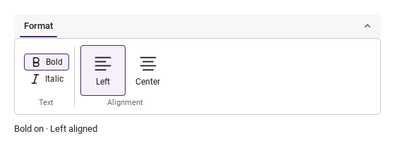
Local checked-state change after initialization, with source "state".
{ ...commandDetail, kind, value }
Local pointer, hover and focus interaction event.
{ tabId, groupId }
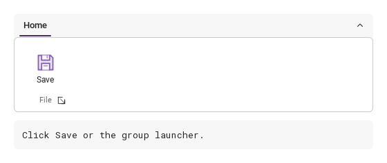
Local group-launcher event; use launcherVisible to show its button.
Layout and state rules
Item
Behavior
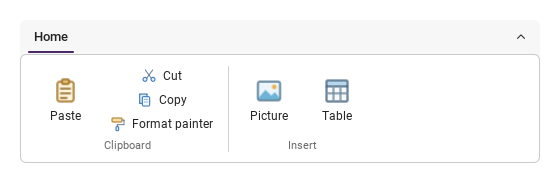
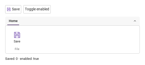
Declare tabs inside SyRibbon, groups inside each tab, and buttons or columns inside each group. Groups preserve horizontal declaration order.
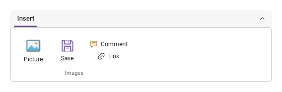
An image/icon button directly in a group places its caption below; a button in a column places it beside the icon. There is no per-button size option or automatic regrouping.
SyRibbonColumn equalizes widths and centers the stack. Two commands stay in two rows, four in four. Standard QML Column and custom Row controls are also supported.
Groups share command height. Buttons center their actual icon and caption without reserving an empty second line. Long horizontal captions elide at 200 px and reveal the full text on hover.
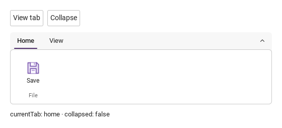
Removing, hiding or disabling the active tab selects the first available tab; no available tab clears the selection. Use tabVisible for tab visibility, not the page’s visible state.
Tab headers use Left/Right/Home/End; command buttons use Space. Overflow scrolls horizontally and focused commands are brought into view.
Theme.reducedMotion skips transitions. Icons.ribbon* keeps colored artwork unchanged via icon.source; monochrome symbols use theme tint.
Standard QML property-change signals remain available alongside the structured ribbon signals.