QML
← All components

Skeleton

Show placeholders shaped like the expected content while it is loading.

import Syidax.Core.Skeleton

Supported QML types

TypeDefinition / role
Placeholder shapes shown while content is loading.

Learn by example

Previews are images of native Qt runs. Use the buttons below each image to view a result.

01 Basic composition

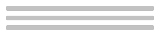
SySkeleton draws gray placeholder blocks in the shape of the content that is still loading

Qt capture · image
Basic composition · Default
Default execution
QML code
import QtQuick
import Syidax.Core

Item {
    implicitWidth: Math.max(360, childrenRect.width)
    implicitHeight: childrenRect.height
    id: story

    property QtObject settings: QtObject {
        id: storyArgs
        property string type: "text"
        property int rows: 3
        property bool disabled: false
        property int columns: 0
    }


    SySkeleton {
        width: 480
        type: storyArgs.type
        rows: storyArgs.rows
        disabled: storyArgs.disabled
        columns: storyArgs.columns
    }

}

02 type

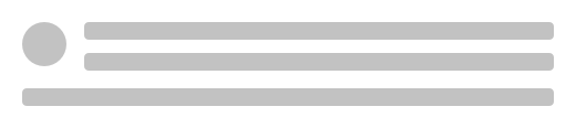
type picks the arrangement of blocks (rows = how many, at least one):

Qt capture · image
type · Default
QML code
import QtQuick
import Syidax.Core

Item {
    implicitWidth: Math.max(360, childrenRect.width)
    implicitHeight: childrenRect.height
    property QtObject settings: QtObject {
        id: storyArgs
        property string type: "avatar"
    }


    SySkeleton { width: 480; type: storyArgs.type; rows: 3 }
}

03 rows

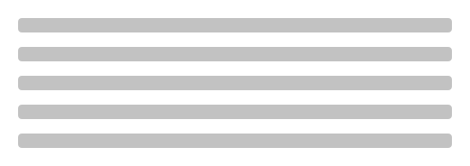
rows is the number of blocks: text lines, gallery rows, buttons, table rows or tree lines.

Qt capture · image
rows · Default
Default execution
QML code
import QtQuick
import Syidax.Core

Item {
    implicitWidth: Math.max(360, childrenRect.width)
    implicitHeight: childrenRect.height
    property QtObject settings: QtObject {
        id: storyArgs
        property int rows: 5
    }


    SySkeleton { width: 480; rows: storyArgs.rows }
}

04 disabled

disabled: true draws every block in the subtlest background color and stops the shimmer — a flat, quieter placeholder for areas that are not actually loading right now (a step that is not reached yet, a locked panel).

Qt capture · image
disabled · Default
QML code
import QtQuick
import Syidax.Core

Item {
    implicitWidth: Math.max(360, childrenRect.width)
    implicitHeight: childrenRect.height
    property QtObject settings: QtObject {
        id: storyArgs
        property bool disabled: true
    }


    SySkeleton { width: 480; type: "avatar"; rows: 2; disabled: storyArgs.disabled }
}

05 stopAnimation · resetAnimation

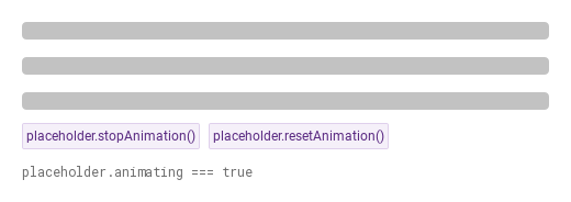
stopAnimation() freezes the shimmer and resetAnimation() starts it again; the read-only animating is false between the two calls and true otherwise.

Qt capture · image
stopAnimation · resetAnimation · Default
QML code
import QtQuick
import Syidax.Core

Item {
    implicitWidth: Math.max(360, childrenRect.width)
    implicitHeight: childrenRect.height
    // Focused Gallery routes: keep only the selected API and its prerequisites.
    id: featureStory

    Column {
        spacing: 12
        SySkeleton { id: placeholder; width: 480; rows: 3 }
        Row {
            spacing: 8
            SyButton { id: exampleControl1;  visible: true; text: "placeholder.stopAnimation()"; variant: "secondary"; size: "small"; onClicked: placeholder.stopAnimation() }
            SyButton { id: exampleControl2;  visible: true; text: "placeholder.resetAnimation()"; variant: "secondary"; size: "small"; onClicked: placeholder.resetAnimation() }
        }
        Text {
            text: "placeholder.animating === " + placeholder.animating
            font.family: Theme.monoFontFamily
            font.pixelSize: 12
            color: Theme.semantic.textSubtle
        }
    }
}

06 Static placeholder

Static placeholder, configured with disabled.

Qt capture · image
Static placeholder · Result
Default execution
QML code
import QtQuick
import Syidax.Core

Item {
    implicitWidth: Math.max(360, childrenRect.width)
    implicitHeight: childrenRect.height
    id: story

    property QtObject settings: QtObject {
        id: storyArgs
        property string type: "text"
        property int rows: 3
        property bool disabled: true
        property int columns: 0
    }


    SySkeleton {
        width: 480
        type: storyArgs.type
        rows: storyArgs.rows
        disabled: storyArgs.disabled
        columns: storyArgs.columns
    }

}

API 24

Hover or select an item for its QML example and copy button.

Properties

PropertyTypeDefaultDescription
string"text""text" · "avatar" · "image" · "gallery" · "button" · "table" · "tree" — the block arrangement; any other string draws nothing.
int0Number of blocks (lines, tiles rows, buttons, table rows, tree lines); 0 or less counts as one. For avatar / image, 0 draws the single centered block.
boolfalseFlat blocks in the subtlest background color, shimmer off.
int0Table columns; 0 = from the width (2 … 6). Only used by type: "table".
bool (read-only)trueThe shimmer's enable flag: false after stopAnimation(), true after resetAnimation(). Does not reflect disabled or reduced motion.
int (read-only)—The effective counts after the rules above.
bool (read-only)—Which avatar / image layout is in use.
color (read-only)—The block color (depends on disabled) and the highlight color.

Methods

MethodDescription
Turns the shimmer's enable flag off; animating becomes false and the sweep stops. No arguments, no return value; safe to call repeatedly.
Turns the flag back on; animating becomes true and the sweep resumes its loop (unless disabled or Theme.reducedMotion keep it still). No arguments, no return value.

Signals

ItemBehavior / conditions
SySkeleton declares no signals of its own; onAnimatingChanged is the useful property change signal.

Behavior

ItemBehavior / conditions
Width and height — the skeleton fills the width it is given (width, anchors or Layout.fillWidth; implicit 320 px) and sets its implicit height from the blocks: 16 px per text line and 16 px between rows.
"text" · "avatar" · "image" · "gallery" · "button" · "table" · "tree" — the block arrangement; any other string draws nothing.
Number of blocks (lines, tiles rows, buttons, table rows, tree lines); 0 or less counts as one. For avatar / image, 0 draws the single centered block.
Table columns; 0 = from the width (2 … 6). Only used by type: "table".
The shimmer's enable flag: false after stopAnimation(), true after resetAnimation(). Does not reflect disabled or reduced motion.
Flat blocks in the subtlest background color, shimmer off.
Turns the shimmer's enable flag off; animating becomes false and the sweep stops. No arguments, no return value; safe to call repeatedly.
Turns the flag back on; animating becomes true and the sweep resumes its loop (unless disabled or Theme.reducedMotion keep it still). No arguments, no return value.
role Indicator, name "Loading". The skeleton takes no pointer input.

Keyboard

ItemBehavior / conditions
SySpinner for short waits without a layout to hold, SyEmpty for the state after loading when there is nothing to show, SyProgressBar / SyProgressCircular for measured progress.