QML
← All components

Layout

Build a page from a header, footer, main content and sidebars.

import Syidax.Core.Layout

Supported QML types

TypeDefinition / role
Arranges header, sider, content and footer sections into an application layout.
Base section carrying its kind, size and content; normally use the concrete layout section types.
Top section of SyLayout, sized by height.
Start or end sidebar of SyLayout, sized by width.
Main content section filling the space remaining in SyLayout.
Bottom section of SyLayout, sized by height.

Learn by example

Previews are images of native Qt runs. Use the buttons below each image to view a result.

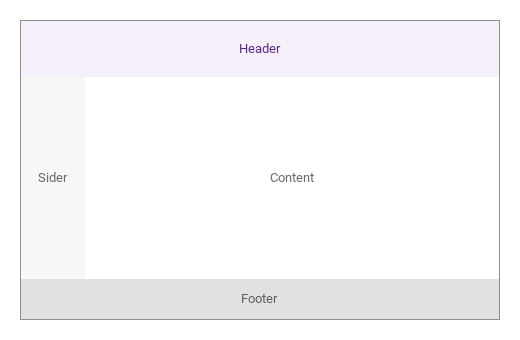
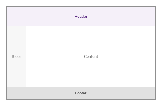
01 Basic composition

Compare the configuration and result of Basic composition.

Qt capture · image
Basic composition · Default
Default execution
QML code
import QtQuick
import Syidax.Core

Item {
    component LayoutBand: Rectangle {
    property string label: ""
    /** "brand" | "bold" | "bolder" | "default" */
    property string tone: "default"
    anchors.fill: parent
    color: tone === "brand" ? Theme.semantic.backgroundBrandDefault : tone === "bold" ? Theme.semantic.backgroundBold : tone === "bolder" ? Theme.semantic.backgroundBolder : Theme.semantic.backgroundDefault
    Text {
        anchors.centerIn: parent
        text: parent.label
        font.family: Theme.fontFamily
        font.pixelSize: 13
        color: parent.tone === "brand" ? Theme.semantic.textBrandDefault : Theme.semantic.textSubtle
    }
}

    implicitWidth: Math.max(360, childrenRect.width)
    implicitHeight: childrenRect.height
    id: story

    property QtObject settings: QtObject {
        id: storyArgs
        property string headerSize: "medium"
        property string siderSize: "small"
        property string siderPosition: "start"
        property string footerSize: "small"
    }


    Rectangle {
        width: 480
        height: 300
        color: "transparent"
        border.width: 1
        border.color: Theme.semantic.borderBold
        SyLayout {
            anchors.fill: parent
            anchors.margins: 1
            SyLayoutHeader { size: storyArgs.headerSize; LayoutBand { label: "Header"; tone: "brand" } }
            SyLayoutSider { size: storyArgs.siderSize; position: storyArgs.siderPosition; LayoutBand { label: "Sider"; tone: "bold" } }
            SyLayoutContent { LayoutBand { label: "Content"; tone: "default" } }
            SyLayoutFooter { size: storyArgs.footerSize; LayoutBand { label: "Footer"; tone: "bolder" } }
        }
    }

}

02 compositions

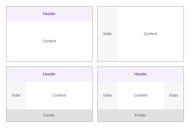
The usual page frames, each built from the same SyLayout with a different set of sections: header + content, sider + content, header + sider + content + footer, and a dual-sider frame with a sider on both sides.

Qt capture · image
compositions · Default
Default execution
QML code
import QtQuick
import Syidax.Core

pragma ComponentBehavior: Bound

Item {
    component LayoutBand: Rectangle {
    property string label: ""
    /** "brand" | "bold" | "bolder" | "default" */
    property string tone: "default"
    anchors.fill: parent
    color: tone === "brand" ? Theme.semantic.backgroundBrandDefault : tone === "bold" ? Theme.semantic.backgroundBold : tone === "bolder" ? Theme.semantic.backgroundBolder : Theme.semantic.backgroundDefault
    Text {
        anchors.centerIn: parent
        text: parent.label
        font.family: Theme.fontFamily
        font.pixelSize: 13
        color: parent.tone === "brand" ? Theme.semantic.textBrandDefault : Theme.semantic.textSubtle
    }
}

    implicitWidth: Math.max(360, childrenRect.width)
    implicitHeight: childrenRect.height
    id: story
    readonly property var frames: [
        { id: "header-content", header: true, siderStart: false, siderEnd: false, footer: false },
        { id: "sider-content", header: false, siderStart: true, siderEnd: false, footer: false },
        { id: "header-sider-content-footer", header: true, siderStart: true, siderEnd: false, footer: true },
        { id: "dual-sider", header: true, siderStart: true, siderEnd: true, footer: true }
    ]
    // (not `snippet` — that is the Story method the code panel calls)


    Grid {
        columns: 2
        columnSpacing: 16
        rowSpacing: 16
        Repeater {
            model: story.frames
            delegate: Rectangle {
                id: frame
                required property var modelData
                width: 280
                height: 180
                color: "transparent"
                border.width: 1
                border.color: Theme.semantic.borderBold
                SyLayout {
                    anchors.fill: parent
                    anchors.margins: 1
                    SyLayoutHeader { visible: frame.modelData.header; size: "small"; kind: frame.modelData.header ? "header" : ""; LayoutBand { label: "Header"; tone: "brand" } }
                    SyLayoutSider { visible: frame.modelData.siderStart; size: "small"; kind: frame.modelData.siderStart ? "sider" : ""; LayoutBand { label: "Sider"; tone: "bold" } }
                    SyLayoutContent { LayoutBand { label: "Content"; tone: "default" } }
                    SyLayoutSider { visible: frame.modelData.siderEnd; size: "small"; position: "end"; kind: frame.modelData.siderEnd ? "sider" : ""; LayoutBand { label: "Sider"; tone: "bold" } }
                    SyLayoutFooter { visible: frame.modelData.footer; size: "small"; kind: frame.modelData.footer ? "footer" : ""; LayoutBand { label: "Footer"; tone: "bolder" } }
                }
            }
        }
    }
}

03 nested

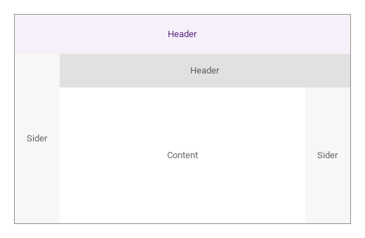
A SyLayout can be declared inside another layout's SyLayoutContent: anchored to fill the content, it frames its own header, sider and content independently

Qt capture · image
nested · Default
Default execution
QML code
import QtQuick
import Syidax.Core

Item {
    component LayoutBand: Rectangle {
    property string label: ""
    /** "brand" | "bold" | "bolder" | "default" */
    property string tone: "default"
    anchors.fill: parent
    color: tone === "brand" ? Theme.semantic.backgroundBrandDefault : tone === "bold" ? Theme.semantic.backgroundBold : tone === "bolder" ? Theme.semantic.backgroundBolder : Theme.semantic.backgroundDefault
    Text {
        anchors.centerIn: parent
        text: parent.label
        font.family: Theme.fontFamily
        font.pixelSize: 13
        color: parent.tone === "brand" ? Theme.semantic.textBrandDefault : Theme.semantic.textSubtle
    }
}

    implicitWidth: Math.max(360, childrenRect.width)
    implicitHeight: childrenRect.height

    Rectangle {
        width: 480
        height: 300
        color: "transparent"
        border.width: 1
        border.color: Theme.semantic.borderBold
        SyLayout {
            anchors.fill: parent
            anchors.margins: 1
            SyLayoutHeader { LayoutBand { label: "Header"; tone: "brand" } }
            SyLayoutSider { size: "small"; LayoutBand { label: "Sider"; tone: "bold" } }
            SyLayoutContent {
                SyLayout {
                    anchors.fill: parent
                    SyLayoutHeader { size: "small"; LayoutBand { label: "Header"; tone: "bolder" } }
                    SyLayoutContent { LayoutBand { label: "Content"; tone: "default" } }
                    SyLayoutSider { position: "end"; size: "small"; LayoutBand { label: "Sider"; tone: "bold" } }
                }
            }
        }
    }
}

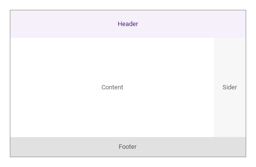
04 Right sidebar

Right sidebar, configured with siderPosition.

Qt capture · image
Right sidebar · Result
Default execution
QML code
import QtQuick
import Syidax.Core

Item {
    component LayoutBand: Rectangle {
    property string label: ""
    /** "brand" | "bold" | "bolder" | "default" */
    property string tone: "default"
    anchors.fill: parent
    color: tone === "brand" ? Theme.semantic.backgroundBrandDefault : tone === "bold" ? Theme.semantic.backgroundBold : tone === "bolder" ? Theme.semantic.backgroundBolder : Theme.semantic.backgroundDefault
    Text {
        anchors.centerIn: parent
        text: parent.label
        font.family: Theme.fontFamily
        font.pixelSize: 13
        color: parent.tone === "brand" ? Theme.semantic.textBrandDefault : Theme.semantic.textSubtle
    }
}

    implicitWidth: Math.max(360, childrenRect.width)
    implicitHeight: childrenRect.height
    id: story

    property QtObject settings: QtObject {
        id: storyArgs
        property string headerSize: "medium"
        property string siderSize: "small"
        property string siderPosition: "end"
        property string footerSize: "small"
    }


    Rectangle {
        width: 480
        height: 300
        color: "transparent"
        border.width: 1
        border.color: Theme.semantic.borderBold
        SyLayout {
            anchors.fill: parent
            anchors.margins: 1
            SyLayoutHeader { size: storyArgs.headerSize; LayoutBand { label: "Header"; tone: "brand" } }
            SyLayoutSider { size: storyArgs.siderSize; position: storyArgs.siderPosition; LayoutBand { label: "Sider"; tone: "bold" } }
            SyLayoutContent { LayoutBand { label: "Content"; tone: "default" } }
            SyLayoutFooter { size: storyArgs.footerSize; LayoutBand { label: "Footer"; tone: "bolder" } }
        }
    }

}

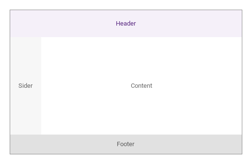
05 Large header

Large header, configured with headerSize.

Qt capture · image
Large header · Result
Default execution
QML code
import QtQuick
import Syidax.Core

Item {
    component LayoutBand: Rectangle {
    property string label: ""
    /** "brand" | "bold" | "bolder" | "default" */
    property string tone: "default"
    anchors.fill: parent
    color: tone === "brand" ? Theme.semantic.backgroundBrandDefault : tone === "bold" ? Theme.semantic.backgroundBold : tone === "bolder" ? Theme.semantic.backgroundBolder : Theme.semantic.backgroundDefault
    Text {
        anchors.centerIn: parent
        text: parent.label
        font.family: Theme.fontFamily
        font.pixelSize: 13
        color: parent.tone === "brand" ? Theme.semantic.textBrandDefault : Theme.semantic.textSubtle
    }
}

    implicitWidth: Math.max(360, childrenRect.width)
    implicitHeight: childrenRect.height
    id: story

    property QtObject settings: QtObject {
        id: storyArgs
        property string headerSize: "large"
        property string siderSize: "small"
        property string siderPosition: "start"
        property string footerSize: "small"
    }


    Rectangle {
        width: 480
        height: 300
        color: "transparent"
        border.width: 1
        border.color: Theme.semantic.borderBold
        SyLayout {
            anchors.fill: parent
            anchors.margins: 1
            SyLayoutHeader { size: storyArgs.headerSize; LayoutBand { label: "Header"; tone: "brand" } }
            SyLayoutSider { size: storyArgs.siderSize; position: storyArgs.siderPosition; LayoutBand { label: "Sider"; tone: "bold" } }
            SyLayoutContent { LayoutBand { label: "Content"; tone: "default" } }
            SyLayoutFooter { size: storyArgs.footerSize; LayoutBand { label: "Footer"; tone: "bolder" } }
        }
    }

}

06 Compact footer

Compact footer, configured with footerSize.

Qt capture · image
Compact footer · Result
Default execution
QML code
import QtQuick
import Syidax.Core

Item {
    component LayoutBand: Rectangle {
    property string label: ""
    /** "brand" | "bold" | "bolder" | "default" */
    property string tone: "default"
    anchors.fill: parent
    color: tone === "brand" ? Theme.semantic.backgroundBrandDefault : tone === "bold" ? Theme.semantic.backgroundBold : tone === "bolder" ? Theme.semantic.backgroundBolder : Theme.semantic.backgroundDefault
    Text {
        anchors.centerIn: parent
        text: parent.label
        font.family: Theme.fontFamily
        font.pixelSize: 13
        color: parent.tone === "brand" ? Theme.semantic.textBrandDefault : Theme.semantic.textSubtle
    }
}

    implicitWidth: Math.max(360, childrenRect.width)
    implicitHeight: childrenRect.height
    id: story

    property QtObject settings: QtObject {
        id: storyArgs
        property string headerSize: "medium"
        property string siderSize: "small"
        property string siderPosition: "start"
        property string footerSize: "small"
    }


    Rectangle {
        width: 480
        height: 300
        color: "transparent"
        border.width: 1
        border.color: Theme.semantic.borderBold
        SyLayout {
            anchors.fill: parent
            anchors.margins: 1
            SyLayoutHeader { size: storyArgs.headerSize; LayoutBand { label: "Header"; tone: "brand" } }
            SyLayoutSider { size: storyArgs.siderSize; position: storyArgs.siderPosition; LayoutBand { label: "Sider"; tone: "bold" } }
            SyLayoutContent { LayoutBand { label: "Content"; tone: "default" } }
            SyLayoutFooter { size: storyArgs.footerSize; LayoutBand { label: "Footer"; tone: "bolder" } }
        }
    }

}

API 36

Hover or select an item for its QML example and copy button.

Properties · SyLayout

PropertyTypeDefaultDescription
list (default property)—The sections, in any order
Item (read-only)nullThe section found for each slot, or null
list (read-only)—Every direct child that carries a kind
real (read-only)—The header's
real (read-only)—footer's extent, 0 when absent
real (read-only)—The siders' extents, 0 when absent
real (read-only)—The band between header and footer
real (read-only)—the width left for the content

Properties · SyLayoutHeader · SyLayoutSider · SyLayoutContent · SyLayoutFooter

PropertyTypeDefaultDescription
list (default property)—What fills the section
string or number"medium"The section's own dimension: small · medium · large or pixels (header 48 · 56 · 64, sider 64 · 240 · 320, footer 40 · 48 · 64; ignored on the content)
string"start"Siders only: start (left) · end (right)
stringby typeheader · sider · content · footer — set by the section type; "" also takes the section out of the frame (hiding it is enough)
real (read-only)—The resolved size in pixels
bool (read-only)—size is one of the preset names

Methods

MethodDescription
Positions and sizes the sections now; the layout calls it itself on every size and section change

Signals

ItemBehavior / conditions
None — the layout and its sections only place items.

Behavior

ItemBehavior / conditions
The header is placed across the top at its extent tall, the footer across the bottom; the band between them (mainHeight) holds the start sider at the left (siderStartWidth wide), the end sider at the right (siderEndWidth), and the content in the remaining width (contentWidth). The resolved pixels are the section's extent.
The header is placed across the top at its extent tall, the footer across the bottom; the band between them (mainHeight) holds the start sider at the left (siderStartWidth wide), the end sider at the right (siderEndWidth), and the content in the remaining width (contentWidth).
The layout reads its direct children that carry a kind: the first header, the first footer, the first sider whose position is not "end", the first sider whose position is "end", and the first content. A hidden section (visible: false) takes no space either — its extent counts as 0 — and comes back when shown; setting kind to "" also drops a section but is no longer needed.
The layout reads its direct children that carry a kind: the first header, the first footer, the first sider whose position is not "end", the first sider whose position is "end", and the first content.
A hidden section (visible: false) takes no space either — its extent counts as 0 — and comes back when shown; setting kind to "" also drops a section but is no longer needed.
A section's own dimension is size: a preset name — header small 48 · medium 56 · large 64, sider small 64 · medium 240 · large 320, footer small 40 · medium 48 · large 64 — or a number of pixels (a numeric string works too). The content's size is ignored: it takes what is left.
The section is an item sized by the layout; what is declared inside it fills it with anchors.fill: parent, or positions itself from the section's top-left.
A SyLayout inside a SyLayoutContent frames its own sections independently; each layout only reads its own direct children.

Keyboard

ItemBehavior / conditions
SyGlobalHeader for the header band, SyNav for a sider, SyPanelGroup + SyPanel for two resizable panes, SyFlex for arranging items inside a section.