QML
← All components

Colorpicker

Choose a color visually or enter its value for settings such as text and background colors.

import Syidax.Core.Colorpicker

Supported QML types

TypeDefinition / role
Standalone color panel with saturation, hue, opacity and format inputs.
Color selector that opens a popup panel or displays it inline.

Learn by example

Previews are images of native Qt runs. Use the buttons below each image to view a result.

01 Basic composition

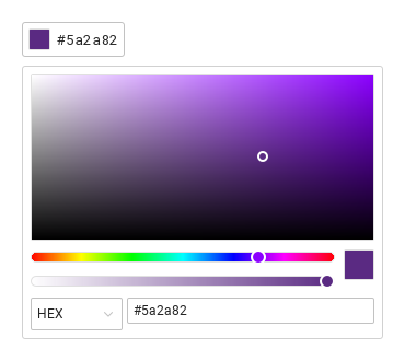
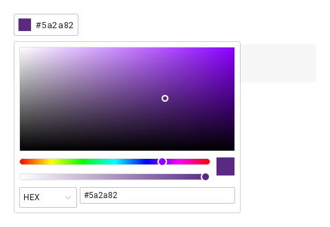
SyColorpicker is a color swatch that opens the color panel above it: a saturation / brightness area, a hue slider, an opacity slider, a preview and the HEX · RGB · HSB inputs.

Qt capture · image
Basic composition · Opened
QML code
import QtQuick
import Syidax.Core

Item {
    implicitWidth: Math.max(360, childrenRect.width)
    implicitHeight: childrenRect.height

    property QtObject settings: QtObject {
        id: storyArgs
        property string value: "#5A2A82"
        property string format: "hex"
        property bool showText: true
        property string trigger: "click"
        property bool hideOpacity: false
        property bool disabled: false
        property bool readonly: false
        property bool inline: false
    }


    SyColorpicker { id: exampleControl1; 
        value: storyArgs.value
        format: storyArgs.format
        showText: storyArgs.showText
        trigger: storyArgs.trigger
        hideOpacity: storyArgs.hideOpacity
        disabled: storyArgs.disabled
        readonly: storyArgs.readonly
        inline: storyArgs.inline
        onChanged: (detail) => { if (storyArgs.value !== detail.value) storyArgs.value = detail.value }
    }

}

02 format

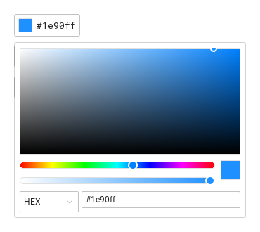
format is the notation of the color the picker reports: "hex" (#1e90ff), "rgb" (rgb(30, 144, 255)) or "hsb" (hsb(210, 88%, 100%)).

Qt capture · image
format · Opened
QML code
import QtQuick
import Syidax.Core

Item {
    implicitWidth: Math.max(360, childrenRect.width)
    implicitHeight: childrenRect.height

    Column {
        spacing: 12
        SyColorpicker { id: exampleControl1;  value: "#1e90ff"; showText: true }
        SyColorpicker { value: "#1e90ff"; format: "rgb"; showText: true }
        SyColorpicker { value: "#1e90ff"; format: "hsb"; showText: true }
    }
}

03 inline

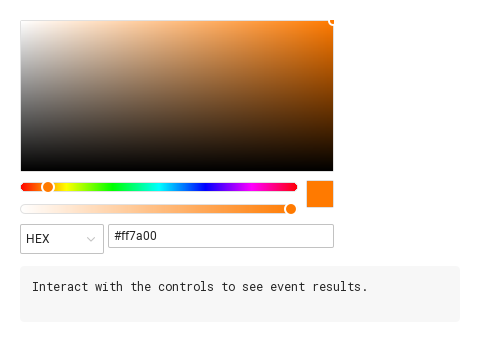
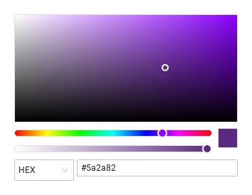
inline: true shows the panel itself in place — no swatch, no popup, no opened / closed, and open() / close() do nothing.

Qt capture · image
inline · Default
Default execution
QML code
import QtQuick
import Syidax.Core

Item {
    component EventLog: Rectangle {
        id: logBox
        property var lines: []
        implicitWidth: 440
        implicitHeight: Math.max(56, logText.implicitHeight + 24)
        radius: 4; color: Theme.semantic.backgroundBold
        function log(value) { lines = lines.slice(-3).concat([String(value)]) }
        Text {
            id: logText; x: 12; y: 12; width: parent.width - 24
            text: logBox.lines.length ? logBox.lines.join("\n") : "Interact with the controls to see event results."
            wrapMode: Text.Wrap; color: Theme.semantic.textDefault
            font.family: Theme.monoFontFamily; font.pixelSize: 12
        }
    }

    implicitWidth: Math.max(360, childrenRect.width)
    implicitHeight: childrenRect.height

    Column {
        spacing: 12
        SyColorpicker { inline: true; value: "#ff7a00"; onChanged: (detail) => output.log(detail.value) }
        EventLog { id: output }
    }
}

04 disabled · readonly · hideOpacity · trigger

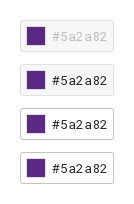
disabled draws the swatch in the disabled tones, takes it out of the Tab order and never opens the panel; readonly keeps the readonly tones and does not open either

Qt capture · image
disabled · readonly · hideOpacity · trigger · Default
Default execution
QML code
import QtQuick
import Syidax.Core

Item {
    implicitWidth: Math.max(360, childrenRect.width)
    implicitHeight: childrenRect.height
    // Focused Gallery routes: keep only the selected API and its prerequisites.
    id: featureStory

    Column {
        spacing: 12
        SyColorpicker { id: featureTarget0; visible: true; value: "#5A2A82"; showText: true; disabled: true }
        SyColorpicker { id: featureTarget1; visible: true; value: "#5A2A82"; showText: true; readonly: true }
        SyColorpicker { id: featureTarget2; visible: true; value: "#5A2A82"; showText: true; hideOpacity: true }
        SyColorpicker { id: featureTarget3; visible: true; value: "#5A2A82"; showText: true; trigger: "hover" }
    }
}

05 changed · opened · closed · formatChange

changed(detail)

Qt capture · image
changed · opened · closed · formatChange · Opened
QML code
import QtQuick
import Syidax.Core

Item {
    component EventLog: Rectangle {
        id: logBox
        property var lines: []
        implicitWidth: 440
        implicitHeight: Math.max(56, logText.implicitHeight + 24)
        radius: 4; color: Theme.semantic.backgroundBold
        function log(value) { lines = lines.slice(-3).concat([String(value)]) }
        Text {
            id: logText; x: 12; y: 12; width: parent.width - 24
            text: logBox.lines.length ? logBox.lines.join("\n") : "Interact with the controls to see event results."
            wrapMode: Text.Wrap; color: Theme.semantic.textDefault
            font.family: Theme.monoFontFamily; font.pixelSize: 12
        }
    }

    implicitWidth: Math.max(360, childrenRect.width)
    implicitHeight: childrenRect.height
    // Focused Gallery routes: keep only the selected API and its prerequisites.
    id: featureStory


    Column {
        spacing: 12
        SyColorpicker { id: exampleControl1; 
            value: "#5A2A82"; showText: true
            onChanged: (detail) => { if (true) { output.log(("changed: %1 · opacity %2").arg(detail.value).arg(detail.opacity)) } }
            onOpened: { if (true) { output.log("opened") } }
            onClosed: { if (true) { output.log("closed") } }
            onFormatChange: (detail) => { if (true) { output.log(("format: %1").arg(detail.format)) } }
        }
        EventLog { id: output }
    }
}

06 open · close · setColor

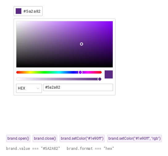
open() opens the popup panel above the swatch and emits opened; it is ignored while disabled, readonly, inline or already open.

Qt capture · image
open · close · setColor · Opened
QML code
import QtQuick
import Syidax.Core

Item {
    implicitWidth: Math.max(360, childrenRect.width)
    implicitHeight: childrenRect.height
    // Focused Gallery routes: keep only the selected API and its prerequisites.
    id: featureStory

    Column {
        spacing: 12
        Item {
            width: 560; height: 430
            SyColorpicker {
                x: 24; y: 24
 id: brand; value: "#5A2A82"; showText: true }
        }
        Flow {
            objectName: "exampleCommands"

            width: 560
            spacing: 8
            SyButton { id: exampleControl1;  visible: true; text: "brand.open()"; variant: "secondary"; size: "small"; onClicked: brand.open() }
            SyButton { id: exampleControl2;  visible: true; text: "brand.close()"; variant: "secondary"; size: "small"; onClicked: brand.close() }
            SyButton { id: exampleControl3;  visible: true; text: "brand.setColor(\"#1e90ff\")"; variant: "secondary"; size: "small"; onClicked: brand.setColor("#1e90ff") }
            SyButton { id: exampleControl4;  visible: true; text: "brand.setColor(\"#1e90ff\", \"rgb\")"; variant: "secondary"; size: "small"; onClicked: brand.setColor("#1e90ff", "rgb") }
        }
        Text {
            text: "brand.value === " + JSON.stringify(brand.value) + "   brand.format === " + JSON.stringify(brand.format)
            font.family: Theme.monoFontFamily
            font.pixelSize: 12
            color: Theme.semantic.textSubtle
        }
    }
}

07 Opaque colors

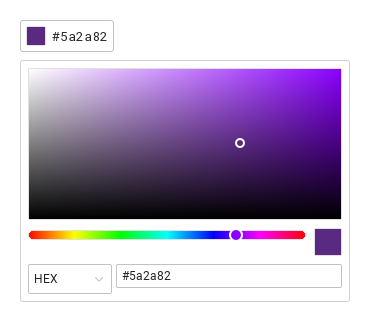
Opaque colors, configured with hideOpacity.

Qt capture · image
Opaque colors · Opened
QML code
import QtQuick
import Syidax.Core

Item {
    implicitWidth: Math.max(360, childrenRect.width)
    implicitHeight: childrenRect.height

    property QtObject settings: QtObject {
        id: storyArgs
        property string value: "#5A2A82"
        property string format: "hex"
        property bool showText: true
        property string trigger: "click"
        property bool hideOpacity: true
        property bool disabled: false
        property bool readonly: false
        property bool inline: false
    }


    SyColorpicker { id: exampleControl1; 
        value: storyArgs.value
        format: storyArgs.format
        showText: storyArgs.showText
        trigger: storyArgs.trigger
        hideOpacity: storyArgs.hideOpacity
        disabled: storyArgs.disabled
        readonly: storyArgs.readonly
        inline: storyArgs.inline
        onChanged: (detail) => { if (storyArgs.value !== detail.value) storyArgs.value = detail.value }
    }

}

08 Inline color editor

Inline color editor, configured with inline.

Qt capture · image
Inline color editor · Result
Default execution
QML code
import QtQuick
import Syidax.Core

Item {
    implicitWidth: Math.max(360, childrenRect.width)
    implicitHeight: childrenRect.height

    property QtObject settings: QtObject {
        id: storyArgs
        property string value: "#5A2A82"
        property string format: "hex"
        property bool showText: true
        property string trigger: "click"
        property bool hideOpacity: false
        property bool disabled: false
        property bool readonly: false
        property bool inline: true
    }


    SyColorpicker {
        value: storyArgs.value
        format: storyArgs.format
        showText: storyArgs.showText
        trigger: storyArgs.trigger
        hideOpacity: storyArgs.hideOpacity
        disabled: storyArgs.disabled
        readonly: storyArgs.readonly
        inline: storyArgs.inline
        onChanged: (detail) => { if (storyArgs.value !== detail.value) storyArgs.value = detail.value }
    }

}

API 63

Hover or select an item for its QML example and copy button.

Properties · SyColorpicker

PropertyTypeDefaultDescription
string"#5A2A82"The color in any notation: #rrggbb · rgb(r, g, b) · hsb(h, s%, b%). The panel rewrites it in format; assigning it from code emits nothing.
string""When it parses, replaces value once at creation.
real1The alpha 0 … 1 (the opacity slider). Not part of value.
string"hex"hex · rgb · hsb — the notation of formattedValue, of the swatch text, of changed and of the panel inputs.
boolfalseNo opacity slider in the panel.
string"click"click · hover — what opens the panel (a click always toggles).
boolfalseThe formatted value next to the swatch.
boolfalseThe panel in place; no trigger, no popup, no opened / closed.
boolfalseDisabled tones, no focus, no opening; an inline panel is inert.
boolfalseReadonly tones, no opening; an inline panel is inert.
bool (read-only)—The popup panel is open (always false when inline).
bool (read-only)—!disabled && !readonly.
bool (read-only)—The swatch has keyboard focus.
list (read-only)—The parsed [r, g, b] (black when value does not parse).
color (read-only)—rgb as a Qt color (opaque).
string (read-only)—The color written in format.

Properties · SyColorpickerContent (the panel, usable alone)

PropertyTypeDefaultDescription
string"#ff0000"The color to show; any notation. Loading it updates hue · saturation · brightness.
real1The alpha shown by the opacity slider.
boolfalseNo opacity slider.
string"hex"Which inputs show and the notation of colorChange.
boolfalseThe panel is dimmed and inert.
real0The working color (0–359 · 0–100 · 0–100).
real100The working color (0–359 · 0–100 · 0–100).
read-only—The working color as [r, g, b], #rrggbb, a Qt color, and the pure hue.

Methods · SyColorpicker

MethodDescription
Opens the popup panel and emits opened. Ignored while disabled, readonly, inline or already open.
Closes the popup panel (emits closed when it was open).
Sets the color from code. Ignored when value does not parse. A different format is applied first (formatChange), then changed fires with the color in the current format. colorOpacity is untouched.

Methods · SyColorpickerContent

MethodDescription
Shows a color without emitting (what the value property does).
Set the working color (a null component keeps its value) and emit colorChange. Ignored while disabled / readonly.
Sets the alpha 0 … 1 and emits colorChange. Ignored while disabled / readonly.
Switches format and emits colorChange in the new notation.

Signals · SyColorpicker

SignalArgumentsWhen
detail: { value, opacity, format }Any change made in the panel, or setColor(). value is in format. Not when code assigns value / colorOpacity.
—The popup panel opened / closed (click, hover, Escape, press outside, open() / close()). Never when inline.
detail: { format, value }The format select changed, or setColor() passed another format; value is already in the new format. A changed follows.

Signals · SyColorpickerContent

SignalArgumentsWhen
detail: { value, opacity, format }Every change made in the panel (value in format).

Behavior

ItemBehavior / conditions
The color in any notation: #rrggbb · rgb(r, g, b) · hsb(h, s%, b%). The panel rewrites it in format; assigning it from code emits nothing.
The parsed [r, g, b] (black when value does not parse).
rgb as a Qt color (opaque).
The color written in format.
hex · rgb · hsb — the notation of formattedValue, of the swatch text, of changed and of the panel inputs.
When it parses, replaces value once at creation.
The alpha 0 … 1 (the opacity slider). Not part of value.
The formatted value next to the swatch.
click · hover — what opens the panel (a click always toggles).
opened / closed follow the popup; isOpen tells its state. opened / closed for the popup only.
The popup panel is open (always false when inline).
No opacity slider.
The color to show; any notation. Loading it updates hue · saturation · brightness.
The alpha shown by the opacity slider.
Any change made in the panel, or setColor(). value is in format. Not when code assigns value / colorOpacity.
Sets the color from code. Ignored when value does not parse. A different format is applied first (formatChange), then changed fires with the color in the current format. colorOpacity is untouched.
The format select changed, or setColor() passed another format; value is already in the new format. A changed follows.
Disabled tones, no focus, no opening; an inline panel is inert.
Readonly tones, no opening; an inline panel is inert.
The panel in place; no trigger, no popup, no opened / closed.