QML
← All components

Drawer

Slide a panel in from a window edge for details, filters or editing without leaving the current page.

import Syidax.Core.Drawer

Supported QML types

TypeDefinition / role
Overlay panel that slides in from an edge of the window.

Learn by example

Previews are images of native Qt runs. Use the buttons below each image to view a result.

01 Basic composition

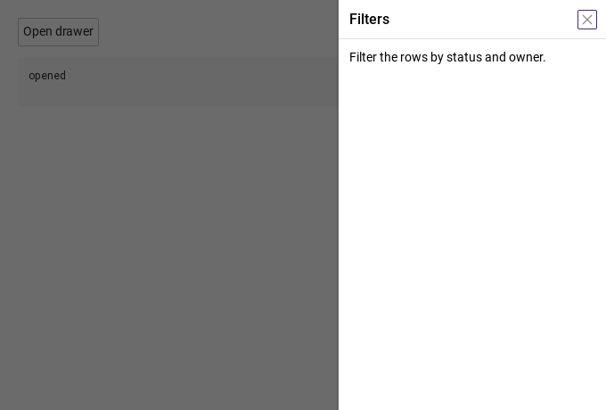
SyDrawer is a panel docked to one edge of the application window (position: right by default, or left, top, bottom) that slides in over a mask.

Qt capture · image
Basic composition · Opened
QML code
import QtQuick
import Syidax.Core

Item {
    component EventLog: Rectangle {
        id: logBox
        property var lines: []
        implicitWidth: 440
        implicitHeight: Math.max(56, logText.implicitHeight + 24)
        radius: 4; color: Theme.semantic.backgroundBold
        function log(value) { lines = lines.slice(-3).concat([String(value)]) }
        Text {
            id: logText; x: 12; y: 12; width: parent.width - 24
            text: logBox.lines.length ? logBox.lines.join("\n") : "Interact with the controls to see event results."
            wrapMode: Text.Wrap; color: Theme.semantic.textDefault
            font.family: Theme.monoFontFamily; font.pixelSize: 12
        }
    }

    implicitWidth: Math.max(360, childrenRect.width)
    implicitHeight: childrenRect.height

    property QtObject settings: QtObject {
        id: storyArgs
        property string position: "right"
        property string size: "medium"
        property int customSize: 100
        property string title: "Filters"
        property bool closable: true
        property bool maskless: false
        property bool maskClosable: true
        property bool preventClose: false
        property string animation: "slide"
    }


    Column {
        spacing: 12
        SyDrawer {
            id: drawer
            position: storyArgs.position
            size: storyArgs.size
            customSize: storyArgs.customSize
            title: storyArgs.title
            closable: storyArgs.closable
            maskless: storyArgs.maskless
            maskClosable: storyArgs.maskClosable
            preventClose: storyArgs.preventClose
            animation: storyArgs.animation
            onOpened: output.log("opened")
            onClosed: output.log("closed")
            Text { text: "Filter the rows by status and owner."; width: parent.width; wrapMode: Text.Wrap; font.family: Theme.fontFamily; font.pixelSize: 14; color: Theme.drawer.contentTextEnabled }
        }
        SyButton { id: exampleControl1;  text: "Open drawer"; onClicked: drawer.setOpen() }
        EventLog { id: output }
    }

}

02 header · footer

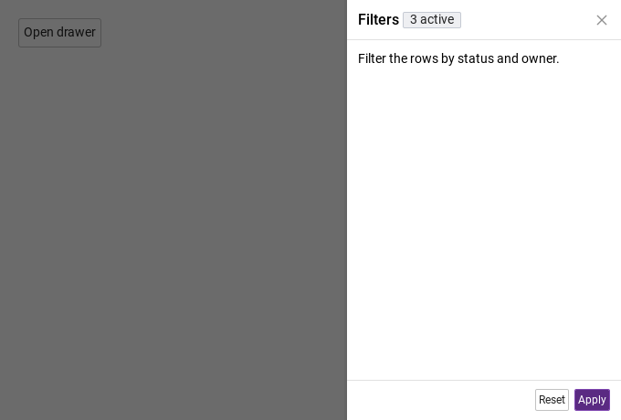
The drawer has three places for content.

Qt capture · image
header · footer · Opened
QML code
import QtQuick
import Syidax.Core

Item {
    implicitWidth: Math.max(360, childrenRect.width)
    implicitHeight: childrenRect.height
    // Focused Gallery routes: keep only the selected API and its prerequisites.
    id: featureStory

    Column {
        spacing: 12
        SyDrawer {
            id: drawer
            title: "Filters"
            closable: true
            open: true
            header: SyTag { text: "3 active"; size: "small" }
            footer: [
                SyButton { text: "Reset"; size: "small" },
                SyButton { text: "Apply"; variant: "primary"; size: "small"; onClicked: drawer.setClose() }
            ]
            Text { text: "Filter the rows by status and owner."; width: parent.width; wrapMode: Text.Wrap; font.family: Theme.fontFamily; font.pixelSize: 14; color: Theme.drawer.contentTextEnabled }
        }
        SyButton { text: "Open drawer"; onClicked: drawer.setOpen() }
    }
}

03 opened · closed

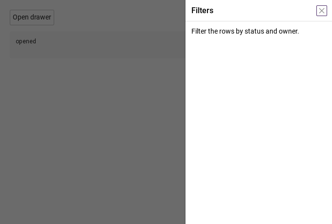
- opened() — fires once the panel is fully in: after the entrance animation, or at once when animation is "none" or Theme.reducedMotion is on.

Qt capture · image
opened · closed · Opened
QML code
import QtQuick
import Syidax.Core

Item {
    component EventLog: Rectangle {
        id: logBox
        property var lines: []
        implicitWidth: 440
        implicitHeight: Math.max(56, logText.implicitHeight + 24)
        radius: 4; color: Theme.semantic.backgroundBold
        function log(value) { lines = lines.slice(-3).concat([String(value)]) }
        Text {
            id: logText; x: 12; y: 12; width: parent.width - 24
            text: logBox.lines.length ? logBox.lines.join("\n") : "Interact with the controls to see event results."
            wrapMode: Text.Wrap; color: Theme.semantic.textDefault
            font.family: Theme.monoFontFamily; font.pixelSize: 12
        }
    }

    implicitWidth: Math.max(360, childrenRect.width)
    implicitHeight: childrenRect.height
    // Focused Gallery routes: keep only the selected API and its prerequisites.
    id: featureStory

    Column {
        spacing: 12
        SyDrawer {
            id: drawer
            title: "Filters"
            closable: true
            animation: "slide"
            onOpened: { if (true) { output.log("opened") } }
            onClosed: { if (true) { output.log("closed") } }
            Text { text: "Filter the rows by status and owner."; width: parent.width; wrapMode: Text.Wrap; font.family: Theme.fontFamily; font.pixelSize: 14; color: Theme.drawer.contentTextEnabled }
        }
        SyButton { id: exampleControl1;  text: "Open drawer"; onClicked: drawer.setOpen() }
        EventLog { id: output }
    }
}

04 setOpen · setClose

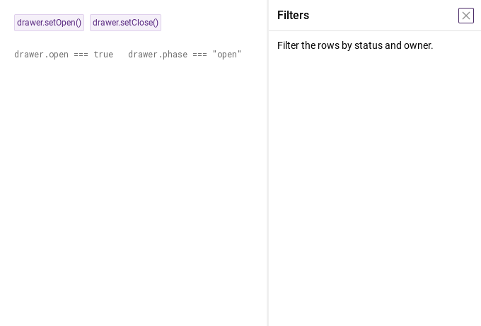
- setOpen() — sets open = true: the sheet is shown, the panel plays its entrance from its edge, the sheet takes keyboard focus; opened() follows.

Qt capture · image
setOpen · setClose · Opened
QML code
import QtQuick
import Syidax.Core

Item {
    implicitWidth: Math.max(360, childrenRect.width)
    implicitHeight: childrenRect.height
    // Focused Gallery routes: keep only the selected API and its prerequisites.
    id: featureStory

    Column {
        spacing: 24
        SyDrawer { id: drawer; title: "Filters"; maskless: true; closable: true; Text { text: "Filter the rows by status and owner."; width: parent.width; wrapMode: Text.Wrap; font.family: Theme.fontFamily; font.pixelSize: 14; color: Theme.drawer.contentTextEnabled } }
        Row {
            spacing: 8
            SyButton { id: exampleControl1;  visible: true; text: "drawer.setOpen()"; variant: "secondary"; size: "small"; onClicked: drawer.setOpen() }
            SyButton { id: exampleControl2;  visible: true; text: "drawer.setClose()"; variant: "secondary"; size: "small"; onClicked: drawer.setClose() }
        }
        Text {
            text: "drawer.open === " + drawer.open + "   drawer.phase === " + JSON.stringify(drawer.phase)
            font.family: Theme.monoFontFamily
            font.pixelSize: 12
            color: Theme.semantic.textSubtle
        }
    }
}

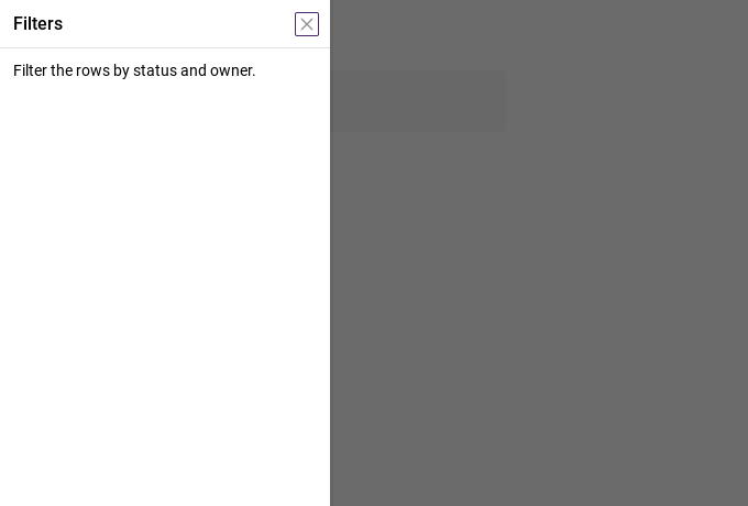
05 Left navigation drawer

Left navigation drawer, configured with position.

Qt capture · image
Left navigation drawer · Opened
QML code
import QtQuick
import Syidax.Core

Item {
    component EventLog: Rectangle {
        id: logBox
        property var lines: []
        implicitWidth: 440
        implicitHeight: Math.max(56, logText.implicitHeight + 24)
        radius: 4; color: Theme.semantic.backgroundBold
        function log(value) { lines = lines.slice(-3).concat([String(value)]) }
        Text {
            id: logText; x: 12; y: 12; width: parent.width - 24
            text: logBox.lines.length ? logBox.lines.join("\n") : "Interact with the controls to see event results."
            wrapMode: Text.Wrap; color: Theme.semantic.textDefault
            font.family: Theme.monoFontFamily; font.pixelSize: 12
        }
    }

    implicitWidth: Math.max(360, childrenRect.width)
    implicitHeight: childrenRect.height

    property QtObject settings: QtObject {
        id: storyArgs
        property string position: "left"
        property string size: "medium"
        property int customSize: 100
        property string title: "Filters"
        property bool closable: true
        property bool maskless: false
        property bool maskClosable: true
        property bool preventClose: false
        property string animation: "slide"
    }


    Column {
        spacing: 12
        SyDrawer {
            id: drawer
            position: storyArgs.position
            size: storyArgs.size
            customSize: storyArgs.customSize
            title: storyArgs.title
            closable: storyArgs.closable
            maskless: storyArgs.maskless
            maskClosable: storyArgs.maskClosable
            preventClose: storyArgs.preventClose
            animation: storyArgs.animation
            onOpened: output.log("opened")
            onClosed: output.log("closed")
            Text { text: "Filter the rows by status and owner."; width: parent.width; wrapMode: Text.Wrap; font.family: Theme.fontFamily; font.pixelSize: 14; color: Theme.drawer.contentTextEnabled }
        }
        SyButton { text: "Open drawer"; onClicked: drawer.setOpen() }
        EventLog { id: output }
    }

}

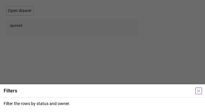
06 Bottom drawer

Bottom drawer, configured with position, size, customSize.

Qt capture · image
Bottom drawer · Opened
QML code
import QtQuick
import Syidax.Core

Item {
    component EventLog: Rectangle {
        id: logBox
        property var lines: []
        implicitWidth: 440
        implicitHeight: Math.max(56, logText.implicitHeight + 24)
        radius: 4; color: Theme.semantic.backgroundBold
        function log(value) { lines = lines.slice(-3).concat([String(value)]) }
        Text {
            id: logText; x: 12; y: 12; width: parent.width - 24
            text: logBox.lines.length ? logBox.lines.join("\n") : "Interact with the controls to see event results."
            wrapMode: Text.Wrap; color: Theme.semantic.textDefault
            font.family: Theme.monoFontFamily; font.pixelSize: 12
        }
    }

    implicitWidth: Math.max(360, childrenRect.width)
    implicitHeight: childrenRect.height

    property QtObject settings: QtObject {
        id: storyArgs
        property string position: "bottom"
        property string size: "custom"
        property int customSize: 180
        property string title: "Filters"
        property bool closable: true
        property bool maskless: false
        property bool maskClosable: true
        property bool preventClose: false
        property string animation: "slide"
    }


    Column {
        spacing: 12
        SyDrawer {
            id: drawer
            position: storyArgs.position
            size: storyArgs.size
            customSize: storyArgs.customSize
            title: storyArgs.title
            closable: storyArgs.closable
            maskless: storyArgs.maskless
            maskClosable: storyArgs.maskClosable
            preventClose: storyArgs.preventClose
            animation: storyArgs.animation
            onOpened: output.log("opened")
            onClosed: output.log("closed")
            Text { text: "Filter the rows by status and owner."; width: parent.width; wrapMode: Text.Wrap; font.family: Theme.fontFamily; font.pixelSize: 14; color: Theme.drawer.contentTextEnabled }
        }
        SyButton { text: "Open drawer"; onClicked: drawer.setOpen() }
        EventLog { id: output }
    }

}

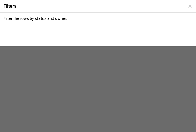
07 Top drawer

Top drawer, configured with position, size, customSize.

Qt capture · image
Top drawer · Opened
QML code
import QtQuick
import Syidax.Core

Item {
    component EventLog: Rectangle {
        id: logBox
        property var lines: []
        implicitWidth: 440
        implicitHeight: Math.max(56, logText.implicitHeight + 24)
        radius: 4; color: Theme.semantic.backgroundBold
        function log(value) { lines = lines.slice(-3).concat([String(value)]) }
        Text {
            id: logText; x: 12; y: 12; width: parent.width - 24
            text: logBox.lines.length ? logBox.lines.join("\n") : "Interact with the controls to see event results."
            wrapMode: Text.Wrap; color: Theme.semantic.textDefault
            font.family: Theme.monoFontFamily; font.pixelSize: 12
        }
    }

    implicitWidth: Math.max(360, childrenRect.width)
    implicitHeight: childrenRect.height

    property QtObject settings: QtObject {
        id: storyArgs
        property string position: "top"
        property string size: "custom"
        property int customSize: 160
        property string title: "Filters"
        property bool closable: true
        property bool maskless: false
        property bool maskClosable: true
        property bool preventClose: false
        property string animation: "slide"
    }


    Column {
        spacing: 12
        SyDrawer {
            id: drawer
            position: storyArgs.position
            size: storyArgs.size
            customSize: storyArgs.customSize
            title: storyArgs.title
            closable: storyArgs.closable
            maskless: storyArgs.maskless
            maskClosable: storyArgs.maskClosable
            preventClose: storyArgs.preventClose
            animation: storyArgs.animation
            onOpened: output.log("opened")
            onClosed: output.log("closed")
            Text { text: "Filter the rows by status and owner."; width: parent.width; wrapMode: Text.Wrap; font.family: Theme.fontFamily; font.pixelSize: 14; color: Theme.drawer.contentTextEnabled }
        }
        SyButton { text: "Open drawer"; onClicked: drawer.setOpen() }
        EventLog { id: output }
    }

}

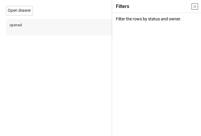
08 Drawer without mask

Drawer without mask, configured with maskless.

Qt capture · image
Drawer without mask · Opened
QML code
import QtQuick
import Syidax.Core

Item {
    component EventLog: Rectangle {
        id: logBox
        property var lines: []
        implicitWidth: 440
        implicitHeight: Math.max(56, logText.implicitHeight + 24)
        radius: 4; color: Theme.semantic.backgroundBold
        function log(value) { lines = lines.slice(-3).concat([String(value)]) }
        Text {
            id: logText; x: 12; y: 12; width: parent.width - 24
            text: logBox.lines.length ? logBox.lines.join("\n") : "Interact with the controls to see event results."
            wrapMode: Text.Wrap; color: Theme.semantic.textDefault
            font.family: Theme.monoFontFamily; font.pixelSize: 12
        }
    }

    implicitWidth: Math.max(360, childrenRect.width)
    implicitHeight: childrenRect.height

    property QtObject settings: QtObject {
        id: storyArgs
        property string position: "right"
        property string size: "medium"
        property int customSize: 100
        property string title: "Filters"
        property bool closable: true
        property bool maskless: true
        property bool maskClosable: true
        property bool preventClose: false
        property string animation: "slide"
    }


    Column {
        spacing: 12
        SyDrawer {
            id: drawer
            position: storyArgs.position
            size: storyArgs.size
            customSize: storyArgs.customSize
            title: storyArgs.title
            closable: storyArgs.closable
            maskless: storyArgs.maskless
            maskClosable: storyArgs.maskClosable
            preventClose: storyArgs.preventClose
            animation: storyArgs.animation
            onOpened: output.log("opened")
            onClosed: output.log("closed")
            Text { text: "Filter the rows by status and owner."; width: parent.width; wrapMode: Text.Wrap; font.family: Theme.fontFamily; font.pixelSize: 14; color: Theme.drawer.contentTextEnabled }
        }
        SyButton { text: "Open drawer"; onClicked: drawer.setOpen() }
        EventLog { id: output }
    }

}

API 62

Hover or select an item for its QML example and copy button.

Properties

PropertyTypeDefaultDescription
boolfalseShows / hides the drawer; setOpen() / setClose() set it.
string"right"The docked edge: "top" · "left" · "right" · "bottom".
string"medium"Depth: "small" 150 · "medium" 300 · "large" 500 · "custom" (customSize).
real100The depth in px for size: "custom".
string""The header text.
list (alias)—Items after the title
list (alias)—items in the footer row.
——The body items (padded 12 px, clipped).
boolfalseShows the × in the header.
boolfalseNo mask; the application behind stays clickable.
booltrueA click on the mask closes (or pulses with preventClose).
boolfalseMask click and Escape only pulse(); setClose() and the × still close.
string"none"none · slide · slide-fade · fade · fade-scale · zoom · pop · slide-top/bottom/left/right · slide-fade-… · reveal.
string"fast"x-fast 100 · fast 150 · medium 250 · slow 350 · x-slow 500 ms.
colorTheme.semantic.backdropBackgroundThe mask colour.
stringpositionBound to the edge and depth; override for a different slide.
realextentBound to the edge and depth; override for a different slide.
real—The resolved depth · position is left or right.
bool (read-only)—The resolved depth · position is left or right.
bool (read-only)—Whether the header / footer rows are shown.
string"closed"closed · opening · open · closing · the sheet is visible.
bool (read-only)"closed"closed · opening · open · closing · the sheet is visible.
Item (read-only)—The full-window sheet.

Methods

MethodDescription
open = true; no effect while open.
open = false; ignores preventClose; no effect while closed.
Nudges the panel 4 px along its axis over 250 ms.

Signals

SignalArgumentsWhen
—The entrance finished; the panel is fully in.
—The exit finished; the sheet is hidden. No argument — the cause is not reported.
—open changed (start of a transition).
—A click on the mask outside the panel, whatever maskClosable / preventClose.
—Escape on the sheet, before the close / pulse decision.
—The base signals behind opened / closed.

Behavior

ItemBehavior / conditions
The drawer item is visible: false and takes no space in its parent.
Shows / hides the drawer; setOpen() / setClose() set it.
When open becomes true, a full-window sheet (a child of the window's overlay, z 100) shows the mask (mask, bound to !maskless; maskColor) and the panel, and takes keyboard focus.
No mask; the application behind stays clickable.
The mask colour.
A click on the mask outside the panel, whatever maskClosable / preventClose.
The docked edge: "top" · "left" · "right" · "bottom".
position docks the panel: left / right panels are as tall as the window and extent wide; top / bottom panels are as wide as the window and extent high. extent is 150 / 300 / 500 for size small / medium / large, or customSize for custom. "slide" and "slide-fade" use the drawer's own edge and full depth (slideSide is bound to position, slideDistance to extent), so the panel glides completely in and out; "fade" only fades; the explicit names "slide-left" / "slide-right" / "slide-top" / "slide-bottom" (and the "slide-fade-…" forms) pick another side, and "fade-scale", "zoom", "pop" scale the panel.
Depth: "small" 150 · "medium" 300 · "large" 500 · "custom" (customSize).
The depth in px for size: "custom".
open = true; no effect while open.
Shows the × in the header.
A click on the mask closes (or pulses with preventClose).
open = false; ignores preventClose; no effect while closed.
Mask click and Escape only pulse(); setClose() and the × still close.
Nudges the panel 4 px along its axis over 250 ms.
none · slide · slide-fade · fade · fade-scale · zoom · pop · slide-top/bottom/left/right · slide-fade-… · reveal.
"slide" and "slide-fade" use the drawer's own edge and full depth (slideSide is bound to position, slideDistance to extent), so the panel glides completely in and out; "fade" only fades; the explicit names "slide-left" / "slide-right" / "slide-top" / "slide-bottom" (and the "slide-fade-…" forms) pick another side, and "fade-scale", "zoom", "pop" scale the panel.
x-fast 100 · fast 150 · medium 250 · slow 350 · x-slow 500 ms.
phase reports "closed" → "opening" → "open" → "closing"; opened() fires when the entrance ends, closed() when the exit ends.
The exit finished; the sheet is hidden. No argument — the cause is not reported.
The entrance finished; the panel is fully in.
The header text.
The header (44 px) shows title (16 px, medium, elided), the header items, and the × at the right; it exists only when one of them is present.
The body is padded 12 px and clipped; items declared inside should bind width: parent.width.
The footer (44 px) shows the footer items right-aligned and exists only when it has items.

Keyboard

ItemBehavior / conditions
SyModal (a centred window on the same sheet base), SyPopover (a small anchored panel), SyNav (a navigation list to put inside), SyTag / SyButton (typical header / footer items).