Run with --diagnose --json to check your Qt version, import path, fonts, runtime and license. No license token is printed.
The Gallery evaluation app is available now. Paid SDK sales and downloads are coming soon. The installation examples above preview the SDK workflow.
Tested Windows configurations
Native window and example smoke checks cover the versions below. Qt 6.8 is a source minimum, not a promise of tested support for every Qt release. Gallery uses software rendering.
Two complete application examples
Step-by-step captures from the running Windows applications. Play, pause and inspect each state.
Workbench: mark a task done, save changes and see release progress update.Record Manager: preserve a failed save, retry, search and confirm before deleting.
See the components in context
RibbonPanelFormTableTreeTheme
TRY IT YOURSELF
The native Gallery
Browse examples, inspect properties and switch between light and dark themes in a Windows application. The Gallery is for evaluation; commercial SDK access is separate.
The --qml path must contain the Syidax folder. Python uses qml-pure. Run from the unzipped SDK, independently of the source repository.
License is inactive or frozen
Download your QML Core certificate and pass it with --license. Web Core, Chart and Grid certificates do not activate QML. Monthly use ends at expiry. Annual licenses retain only releases covered by their update period.
Qt or plugin mismatch
Check the Qt version and architecture used to build plugins. Do not mix Python Qt bindings. qml-pure removes the compiled plugin ABI dependency.
PDF or icons missing
PDF requires the optional QtQuick.Pdf module. Other Core components remain usable without it. For icon packs and resource paths, read SDK docs/ICON-PACKS.md.
Save failure or corrupt settings
Examples write only to their application-data folder. Check permissions and disk space. Invalid JSON is backed up before reset. A failed save preserves your draft.
Suggest matching entries as the user types, so a value can be entered or selected quickly.
import Syidax.Core.Autocomplete
Supported QML types
Type
Definition / role
Text field with suggestions filtered from a source list.
Learn by example
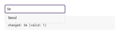
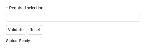
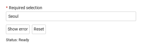
Previews are images of native Qt runs. Use the buttons below each image to view a result.
01 Basic composition
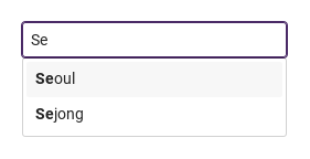
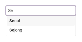
SyAutocomplete is a text field with suggestions: the strings of source that contain the typed text drop down under the field, and a click or Enter on one of them fills the field.
changed(detail) fires whenever value changes after creation: on every keystroke, when a suggestion is picked (the pick writes value first), and when code assigns value; detail = { value, isValid, status }.
Qt capture · image
QML code
import QtQuick
import Syidax.Core

Item {
    component EventLog: Rectangle {
        id: logBox
        property var lines: []
        implicitWidth: 440
        implicitHeight: Math.max(56, logText.implicitHeight + 24)
        radius: 4; color: Theme.semantic.backgroundBold
        function log(value) { lines = lines.slice(-3).concat([String(value)]) }
        Text {
            id: logText; x: 12; y: 12; width: parent.width - 24
            text: logBox.lines.length ? logBox.lines.join("\n") : "Interact with the controls to see event results."
            wrapMode: Text.Wrap; color: Theme.semantic.textDefault
            font.family: Theme.monoFontFamily; font.pixelSize: 12
        }
    }

    implicitWidth: Math.max(360, childrenRect.width)
    implicitHeight: childrenRect.height
    // Focused Gallery routes: keep only the selected API and its prerequisites.

    id: story
    readonly property var cities: ["Seoul", "Busan", "Incheon", "Daegu", "Daejeon"]


    Column {
        spacing: 12
        SyAutocomplete { id: exampleControl1;
            source: story.cities
            onChanged: (detail) => { if (true) { output.log(("changed: %1 (valid: %2)").arg(detail.value).arg(detail.isValid)) } }
            onSelected: (detail) => { if (true) { output.log(("selected: %1").arg(detail.value)) } }
        }
        EventLog { id: output }
    }
}
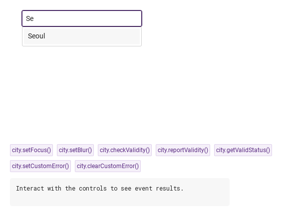
06 setFocus · checkValidity · reportValidity · …
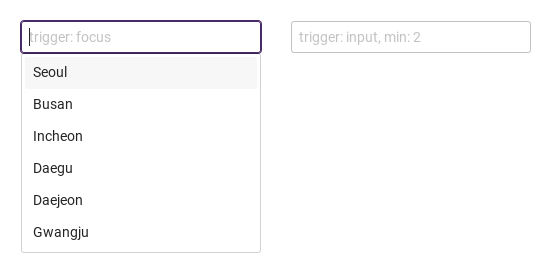
setFocus() focuses the field (with trigger: "focus" that opens the list); setBlur() removes the focus and closes the list.
Hover or select an item for its QML example and copy button.
Properties
Property
Type
Default
Description
string
""
The text. Writable from code (emits changed).
list
[]
The suggestion strings. Changing it refilters.
string
"focus"
focus: list on focus · input: list only after typing.
int
0
Characters needed before the list shows and filters.
bool
false
Match (and highlight) with exact case.
bool
false
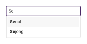
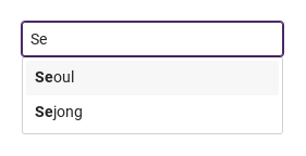
The matching part of each suggestion in bold.
int
0
Milliseconds to wait after the last keystroke before filtering (0 = at once).
bool
false
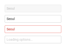
A spinner row instead of the suggestions.
string
""
Shown while the text is empty.
string
"default"
default · warning · error · success — a look, not a validity.
bool
false
Not editable, no list, still readable.
int
-1
The highlighted row in filteredList.
list
[]
The suggestions currently shown.
bool
false
True once the user typed (what trigger: "input" waits for).
bool (read-only)
—
The list is showing.
string (read-only)
—
value as a string.
bool (read-only)
—
The field has focus
bool (read-only)
—
the pointer is over the box.
string
""
The frame's title, form key, helper text and custom error copy.
string
""
The frame's title, form key, helper text and custom error copy.
string
""
The frame's title, form key, helper text and custom error copy.
string
""
The frame's title, form key, helper text and custom error copy.
string
"medium"
small · medium · large — box height 24 / 32 / 40 px.
bool
false
Disabled tones and no interaction
bool
false
empty text is valueMissing.
read-only
—
Validity: "" · valueMissing · custom; invalid once touched or reported.
read-only
—
Validity: "" · valueMissing · custom; invalid once touched or reported.
read-only
—
Validity: "" · valueMissing · custom; invalid once touched or reported.
real
240
The width when the app sets none.
Methods
Method
Description
Focuses the field; with trigger: "focus" the list opens.
Removes the focus and closes the list.
Returns whether the status is "" (silent).
Same, and reveals the error line.
"", "valueMissing" or "custom" (the two are the same).
"", "valueMissing" or "custom" (the two are the same).
Forces the custom status (and marks the field touched)
clears it.
Restores the creation value and clears the touched / submitted / custom flags.
Signals
Signal
Arguments
When
detail: { value, isValid, status }
value changed after creation — typing, a pick, or code. Not for the initial value.
detail: { value, isValid, status }
A suggestion was picked by click or Enter on the highlighted row (after changed).
detail: { value, isValid, status }
The field gained focus.
detail: { value, isValid, status }
The field lost focus; the field is now touched and the list is closed.
Behavior
Item
Behavior / conditions
Match (and highlight) with exact case.
The suggestion strings. Changing it refilters.
The matching part of each suggestion in bold.
focus: list on focus · input: list only after typing.
trigger: "focus" (default): whenever the field has focus and the text has at least min characters (min: 0 → on focus). It also closes when the text falls under min, on Escape, when the field loses focus or setBlur() is called.
Characters needed before the list shows and filters.
Milliseconds to wait after the last keystroke before filtering (0 = at once).
Removes the focus and closes the list.
The list is showing.
The suggestions currently shown.
The highlighted row in filteredList.
The text. Writable from code (emits changed).
A suggestion was picked by click or Enter on the highlighted row (after changed).
value changed after creation — typing, a pick, or code. Not for the initial value.
when the list is closed or nothing is highlighted, Enter submits the SyForm the field is declared in (if any). The keypad Enter does the same as Return.
disabled: disabled tones, no focus, no list.
Not editable, no list, still readable.
default · warning · error · success — a look, not a validity.
status adds a look — default, warning, error, success tones on the frame and text — without touching validity. The error line (the built-in text or error) shows once the field was blurred (touched) or after reportValidity().
A spinner row instead of the suggestions.
required and an empty text → valueMissing; setCustomError() → custom; disabled or readonly → always "".
required and an empty text → valueMissing; setCustomError() → custom; disabled or readonly → always "".
Same, and reveals the error line.
small · medium · large — box height 24 / 32 / 40 px.
The width when the app sets none.
the box is size high (small 24 · medium 32 · large 40 px); the width is preferredWidth 240 unless the app sets width; the list is as wide as the box and at most 300 px tall.
Keyboard
Item
Behavior / conditions
Keyboard: Tab and Shift+Tab enter and leave the field. Hidden and disabled fields are skipped. Escape closes an open picker before continuing. Textarea uses Tab for focus navigation, including inside a modal; it does not insert indentation.