Run with --diagnose --json to check your Qt version, import path, fonts, runtime and license. No license token is printed.
The Gallery evaluation app is available now. Paid SDK sales and downloads are coming soon. The installation examples above preview the SDK workflow.
Tested Windows configurations
Native window and example smoke checks cover the versions below. Qt 6.8 is a source minimum, not a promise of tested support for every Qt release. Gallery uses software rendering.
Two complete application examples
Step-by-step captures from the running Windows applications. Play, pause and inspect each state.
Workbench: mark a task done, save changes and see release progress update.Record Manager: preserve a failed save, retry, search and confirm before deleting.
See the components in context
RibbonPanelFormTableTreeTheme
TRY IT YOURSELF
The native Gallery
Browse examples, inspect properties and switch between light and dark themes in a Windows application. The Gallery is for evaluation; commercial SDK access is separate.
The --qml path must contain the Syidax folder. Python uses qml-pure. Run from the unzipped SDK, independently of the source repository.
License is inactive or frozen
Download your QML Core certificate and pass it with --license. Web Core, Chart and Grid certificates do not activate QML. Monthly use ends at expiry. Annual licenses retain only releases covered by their update period.
Qt or plugin mismatch
Check the Qt version and architecture used to build plugins. Do not mix Python Qt bindings. qml-pure removes the compiled plugin ABI dependency.
PDF or icons missing
PDF requires the optional QtQuick.Pdf module. Other Core components remain usable without it. For icon packs and resource paths, read SDK docs/ICON-PACKS.md.
Save failure or corrupt settings
Examples write only to their application-data folder. Check permissions and disk space. Invalid JSON is backed up before reset. A failed save preserves your draft.
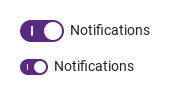
size has two values: medium (the default) draws a 44 × 22 px track with an 18 px handle, small a 28 × 16 px track with a 12 px handle; the "|" and "○" marks on the track and the loading ring scale with it.
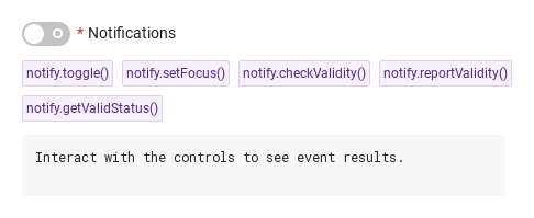
Hover or select an item for its QML example and copy button.
Properties
Item
Behavior / conditions
The shared field properties (name, required, disabled, message, error, touched, submitted, customError, validStatus, valid, invalid, ready) are described on the Form page; the ones below are the switch's own or have switch-specific meaning.
The shared field properties (name, required, disabled, message, error, touched, submitted, customError, validStatus, valid, invalid, ready) are described on the Form page; the ones below are the switch's own or have switch-specific meaning.
The shared field properties (name, required, disabled, message, error, touched, submitted, customError, validStatus, valid, invalid, ready) are described on the Form page; the ones below are the switch's own or have switch-specific meaning.
The shared field properties (name, required, disabled, message, error, touched, submitted, customError, validStatus, valid, invalid, ready) are described on the Form page; the ones below are the switch's own or have switch-specific meaning.
The shared field properties (name, required, disabled, message, error, touched, submitted, customError, validStatus, valid, invalid, ready) are described on the Form page; the ones below are the switch's own or have switch-specific meaning.
The shared field properties (name, required, disabled, message, error, touched, submitted, customError, validStatus, valid, invalid, ready) are described on the Form page; the ones below are the switch's own or have switch-specific meaning.
The shared field properties (name, required, disabled, message, error, touched, submitted, customError, validStatus, valid, invalid, ready) are described on the Form page; the ones below are the switch's own or have switch-specific meaning.
The shared field properties (name, required, disabled, message, error, touched, submitted, customError, validStatus, valid, invalid, ready) are described on the Form page; the ones below are the switch's own or have switch-specific meaning.
The shared field properties (name, required, disabled, message, error, touched, submitted, customError, validStatus, valid, invalid, ready) are described on the Form page; the ones below are the switch's own or have switch-specific meaning.
The shared field properties (name, required, disabled, message, error, touched, submitted, customError, validStatus, valid, invalid, ready) are described on the Form page; the ones below are the switch's own or have switch-specific meaning.
The shared field properties (name, required, disabled, message, error, touched, submitted, customError, validStatus, valid, invalid, ready) are described on the Form page; the ones below are the switch's own or have switch-specific meaning.
The shared field properties (name, required, disabled, message, error, touched, submitted, customError, validStatus, valid, invalid, ready) are described on the Form page; the ones below are the switch's own or have switch-specific meaning.
Properties
Property
Type
Default
Description
bool
false
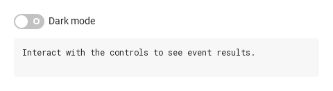
The state. Flipped by a click on the track, Space / Enter and toggle(); every change emits changed.
string
""
The text beside the track, with * when required. Hidden when empty.
string
"medium"
medium (44 × 22 px) · small (28 × 16 px). Any other value draws medium.
bool
false
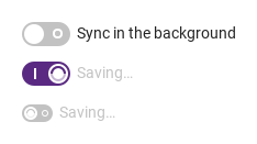
Spinner in the handle; the switch ignores every flip until it is cleared. Does not change checked.
string
"on"
What the owning SyForm submits under name while on.
var (read-only)
—
value while on, null otherwise — what SyForm.values() stores.
string
""
Key in the owning SyForm's values().
bool
false
Off → valueMissing; adds the * mark.
bool
false
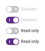
Inert and grayed; not a Tab stop; always valid; not submitted.
bool
false
Focusable but unchangeable; always valid; still submitted.
string
""
Helper line under the switch
string
""
custom error copy for the required check.
bool (read-only)
—
The track has active focus
bool (read-only)
—
the pointer is over it (false while disabled)
bool (read-only)
—
it is being pressed.
bool (read-only)
—
Not disabled, not read-only, not loading — a flip is possible.
The field base's title line, turned off for the switch (the label sits beside the track).
Methods
Method
Description
The click: flips checked (changed fires). Ignored while disabled, readonly or loading.
Give the track keyboard focus / take it away (focused / blured fire; the blur sets touched).
Give the track keyboard focus / take it away (focused / blured fire; the blur sets touched).
true unless a required switch is off (or a custom error is set). Silent.
Same verdict, and the error line shows from now on.
"" · valueMissing · custom.
"" · valueMissing · custom.
Force / lift the custom status; the error shows at once.
Force / lift the custom status; the error shows at once.
Restores checked (to initialChecked, the value the switch was created with) and value, and clears the touched, reported and custom flags.
Signals
Signal
Arguments
When
checked: bool — the new state
checked changed after load, by the user or from code. Not for the initial value; not while disabled, read-only or loading block the flip.
checked: bool — the current state
The track gained active focus.
checked: bool — the current state
The track lost focus; touched is set first.
Behavior
Item
Behavior / conditions
The state. Flipped by a click on the track, Space / Enter and toggle(); every change emits changed.
The click: flips checked (changed fires). Ignored while disabled, readonly or loading.
checked changed after load, by the user or from code. Not for the initial value; not while disabled, read-only or loading block the flip.
Spinner in the handle; the switch ignores every flip until it is cleared. Does not change checked.
What the owning SyForm submits under name while on.
value while on, null otherwise — what SyForm.values() stores.
Key in the owning SyForm's values().
Off → valueMissing; adds the * mark.
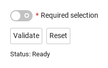
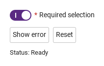
required makes an off switch valueMissing; the error line under the switch ("This field is required", or error) appears once the switch was left (touched) or reported (submitted).
required makes an off switch valueMissing; the error line under the switch ("This field is required", or error) appears once the switch was left (touched) or reported (submitted).
required makes an off switch valueMissing; the error line under the switch ("This field is required", or error) appears once the switch was left (touched) or reported (submitted).
message draws a helper line under it.
Inert and grayed; not a Tab stop; always valid; not submitted.
Focusable but unchangeable; always valid; still submitted.
Tab stops on the track unless it is disabled (a read-only switch is still a Tab stop); Space, Return and Enter toggle. The focus ring is drawn 2 px outside the track while it has focus and is not disabled. The hand cursor shows while the switch is interactive (not disabled, read-only or loading).
The handle slides in 200 ms and the track color cross-fades in 200 ms; while the track is pressed the handle stretches into a pill (6 px wider, 4 px when small) and springs back on release. All of it is skipped under Theme.reducedMotion.
disabled grays everything, blocks every interaction and the Tab stop, and the switch is skipped by SyForm.values().
Tones: disabled > readonly > loading > pressed > focus > hover > enabled, in the checked or unchecked palette.
Tones: disabled > readonly > loading > pressed > focus > hover > enabled, in the checked or unchecked palette.
Tones: disabled > readonly > loading > pressed > focus > hover > enabled, in the checked or unchecked palette.
The track gained active focus.
The track lost focus; touched is set first.
medium (44 × 22 px) · small (28 × 16 px). Any other value draws medium.
size is medium (44 × 22, handle 18) or small (28 × 16, handle 12); the label is 14 px in both.
The text beside the track, with * when required. Hidden when empty.
Colors come from Theme.switchFamily by state and follow Theme.scheme; the handle is the page background color.