QML
← All components

Button Group

Arrange related command buttons together in a horizontal or vertical group.

import Syidax.Core.ButtonGroup

Supported QML types

TypeDefinition / role
Arranges buttons as one connected group.

Learn by example

Previews are images of native Qt runs. Use the buttons below each image to view a result.

01 Basic composition

Compare the configuration and result of Basic composition.

Qt capture · image
Basic composition · Default
Default execution
QML code
import QtQuick
import Syidax.Core

Item {
    implicitWidth: Math.max(360, childrenRect.width)
    implicitHeight: childrenRect.height
    id: story

    property QtObject settings: QtObject {
        id: storyArgs
        property string variant: "secondary"
        property string size: "medium"
        property bool vertical: false
    }


    SyButtonGroup {
        variant: storyArgs.variant
        size: storyArgs.size
        vertical: storyArgs.vertical
        SyButton { text: "Day" }
        SyButton { text: "Week" }
        SyButton { text: "Month" }
    }

}

02 vertical

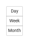
vertical: true stacks the buttons top to bottom instead of left to right.

Qt capture · image
vertical · Default
QML code
import QtQuick
import Syidax.Core

Item {
    implicitWidth: Math.max(360, childrenRect.width)
    implicitHeight: childrenRect.height
    property QtObject settings: QtObject {
        id: storyArgs
        property bool vertical: true
    }


    SyButtonGroup {
        vertical: storyArgs.vertical
        SyButton { text: "Day" }
        SyButton { text: "Week" }
        SyButton { text: "Month" }
    }
}

03 clicked

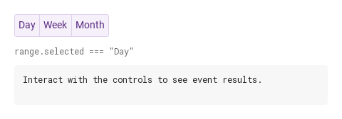
The group has no signals of its own.

Qt capture · image
clicked · Default
QML code
import QtQuick
import Syidax.Core

Item {
    component EventLog: Rectangle {
        id: logBox
        property var lines: []
        implicitWidth: 440
        implicitHeight: Math.max(56, logText.implicitHeight + 24)
        radius: 4; color: Theme.semantic.backgroundBold
        function log(value) { lines = lines.slice(-3).concat([String(value)]) }
        Text {
            id: logText; x: 12; y: 12; width: parent.width - 24
            text: logBox.lines.length ? logBox.lines.join("\n") : "Interact with the controls to see event results."
            wrapMode: Text.Wrap; color: Theme.semantic.textDefault
            font.family: Theme.monoFontFamily; font.pixelSize: 12
        }
    }

    implicitWidth: Math.max(360, childrenRect.width)
    implicitHeight: childrenRect.height

    Column {
        spacing: 12
        SyButtonGroup {
            id: range
            variant: "secondary"
            property string selected: "Day"
            function pick(button) { selected = button.text; output.log(("range: %1").arg(selected)) }
            SyButton { id: exampleControl1;  text: "Day"; onClicked: range.pick(this) }
            SyButton { id: exampleControl2;  text: "Week"; onClicked: range.pick(this) }
            SyButton { id: exampleControl3;  text: "Month"; onClicked: range.pick(this) }
        }
        Text {
            text: "range.selected === " + JSON.stringify(range.selected)
            font.family: Theme.monoFontFamily
            font.pixelSize: 12
            color: Theme.semantic.textSubtle
        }
        EventLog { id: output }
    }
}

04 Vertical actions

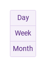
Vertical actions, configured with vertical.

Qt capture · image
Vertical actions · Result
Default execution
QML code
import QtQuick
import Syidax.Core

Item {
    implicitWidth: Math.max(360, childrenRect.width)
    implicitHeight: childrenRect.height
    id: story

    property QtObject settings: QtObject {
        id: storyArgs
        property string variant: "secondary"
        property string size: "medium"
        property bool vertical: true
    }


    SyButtonGroup {
        variant: storyArgs.variant
        size: storyArgs.size
        vertical: storyArgs.vertical
        SyButton { text: "Day" }
        SyButton { text: "Week" }
        SyButton { text: "Month" }
    }

}

API 16

Hover or select an item for its QML example and copy button.

Properties

PropertyTypeDefaultDescription
string"default"Written into every button on each layout pass: default · primary · secondary · borderless.
string"medium"Written into every button on each layout pass: small · medium · large.
boolfalsetrue stacks the buttons top to bottom; the squared corners follow.
boolfalseSide by side only: every button takes an equal share of the group's width (set the group's width).
list (read-only)—The SyButton children of the group, in declaration order (hidden ones included).
Item…—Default property: the buttons declared inside the group.

Methods

MethodDescription
The group has no public methods. Drive the buttons through buttons[i] (setFocus(), setBlur(), setClick()).

Signals

SignalArgumentsWhen
—The group emits no signals. Each SyButton inside emits its own clicked().

Behavior

ItemBehavior / conditions
The group positions its buttons itself (it is not a Row): every visible SyButton child is placed after the previous one, overlapping it by one pixel, and the group's implicit size is the bounding box of its children. Hidden buttons (visible: false) are skipped and the corners of their neighbours are recomputed.
Written into every button on each layout pass: default · primary · secondary · borderless.
Written into every button on each layout pass: small · medium · large.
true stacks the buttons top to bottom; the squared corners follow.
The group writes groupPosition (first · middle · last) and groupVertical into each button; the button squares the corners that face a neighbour. A group with a single visible button leaves all four corners round.
The button that has active focus gets z: 2, the others z: 1, so a focus ring is never cut by the neighbour's border.
Each button keeps its own clicked(); the group adds no signal, no selection and no highlighted state. Tab moves focus from one button to the next and Space activates the focused one. Only SyButtons (and types derived from it) take part — other items declared inside are ignored by the layout but still count toward the group's size.
The group announces itself as a grouping; each button keeps its own name.