QML
← All components

Icon

Display a symbol or image beside text and controls to make an action or status easier to recognize.

import Syidax.Core.Icon

Supported QML types

TypeDefinition / role
Renders an icon source with size, color and state handling.

Learn by example

Previews are images of native Qt runs. Use the buttons below each image to view a result.

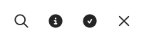
01 Built-in symbols

Choose named symbols from Icons.

Qt capture · image
Built-in symbols · Default
Default execution
QML code
import QtQuick
import Syidax.Core

Row { spacing: 24
    SyIcon { source: Icons.inputSearch; size: "xxlarge" }
    SyIcon { source: Icons.bannerInfo; size: "xxlarge" }
    SyIcon { source: Icons.toastSuccess; size: "xxlarge" }
    SyIcon { source: Icons.modalClose; size: "xxlarge" }
}

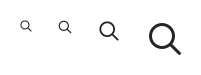
02 Symbol sizes

Compare four supported icon sizes.

Qt capture · image
Symbol sizes · Default
Default execution
QML code
import QtQuick
import Syidax.Core

Row { spacing: 24
    SyIcon { source: Icons.inputSearch; size: "small" }
    SyIcon { source: Icons.inputSearch; size: "medium" }
    SyIcon { source: Icons.inputSearch; size: "xxlarge" }
    SyIcon { source: Icons.inputSearch; size: "xxxxlarge" }
}

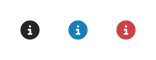
03 Theme and custom colors

Monochrome symbols use the selected color.

Qt capture · image
Theme and custom colors · Default
Default execution
QML code
import QtQuick
import Syidax.Core

Row { spacing: 24
    SyIcon { source: Icons.bannerInfo; size: "xxlarge"; color: Theme.semantic.iconDefault }
    SyIcon { source: Icons.bannerInfo; size: "xxlarge"; color: "#167dbe" }
    SyIcon { source: Icons.bannerInfo; size: "xxlarge"; color: "#d14040" }
}

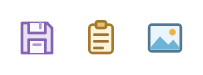
04 Colored ribbon artwork

Ribbon artwork retains its original colors.

Qt capture · image
Colored ribbon artwork · Default
Default execution
QML code
import QtQuick
import Syidax.Core

Row { spacing: 24
    SyIcon { source: Icons.ribbonSave; size: "xxxxlarge" }
    SyIcon { source: Icons.ribbonPaste; size: "xxxxlarge" }
    SyIcon { source: Icons.ribbonPicture; size: "xxxxlarge" }
}

05 Inline SVG and natural aspect

Preserve the aspect ratio of a wide custom SVG.

Qt capture · image
Inline SVG and natural aspect · Default
Default execution
QML code
import QtQuick
import Syidax.Core

SyIcon {
    size: "xxxxlarge"; naturalAspect: true
    svgMarkup: '<svg xmlns="http://www.w3.org/2000/svg" viewBox="0 0 80 32"><rect width="80" height="32" rx="8" fill="#167dbe"/></svg>'
}

06 Selection event

Use selected(value) for mouse and keyboard activation.

Qt capture · image
Selection event · Default
QML code
import QtQuick
import Syidax.Core

Column {
    spacing: 12
    SyIcon { id: symbol; source: Icons.bannerInfo; size: "xxxxlarge"; selectable: true
        accessibleName: "Show information"
        onSelected: value => result.text = "Selected: " + value
    }
    Text { id: result; text: "Select the information icon."; color: Theme.semantic.textDefault; width: 440; wrapMode: Text.Wrap }
}

API 32

Hover or select an item for its QML example and copy button.

Properties

PropertyTypeDefaultDescription
url—The glyph: an Icons.* resource or any SVG / image url.
string""Inline SVG text drawn instead of source when non-empty.
string"medium"xxsmall 10 · xsmall 12 · small 14 · medium 16 · large 18 · xlarge 20 · xxlarge 24 · xxxlarge 30 · xxxxlarge 40 px.
colorTheme.semantic.iconDefaultTint for monochrome glyphs. Shared colored artwork retains its original colors.
boolfalseKeep the image's own width-to-height ratio instead of a square box.
boolfalsePointer cursor and selected on tap.
int (read-only)16The pixel size behind size.
url (read-only)—svgMarkup as a data url, else source.
real (read-only)1The loaded image's width ÷ height.
enumeration (read-only)Image.NullImage.Null · Loading · Ready · Error.
string (read-only)—What selected delivers: svgMarkup or the source string.
var (read-only)—The name → pixel map.

Methods

ItemBehavior / conditions
SyIcon has no methods; change source, svgMarkup, size or color and it redraws.

Signals

SignalArgumentsWhen
value: stringA tap on a selectable icon; value is the markup or the source url.
—The load state changed (the property's own signal).

Behavior

ItemBehavior / conditions
svgMarkup as a data url, else source.
Inline SVG text drawn instead of source when non-empty.
The glyph: an Icons.* resource or any SVG / image url.
Tint for monochrome glyphs. Shared colored artwork retains its original colors.
Image.Null · Loading · Ready · Error.
xxsmall 10 · xsmall 12 · small 14 · medium 16 · large 18 · xlarge 20 · xxlarge 24 · xxxlarge 30 · xxxxlarge 40 px.
The pixel size behind size.
pixelSize is that number; implicitWidth and implicitHeight are pixelSize, or with naturalAspect the width is pixelSize × naturalRatio (the image's own width-to-height ratio) and the picture is rasterised by height only.
Keep the image's own width-to-height ratio instead of a square box.
The loaded image's width ÷ height.
pixelSize is that number; implicitWidth and implicitHeight are pixelSize, or with naturalAspect the width is pixelSize × naturalRatio (the image's own width-to-height ratio) and the picture is rasterised by height only. You may also set width / height directly; the glyph scales to fit.
You may also set width / height directly; the glyph scales to fit.
Pointer cursor and selected on tap.
A tap on a selectable icon; value is the markup or the source url.
What selected delivers: svgMarkup or the source string.

Keyboard

ItemBehavior / conditions
Icons (the glyph catalogue, see the *All glyphs* page), SyButton (icon.source and iconOnly), SyAvatar (icon for a glyph avatar), SyBadge / SyTag (status marks that embed icons).