QML
← All components

Inline Message

Show feedback next to the control it concerns, with an optional action to resolve the issue.

import Syidax.Core.InlineMessage

Supported QML types

TypeDefinition / role
Compact contextual message placed beside the related content.

Learn by example

Previews are images of native Qt runs. Use the buttons below each image to view a result.

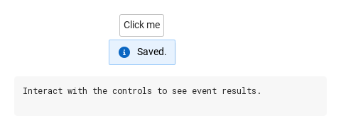
01 Basic composition

SyInlineMessage is a small message bubble that floats next to the control it is declared in

Qt capture · image
Basic composition · Opened
QML code
import QtQuick
import Syidax.Core

Item {
    component EventLog: Rectangle {
        id: logBox
        property var lines: []
        implicitWidth: 440
        implicitHeight: Math.max(56, logText.implicitHeight + 24)
        radius: 4; color: Theme.semantic.backgroundBold
        function log(value) { lines = lines.slice(-3).concat([String(value)]) }
        Text {
            id: logText; x: 12; y: 12; width: parent.width - 24
            text: logBox.lines.length ? logBox.lines.join("\n") : "Interact with the controls to see event results."
            wrapMode: Text.Wrap; color: Theme.semantic.textDefault
            font.family: Theme.monoFontFamily; font.pixelSize: 12
        }
    }

    implicitWidth: Math.max(360, childrenRect.width)
    implicitHeight: childrenRect.height

    property QtObject settings: QtObject {
        id: storyArgs
        property string variant: "informational"
        property string message: "Saved."
        property bool icon: true
        property bool action: false
        property string btnLabel: ""
        property string position: "bottom"
        property string trigger: "click"
        property bool sticky: false
        property string animation: "none"
    }


    Column {
        spacing: 12
        Item {
            width: 360
            height: 120
            SyButton {
                anchors.centerIn: parent
                text: "Click me"
                SyInlineMessage { id: exampleControl1; 
                    variant: storyArgs.variant
                    message: storyArgs.message
                    icon: storyArgs.icon
                    action: storyArgs.action
                    btnLabel: storyArgs.btnLabel
                    position: storyArgs.position
                    trigger: storyArgs.trigger
                    sticky: storyArgs.sticky
                    animation: storyArgs.animation
                    onActionClick: output.log("actionClick")
                }
            }
        }
        EventLog { id: output }
    }

}

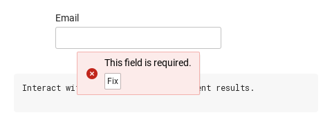
02 actionClick · dismiss

Three signals.

Qt capture · image
actionClick · dismiss · Opened
QML code
import QtQuick
import Syidax.Core

Item {
    component EventLog: Rectangle {
        id: logBox
        property var lines: []
        implicitWidth: 440
        implicitHeight: Math.max(56, logText.implicitHeight + 24)
        radius: 4; color: Theme.semantic.backgroundBold
        function log(value) { lines = lines.slice(-3).concat([String(value)]) }
        Text {
            id: logText; x: 12; y: 12; width: parent.width - 24
            text: logBox.lines.length ? logBox.lines.join("\n") : "Interact with the controls to see event results."
            wrapMode: Text.Wrap; color: Theme.semantic.textDefault
            font.family: Theme.monoFontFamily; font.pixelSize: 12
        }
    }

    implicitWidth: Math.max(360, childrenRect.width)
    implicitHeight: childrenRect.height
    // Focused Gallery routes: keep only the selected API and its prerequisites.
    id: featureStory

    Column {
        spacing: 12
        Item {
            width: 360
            height: 100
            SyInput {
                anchors.centerIn: parent
                width: 240
                label: "Email"
                SyInlineMessage { id: exampleControl1; 
                    variant: "error"
                    message: "This field is required."
                    btnLabel: "Fix"
                    trigger: "focusout"
                    onActionClick: { if (true) { output.log("actionClick") } }
                    onDismiss: { if (true) { output.log("dismiss") } }
                }
            }
        }
        EventLog { id: output }
    }
}

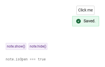
03 show · hide

show() opens the message and hide() closes it from code, whatever the trigger

Qt capture · image
show · hide · Opened
QML code
import QtQuick
import Syidax.Core

Item {
    implicitWidth: Math.max(360, childrenRect.width)
    implicitHeight: childrenRect.height
    // Focused Gallery routes: keep only the selected API and its prerequisites.
    id: featureStory

    Column {
        spacing: 24
        Item {
            width: 560
            height: 180
            SyButton { anchors.centerIn: parent; text: "Click me"; SyInlineMessage { id: note; variant: "success"; message: "Saved."; trigger: "none"; sticky: true } }
        }
        Row {
            objectName: "exampleCommands"

            spacing: 8
            SyButton { id: exampleControl1;  visible: true; text: "note.show()"; variant: "secondary"; size: "small"; onClicked: note.show() }
            SyButton { id: exampleControl2;  visible: true; text: "note.hide()"; variant: "secondary"; size: "small"; onClicked: note.hide() }
        }
        Text {
            text: "note.isOpen === " + note.isOpen
            font.family: Theme.monoFontFamily
            font.pixelSize: 12
            color: Theme.semantic.textSubtle
        }
    }
}

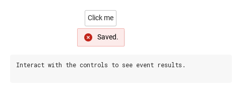
04 Error feedback

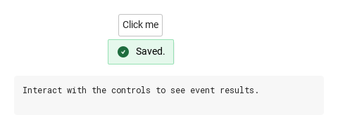
Error feedback, configured with variant.

Qt capture · image
Error feedback · Opened
QML code
import QtQuick
import Syidax.Core

Item {
    component EventLog: Rectangle {
        id: logBox
        property var lines: []
        implicitWidth: 440
        implicitHeight: Math.max(56, logText.implicitHeight + 24)
        radius: 4; color: Theme.semantic.backgroundBold
        function log(value) { lines = lines.slice(-3).concat([String(value)]) }
        Text {
            id: logText; x: 12; y: 12; width: parent.width - 24
            text: logBox.lines.length ? logBox.lines.join("\n") : "Interact with the controls to see event results."
            wrapMode: Text.Wrap; color: Theme.semantic.textDefault
            font.family: Theme.monoFontFamily; font.pixelSize: 12
        }
    }

    implicitWidth: Math.max(360, childrenRect.width)
    implicitHeight: childrenRect.height

    property QtObject settings: QtObject {
        id: storyArgs
        property string variant: "error"
        property string message: "Saved."
        property bool icon: true
        property bool action: false
        property string btnLabel: ""
        property string position: "bottom"
        property string trigger: "click"
        property bool sticky: false
        property string animation: "none"
    }


    Column {
        spacing: 12
        Item {
            width: 360
            height: 120
            SyButton {
                anchors.centerIn: parent
                text: "Click me"
                SyInlineMessage { id: exampleControl1; 
                    variant: storyArgs.variant
                    message: storyArgs.message
                    icon: storyArgs.icon
                    action: storyArgs.action
                    btnLabel: storyArgs.btnLabel
                    position: storyArgs.position
                    trigger: storyArgs.trigger
                    sticky: storyArgs.sticky
                    animation: storyArgs.animation
                    onActionClick: output.log("actionClick")
                }
            }
        }
        EventLog { id: output }
    }

}

05 Success feedback

Success feedback, configured with variant.

Qt capture · image
Success feedback · Opened
QML code
import QtQuick
import Syidax.Core

Item {
    component EventLog: Rectangle {
        id: logBox
        property var lines: []
        implicitWidth: 440
        implicitHeight: Math.max(56, logText.implicitHeight + 24)
        radius: 4; color: Theme.semantic.backgroundBold
        function log(value) { lines = lines.slice(-3).concat([String(value)]) }
        Text {
            id: logText; x: 12; y: 12; width: parent.width - 24
            text: logBox.lines.length ? logBox.lines.join("\n") : "Interact with the controls to see event results."
            wrapMode: Text.Wrap; color: Theme.semantic.textDefault
            font.family: Theme.monoFontFamily; font.pixelSize: 12
        }
    }

    implicitWidth: Math.max(360, childrenRect.width)
    implicitHeight: childrenRect.height

    property QtObject settings: QtObject {
        id: storyArgs
        property string variant: "success"
        property string message: "Saved."
        property bool icon: true
        property bool action: false
        property string btnLabel: ""
        property string position: "bottom"
        property string trigger: "click"
        property bool sticky: false
        property string animation: "none"
    }


    Column {
        spacing: 12
        Item {
            width: 360
            height: 120
            SyButton {
                anchors.centerIn: parent
                text: "Click me"
                SyInlineMessage { id: exampleControl1; 
                    variant: storyArgs.variant
                    message: storyArgs.message
                    icon: storyArgs.icon
                    action: storyArgs.action
                    btnLabel: storyArgs.btnLabel
                    position: storyArgs.position
                    trigger: storyArgs.trigger
                    sticky: storyArgs.sticky
                    animation: storyArgs.animation
                    onActionClick: output.log("actionClick")
                }
            }
        }
        EventLog { id: output }
    }

}

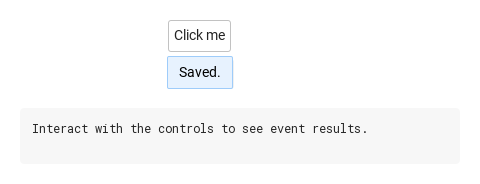
06 Text-only feedback

Text-only feedback, configured with icon.

Qt capture · image
Text-only feedback · Opened
QML code
import QtQuick
import Syidax.Core

Item {
    component EventLog: Rectangle {
        id: logBox
        property var lines: []
        implicitWidth: 440
        implicitHeight: Math.max(56, logText.implicitHeight + 24)
        radius: 4; color: Theme.semantic.backgroundBold
        function log(value) { lines = lines.slice(-3).concat([String(value)]) }
        Text {
            id: logText; x: 12; y: 12; width: parent.width - 24
            text: logBox.lines.length ? logBox.lines.join("\n") : "Interact with the controls to see event results."
            wrapMode: Text.Wrap; color: Theme.semantic.textDefault
            font.family: Theme.monoFontFamily; font.pixelSize: 12
        }
    }

    implicitWidth: Math.max(360, childrenRect.width)
    implicitHeight: childrenRect.height

    property QtObject settings: QtObject {
        id: storyArgs
        property string variant: "informational"
        property string message: "Saved."
        property bool icon: false
        property bool action: false
        property string btnLabel: ""
        property string position: "bottom"
        property string trigger: "click"
        property bool sticky: false
        property string animation: "none"
    }


    Column {
        spacing: 12
        Item {
            width: 360
            height: 120
            SyButton {
                anchors.centerIn: parent
                text: "Click me"
                SyInlineMessage { id: exampleControl1; 
                    variant: storyArgs.variant
                    message: storyArgs.message
                    icon: storyArgs.icon
                    action: storyArgs.action
                    btnLabel: storyArgs.btnLabel
                    position: storyArgs.position
                    trigger: storyArgs.trigger
                    sticky: storyArgs.sticky
                    animation: storyArgs.animation
                    onActionClick: output.log("actionClick")
                }
            }
        }
        EventLog { id: output }
    }

}

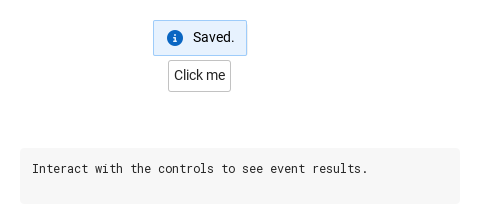
07 Feedback above the field

Feedback above the field, configured with position.

Qt capture · image
Feedback above the field · Opened
QML code
import QtQuick
import Syidax.Core

Item {
    component EventLog: Rectangle {
        id: logBox
        property var lines: []
        implicitWidth: 440
        implicitHeight: Math.max(56, logText.implicitHeight + 24)
        radius: 4; color: Theme.semantic.backgroundBold
        function log(value) { lines = lines.slice(-3).concat([String(value)]) }
        Text {
            id: logText; x: 12; y: 12; width: parent.width - 24
            text: logBox.lines.length ? logBox.lines.join("\n") : "Interact with the controls to see event results."
            wrapMode: Text.Wrap; color: Theme.semantic.textDefault
            font.family: Theme.monoFontFamily; font.pixelSize: 12
        }
    }

    implicitWidth: Math.max(360, childrenRect.width)
    implicitHeight: childrenRect.height

    property QtObject settings: QtObject {
        id: storyArgs
        property string variant: "informational"
        property string message: "Saved."
        property bool icon: true
        property bool action: false
        property string btnLabel: ""
        property string position: "top"
        property string trigger: "click"
        property bool sticky: false
        property string animation: "none"
    }


    Column {
        spacing: 12
        Item {
            width: 360
            height: 120
            SyButton {
                anchors.centerIn: parent
                text: "Click me"
                SyInlineMessage { id: exampleControl1; 
                    variant: storyArgs.variant
                    message: storyArgs.message
                    icon: storyArgs.icon
                    action: storyArgs.action
                    btnLabel: storyArgs.btnLabel
                    position: storyArgs.position
                    trigger: storyArgs.trigger
                    sticky: storyArgs.sticky
                    animation: storyArgs.animation
                    onActionClick: output.log("actionClick")
                }
            }
        }
        EventLog { id: output }
    }

}

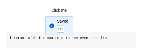
08 Feedback with action

Feedback with action, configured with action.

Qt capture · image
Feedback with action · Opened
QML code
import QtQuick
import Syidax.Core

Item {
    component EventLog: Rectangle {
        id: logBox
        property var lines: []
        implicitWidth: 440
        implicitHeight: Math.max(56, logText.implicitHeight + 24)
        radius: 4; color: Theme.semantic.backgroundBold
        function log(value) { lines = lines.slice(-3).concat([String(value)]) }
        Text {
            id: logText; x: 12; y: 12; width: parent.width - 24
            text: logBox.lines.length ? logBox.lines.join("\n") : "Interact with the controls to see event results."
            wrapMode: Text.Wrap; color: Theme.semantic.textDefault
            font.family: Theme.monoFontFamily; font.pixelSize: 12
        }
    }

    implicitWidth: Math.max(360, childrenRect.width)
    implicitHeight: childrenRect.height

    property QtObject settings: QtObject {
        id: storyArgs
        property string variant: "informational"
        property string message: "Saved."
        property bool icon: true
        property bool action: true
        property string btnLabel: ""
        property string position: "bottom"
        property string trigger: "click"
        property bool sticky: false
        property string animation: "none"
    }


    Column {
        spacing: 12
        Item {
            width: 360
            height: 120
            SyButton {
                anchors.centerIn: parent
                text: "Click me"
                SyInlineMessage { id: exampleControl1; 
                    variant: storyArgs.variant
                    message: storyArgs.message
                    icon: storyArgs.icon
                    action: storyArgs.action
                    btnLabel: storyArgs.btnLabel
                    position: storyArgs.position
                    trigger: storyArgs.trigger
                    sticky: storyArgs.sticky
                    animation: storyArgs.animation
                    onActionClick: output.log("actionClick")
                }
            }
        }
        EventLog { id: output }
    }

}

API 67

Hover or select an item for its QML example and copy button.

Properties

PropertyTypeDefaultDescription
string"informational""informational" (= "info") · "success" · "warning" · "error" — colors and icon.
string"Inline message"The text; wraps so the bubble stays within 300 px.
booltrueShow the variant icon.
boolfalseShow the action button (labelled btnLabel or "OK").
string""The button's label; a non-empty label shows the button even when action is false.
list—Your own items in the action row; they replace the built-in button.
string"click""click" · "focusout" · "none".
string"bottom""top" · "bottom" · "left" · "right" (the base's corner names work too).
boolfalseNever closes by itself; hide() only (and the anchor toggle with the click trigger).
boolfalseThe base popup's pointer towards the anchor.
int0Milliseconds before opening / closing.
string"none""none" · "fade"; speed "x-fast" · "fast" · "medium" · "slow" · "x-slow".
string"fast""none" · "fade"; speed "x-fast" · "fast" · "medium" · "slow" · "x-slow".
Itemthe item it is declared inThe item it follows (resolved to the nearest ancestor with hovered within three levels).
bool (read-only)—The message is visible.
string (read-only)—The side after flipping.
read-only—Whether the action row is shown, the resolved variant, and the theme colors and icon.
base popup—Lower-level geometry and look; position and variant drive them.

Methods

MethodDescription
Opens from code (setOpen()): cancels pending delays; refused while the anchor is disabled / readonly / not enabled.
Closes from code (setClose()): cancels pending delays, closes even when sticky, and dismiss() follows.
The base popup's methods; show() / hide() are the ones to use.

Signals

SignalArgumentsWhen
—The built-in action button was pressed. Not for actionContent items. The message stays open.
—Right after actionClick() for the same press — an alias; handle one of the two.
—The bubble became hidden, by any path (hide(), Escape, outside press, anchor toggle). Not emitted while already hidden.
—Emitted after the popup finishes its enter transition.
—Emitted after the popup finishes its exit transition.
—The base popup's lifecycle signals.

Behavior

ItemBehavior / conditions
the item the message is declared in; inside a control's content it walks up at most three parents to the nearest item with a boolean hovered, so the control itself is the anchor. It is parented to the anchor and drawn in the window overlay, following the anchor.
Interactive anchor — the message opens only while the anchor is enabled and neither disabled nor readonly; this applies to every trigger and to show().
Opens from code (setOpen()): cancels pending delays; refused while the anchor is disabled / readonly / not enabled.
"click" · "focusout" · "none".
Closes from code (setClose()): cancels pending delays, closes even when sticky, and dismiss() follows.
Never closes by itself; hide() only (and the anchor toggle with the click trigger).
The built-in action button was pressed. Not for actionContent items. The message stays open.
Right after actionClick() for the same press — an alias; handle one of the two.
The bubble became hidden, by any path (hide(), Escape, outside press, anchor toggle). Not emitted while already hidden.
Show the variant icon.
The text; wraps so the bubble stays within 300 px.
Show the action button (labelled btnLabel or "OK").
The button's label; a non-empty label shows the button even when action is false.
Your own items in the action row; they replace the built-in button.
informational (default; info is the same), success, warning, error: background, border, text and icon colors from the theme.
"top" · "bottom" · "left" · "right" (the base's corner names work too).
The side after flipping.
placement is the base's lower-level property that position drives — set position, not both.
The base popup's pointer towards the anchor.
animation: "fade" fades over animationSpeed (x-fast 100 · fast 150 · medium 250 · slow 350 · x-slow 500 ms); none under Theme.reducedMotion.
Delays — opendelay / closedelay in ms (0 by default); show() / hide() cancel them, and closing by any route — Escape, an outside press, close() — cancels a pending delayed open.

Keyboard

ItemBehavior / conditions
SyBannerMessage for page-wide notices, SyToast for passing confirmations, SyTooltip for a plain hint, SyForm for form-level validation; SyInput and SyButton as typical anchors.