QML
← All components

Input

Enter a single line of text, with a label, helper message and validation feedback.

import Syidax.Core.Input

Supported QML types

TypeDefinition / role
Single-line text field with validation, helper text and optional clear control.

Learn by example

Previews are images of native Qt runs. Use the buttons below each image to view a result.

01 Basic composition

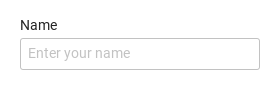
SyInput is the single-line text field: a title (label, with the required mark), the box with the text, and a line under it for a helper (message) or the validation error.

Qt capture · image
Basic composition · Default
Default execution
QML code
import QtQuick
import Syidax.Core

Item {
    implicitWidth: Math.max(360, childrenRect.width)
    implicitHeight: childrenRect.height

    property QtObject settings: QtObject {
        id: storyArgs
        property string label: "Name"
        property string placeholder: "Enter your name"
        property string value: ""
        property string variant: "text"
        property string type: "text"
        property string size: "medium"
        property string status: "default"
        property bool required: false
        property bool disabled: false
        property bool readonly: false
        property bool clearable: false
        property bool borderless: false
        property string message: ""
    }


    SyInput {
        label: storyArgs.label
        placeholder: storyArgs.placeholder
        value: storyArgs.value
        variant: storyArgs.variant
        type: storyArgs.type
        size: storyArgs.size
        status: storyArgs.status
        required: storyArgs.required
        disabled: storyArgs.disabled
        readonly: storyArgs.readonly
        clearable: storyArgs.clearable
        borderless: storyArgs.borderless
        message: storyArgs.message
        onValueChanged: if (storyArgs.value !== value) storyArgs.value = value
    }

}

02 variant

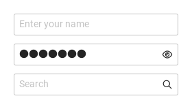
variant picks one of three kinds of field.

Qt capture · image
variant · Default
Default execution
QML code
import QtQuick
import Syidax.Core

Item {
    implicitWidth: Math.max(360, childrenRect.width)
    implicitHeight: childrenRect.height

    Column {
        spacing: 12
        SyInput { placeholder: "Enter your name" }
        SyInput { variant: "password"; value: "hunter2" }
        SyInput { variant: "search" }
    }
}

03 size

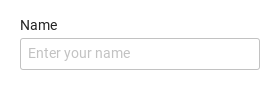
size sets the box height and the text scale: small is 24 px high with 12 px text, medium (the default) 32 px with 14 px text, large 40 px with 16 px text.

Qt capture · image
size · Default
QML code
import QtQuick
import Syidax.Core

Item {
    implicitWidth: Math.max(360, childrenRect.width)
    implicitHeight: childrenRect.height
    property QtObject settings: QtObject {
        id: storyArgs
        property string size: "medium"
    }


    SyInput { label: "Name"; placeholder: "Enter your name"; size: storyArgs.size }
}

04 status

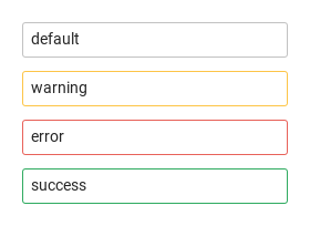
status colors the box independently of validation: default (the normal tones), warning, error and success each recolor the border, the background, the text and the icons.

Qt capture · image
status · Default
Default execution
QML code
import QtQuick
import Syidax.Core

Item {
    implicitWidth: Math.max(360, childrenRect.width)
    implicitHeight: childrenRect.height

    Column {
        spacing: 12
        SyInput { value: "default" }
        SyInput { value: "warning"; status: "warning" }
        SyInput { value: "error"; status: "error" }
        SyInput { value: "success"; status: "success" }
    }
}

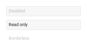
05 disabled · readonly · borderless

Three properties change what the user can do.

Qt capture · image
disabled · readonly · borderless · Default
Default execution
QML code
import QtQuick
import Syidax.Core

Item {
    implicitWidth: Math.max(360, childrenRect.width)
    implicitHeight: childrenRect.height
    // Focused Gallery routes: keep only the selected API and its prerequisites.
    id: featureStory

    Column {
        spacing: 12
        SyInput { id: featureTarget0; visible: true; value: "Disabled"; disabled: true }
        SyInput { id: featureTarget1; visible: true; value: "Read only"; readonly: true }
        SyInput { id: featureTarget2; visible: true; placeholder: "Borderless"; borderless: true }
    }
}

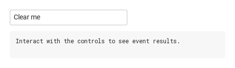
06 clearable

clearable: true shows an × at the end of the box while the field has focus and a non-empty value (never while disabled or read-only).

Qt capture · image
clearable · Default
Default execution
QML code
import QtQuick
import Syidax.Core

Item {
    component EventLog: Rectangle {
        id: logBox
        property var lines: []
        implicitWidth: 440
        implicitHeight: Math.max(56, logText.implicitHeight + 24)
        radius: 4; color: Theme.semantic.backgroundBold
        function log(value) { lines = lines.slice(-3).concat([String(value)]) }
        Text {
            id: logText; x: 12; y: 12; width: parent.width - 24
            text: logBox.lines.length ? logBox.lines.join("\n") : "Interact with the controls to see event results."
            wrapMode: Text.Wrap; color: Theme.semantic.textDefault
            font.family: Theme.monoFontFamily; font.pixelSize: 12
        }
    }

    implicitWidth: Math.max(360, childrenRect.width)
    implicitHeight: childrenRect.height

    Column {
        spacing: 12
        SyInput { clearable: true; value: "Clear me"; onClear: output.log("clear") }
        EventLog { id: output }
    }
}

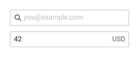
07 prefix · suffix

prefix and suffix take any items

Qt capture · image
prefix · suffix · Default
Default execution
QML code
import QtQuick
import Syidax.Core

Item {
    implicitWidth: Math.max(360, childrenRect.width)
    implicitHeight: childrenRect.height
    // Focused Gallery routes: keep only the selected API and its prerequisites.
    id: featureStory

    Column {
        spacing: 12
        SyInput { id: featureTarget0; visible: true;
            placeholder: "you@example.com"
            prefix: SyIcon { source: Icons.inputSearch }
        }
        SyInput { id: featureTarget1; visible: true;
            value: "42"
            suffix: Text { text: "USD"; color: Theme.semantic.textSubtle; font.family: Theme.fontFamily; font.pixelSize: 14 }
        }
    }
}

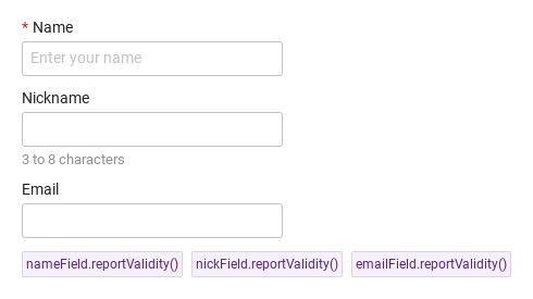
08 required · min · max · type · error

Compare the configuration and result of required · min · max · type · error.

Qt capture · image
required · min · max · type · error · Default
QML code
import QtQuick
import Syidax.Core

Item {
    implicitWidth: Math.max(360, childrenRect.width)
    implicitHeight: childrenRect.height
    // Focused Gallery routes: keep only the selected API and its prerequisites.
    id: featureStory

    Column {
        spacing: 12
        SyInput { visible: true; id: nameField; label: "Name"; required: true; placeholder: "Enter your name" }
        SyInput { visible: true; id: nickField; label: "Nickname"; min: 3; max: 8; message: "3 to 8 characters" }
        SyInput { visible: true; id: emailField; label: "Email"; type: "email"; error: "That does not look like an email address" }
        Row {
            spacing: 8
            SyButton { id: exampleControl1;  visible: true; text: "nameField.reportValidity()"; variant: "secondary"; size: "small"; onClicked: nameField.reportValidity() }
            SyButton { id: exampleControl2;  visible: true; text: "nickField.reportValidity()"; variant: "secondary"; size: "small"; onClicked: nickField.reportValidity() }
            SyButton { id: exampleControl3;  visible: true; text: "emailField.reportValidity()"; variant: "secondary"; size: "small"; onClicked: emailField.reportValidity() }
        }
    }
}

09 changed · focused · blured · clear

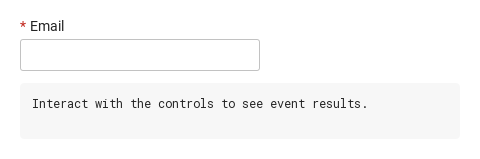
The field has four signals.

Qt capture · image
changed · focused · blured · clear · Default
Default execution
QML code
import QtQuick
import Syidax.Core

Item {
    component EventLog: Rectangle {
        id: logBox
        property var lines: []
        implicitWidth: 440
        implicitHeight: Math.max(56, logText.implicitHeight + 24)
        radius: 4; color: Theme.semantic.backgroundBold
        function log(value) { lines = lines.slice(-3).concat([String(value)]) }
        Text {
            id: logText; x: 12; y: 12; width: parent.width - 24
            text: logBox.lines.length ? logBox.lines.join("\n") : "Interact with the controls to see event results."
            wrapMode: Text.Wrap; color: Theme.semantic.textDefault
            font.family: Theme.monoFontFamily; font.pixelSize: 12
        }
    }

    implicitWidth: Math.max(360, childrenRect.width)
    implicitHeight: childrenRect.height
    // Focused Gallery routes: keep only the selected API and its prerequisites.
    id: featureStory


    Column {
        spacing: 12
        SyInput {
            label: "Email"; type: "email"; required: true; clearable: true
            onChanged: (detail) => { if (true) { output.log(("changed: %1 (valid: %2)").arg(detail.value).arg(detail.isValid)) } }
            onFocused: (detail) => { if (true) { output.log("focused") } }
            onBlured: (detail) => { if (true) { output.log(("blured: status %1").arg(detail.status)) } }
            onClear: { if (true) { output.log("clear") } }
        }
        EventLog { id: output }
    }
}

10 setFocus · checkValidity · reportValidity · …

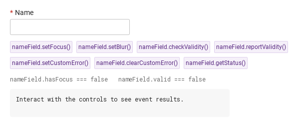
The field's functions, all shown by the buttons in the demo:

Qt capture · image
setFocus · checkValidity · reportValidity · … · Default
QML code
import QtQuick
import Syidax.Core

Item {
    component EventLog: Rectangle {
        id: logBox
        property var lines: []
        implicitWidth: 440
        implicitHeight: Math.max(56, logText.implicitHeight + 24)
        radius: 4; color: Theme.semantic.backgroundBold
        function log(value) { lines = lines.slice(-3).concat([String(value)]) }
        Text {
            id: logText; x: 12; y: 12; width: parent.width - 24
            text: logBox.lines.length ? logBox.lines.join("\n") : "Interact with the controls to see event results."
            wrapMode: Text.Wrap; color: Theme.semantic.textDefault
            font.family: Theme.monoFontFamily; font.pixelSize: 12
        }
    }

    implicitWidth: Math.max(360, childrenRect.width)
    implicitHeight: childrenRect.height
    // Focused Gallery routes: keep only the selected API and its prerequisites.
    id: featureStory

    Column {
        spacing: 12
        SyInput { id: nameField; label: "Name"; required: true }
        Flow {
            width: 560
            spacing: 8
            SyButton { id: exampleControl1;  visible: true; text: "nameField.setFocus()"; variant: "secondary"; size: "small"; onClicked: nameField.setFocus() }
            SyButton { id: exampleControl2;  visible: true; text: "nameField.setBlur()"; variant: "secondary"; size: "small"; onClicked: nameField.setBlur() }
            SyButton { id: exampleControl3;  visible: true; text: "nameField.checkValidity()"; variant: "secondary"; size: "small"; onClicked: output.log("checkValidity() → " + nameField.checkValidity()) }
            SyButton { visible: true; text: "nameField.reportValidity()"; variant: "secondary"; size: "small"; onClicked: output.log("reportValidity() → " + nameField.reportValidity()) }
            SyButton { visible: true; text: "nameField.setCustomError()"; variant: "secondary"; size: "small"; onClicked: nameField.setCustomError() }
            SyButton { visible: true; text: "nameField.clearCustomError()"; variant: "secondary"; size: "small"; onClicked: nameField.clearCustomError() }
            SyButton { visible: true; text: "nameField.getStatus()"; variant: "secondary"; size: "small"; onClicked: output.log("getStatus() → " + JSON.stringify(nameField.getStatus())) }
        }
        Text {
            text: "nameField.hasFocus === " + nameField.hasFocus + "   nameField.valid === " + nameField.valid
            font.family: Theme.monoFontFamily
            font.pixelSize: 12
            color: Theme.semantic.textSubtle
        }
        EventLog { id: output }
    }
}

11 Search and clear

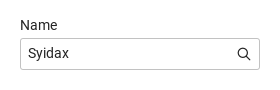
Search and clear, configured with variant, clearable, value.

Qt capture · image
Search and clear · Result
Default execution
QML code
import QtQuick
import Syidax.Core

Item {
    implicitWidth: Math.max(360, childrenRect.width)
    implicitHeight: childrenRect.height

    property QtObject settings: QtObject {
        id: storyArgs
        property string label: "Name"
        property string placeholder: "Enter your name"
        property string value: "Syidax"
        property string variant: "search"
        property string type: "text"
        property string size: "medium"
        property string status: "default"
        property bool required: false
        property bool disabled: false
        property bool readonly: false
        property bool clearable: true
        property bool borderless: false
        property string message: ""
    }


    SyInput {
        label: storyArgs.label
        placeholder: storyArgs.placeholder
        value: storyArgs.value
        variant: storyArgs.variant
        type: storyArgs.type
        size: storyArgs.size
        status: storyArgs.status
        required: storyArgs.required
        disabled: storyArgs.disabled
        readonly: storyArgs.readonly
        clearable: storyArgs.clearable
        borderless: storyArgs.borderless
        message: storyArgs.message
        onValueChanged: if (storyArgs.value !== value) storyArgs.value = value
    }

}

12 Password entry

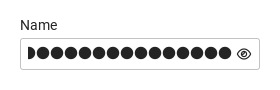
Password entry, configured with variant, value.

Qt capture · image
Password entry · Result
Default execution
QML code
import QtQuick
import Syidax.Core

Item {
    implicitWidth: Math.max(360, childrenRect.width)
    implicitHeight: childrenRect.height

    property QtObject settings: QtObject {
        id: storyArgs
        property string label: "Name"
        property string placeholder: "Enter your name"
        property string value: "example-password"
        property string variant: "password"
        property string type: "text"
        property string size: "medium"
        property string status: "default"
        property bool required: false
        property bool disabled: false
        property bool readonly: false
        property bool clearable: false
        property bool borderless: false
        property string message: ""
    }


    SyInput {
        label: storyArgs.label
        placeholder: storyArgs.placeholder
        value: storyArgs.value
        variant: storyArgs.variant
        type: storyArgs.type
        size: storyArgs.size
        status: storyArgs.status
        required: storyArgs.required
        disabled: storyArgs.disabled
        readonly: storyArgs.readonly
        clearable: storyArgs.clearable
        borderless: storyArgs.borderless
        message: storyArgs.message
        onValueChanged: if (storyArgs.value !== value) storyArgs.value = value
    }

}

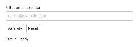
13 Required field and reset

Compare the untouched field, validation error and reset result.

Qt capture · image
Required field and reset · Untouched
QML code
import QtQuick
import Syidax.Core

Column {
    width: 440; spacing: 12
    SyInput {
        id: field; width: parent.width; name: "selection"; required: true
        label: "Required selection"; placeholder: "name@example.com"; type: "email"
        
        error: "Complete this field before continuing."
    }
    Row {
        spacing: 8
        SyButton { id: check; text: "Validate"; onClicked: field.reportValidity() }
        SyButton { id: reset; text: "Reset"; onClicked: field.reset() }
    }
    Text { text: "Status: " + (field.invalid ? "Invalid" : "Ready"); color: Theme.semantic.textDefault }
}

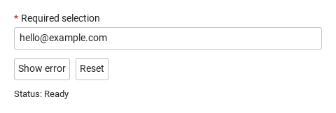
14 Custom error

Show an application-specific error, then reset the field.

Qt capture · image
Custom error · Untouched
QML code
import QtQuick
import Syidax.Core

Column {
    width: 440; spacing: 12
    SyInput {
        id: field; width: parent.width; name: "selection"; required: true
        label: "Required selection"; placeholder: "name@example.com"; type: "email"
        value: "hello@example.com"
        error: "This selection is currently unavailable. Choose another."
    }
    Row {
        spacing: 8
        SyButton { id: check; text: "Show error"; onClicked: field.setCustomError() }
        SyButton { id: reset; text: "Reset"; onClicked: field.reset() }
    }
    Text { text: "Status: " + (field.invalid ? "Invalid" : "Ready"); color: Theme.semantic.textDefault }
}

API 93

Hover or select an item for its QML example and copy button.

Properties

ItemBehavior / conditions
The shared field properties (name, label, required, disabled, size, message, error, touched, submitted, customError, validStatus, valid, invalid, preferredWidth, showTitle, ready) are described on the Form page; the ones below are the input's own or have input-specific meaning.

Properties

PropertyTypeDefaultDescription
string""The text. Changes with every keystroke and with assignments; non-strings are converted.
string""Shown while the value is empty. A search variant with an empty placeholder shows "Search".
string""Title above the box, with * when required.
string""Helper line under the box; hidden while the error shows.
string""Your own error copy, used instead of the built-in message while invalid.
string""Key in the owning SyForm's values().
string"text"text · password (hidden characters, eye toggle) · search (glyph, "Search" placeholder).
string"text"text · email · url · tel · number · password · search. Anything but text overrides variant for hiding, keyboard hint and format check.
string"medium"small 24 · medium 32 · large 40 px high; text 12 · 14 · 16 px.
string"default"default · warning · error · success — a tone independent of validation; hidden behind the invalid tone.
boolfalseEmpty value → valueMissing; adds the * mark.
boolfalseInert, always valid, not submitted.
boolfalseSelectable but not editable; always valid; still submitted.
boolfalseShows the × while focused with a value; it empties the value and emits clear().
boolfalseNo border until the box is focused or invalid.
int-1Minimum length of a non-empty value (tooShort); -1 = none.
int-1Maximum length: typing stops there; a longer value from code is tooLong; -1 = none.
boolfalseFocus the box as soon as the field is created.
list of Item—Items before the text, inside the box.
list of Item—Items after the text, after the built-in icons.
boolfalseWhether a password field shows its characters; the eye icon flips it.
bool (read-only)—The text box has active focus.
bool (read-only)—The pointer is over the box (false while disabled).
string (read-only)—value as a string.
read-only—The kind actually in effect (type unless "text", else variant), and whether it is password.
read-only—Whether the × / the border is visible, and the current tone (enabled · hover · focus · warning · error · success · invalid · readonly · disabled).

Methods

MethodDescription
Focus the text box (focused fires, the ring appears).
Remove the focus (blured fires, touched is set).
true when the status is ""; shows nothing.
Same verdict, and marks the field reported so the error line shows from now on.
Status "custom" and touched — the error (error or "Invalid by custom") shows at once. No arguments.
Lifts the custom status; the ordinary checks apply again.
"" · valueMissing · tooShort · tooLong · typeMismatch · custom.
Back to the value the field was created with; touched, reported and custom flags cleared.

Signals

SignalArgumentsWhen
detail: { value: string, isValid: bool, status: string }value changed after load — every keystroke, the ×, assignments from code. Not for the initial value.
sameThe box gained active focus.
sameThe box lost focus; touched is set first, so the error line may appear with it.
—After the × was clicked; value is already "" and its changed has fired. Not emitted when code empties the value.

Behavior

ItemBehavior / conditions
The text. Changes with every keystroke and with assignments; non-strings are converted.
value changed after load — every keystroke, the ×, assignments from code. Not for the initial value.
The initial value emits nothing (ready is false until the field has loaded).
Shown while the value is empty. A search variant with an empty placeholder shows "Search".
text · password (hidden characters, eye toggle) · search (glyph, "Search" placeholder).
value as a string.
text · email · url · tel · number · password · search. Anything but text overrides variant for hiding, keyboard hint and format check.
Status "custom" and touched — the error (error or "Invalid by custom") shows at once. No arguments.
Empty value → valueMissing; adds the * mark.
Minimum length of a non-empty value (tooShort); -1 = none.
Maximum length: typing stops there; a longer value from code is tooLong; -1 = none.
valid follows the status; invalid is true only once the error may be shown — after a blur (touched) or reportValidity() (submitted).
valid follows the status; invalid is true only once the error may be shown — after a blur (touched) or reportValidity() (submitted). The error line shows the built-in copy or error, and the box takes the invalid tone; message is hidden meanwhile. disabled > readonly > invalid > status (warning · error · success) > focus > hover > enabled: the first that applies colors the border, background, text and icons.
valid follows the status; invalid is true only once the error may be shown — after a blur (touched) or reportValidity() (submitted). Leaving the box fires blured and sets touched.
Same verdict, and marks the field reported so the error line shows from now on.
valid follows the status; invalid is true only once the error may be shown — after a blur (touched) or reportValidity() (submitted).
Your own error copy, used instead of the built-in message while invalid.
Helper line under the box; hidden while the error shows.
Inert, always valid, not submitted.
Selectable but not editable; always valid; still submitted.
default · warning · error · success — a tone independent of validation; hidden behind the invalid tone.
disabled > readonly > invalid > status (warning · error · success) > focus > hover > enabled: the first that applies colors the border, background, text and icons.
No border until the box is focused or invalid.
The box gained active focus.
The box lost focus; touched is set first, so the error line may appear with it.
Shows the × while focused with a value; it empties the value and emits clear().
After the × was clicked; value is already "" and its changed has fired. Not emitted when code empties the value.
Whether a password field shows its characters; the eye icon flips it.
disabled blocks focus and typing and skips the field in SyForm.values().
The field is 240 px wide unless width is set; the box, the title and the message line follow the width.
small 24 · medium 32 · large 40 px high; text 12 · 14 · 16 px.
Items before the text, inside the box.
Items after the text, after the built-in icons.
Colors come from Theme.input and follow Theme.scheme; the icon color transitions are skipped under Theme.reducedMotion.

Keyboard

ItemBehavior / conditions
Keyboard: Tab and Shift+Tab enter and leave the field. Hidden and disabled fields are skipped. Escape closes an open picker before continuing. Textarea uses Tab for focus navigation, including inside a modal; it does not insert indentation.