QML
← All components

Menu

Present a list of actions, with groups and nested submenus for related commands.

import Syidax.Core.Menu

Supported QML types

TypeDefinition / role
Container for command items, nested menus and labelled groups.
One menu command, optionally selectable or checkable.
Menu row that opens a nested menu beside it.
Labelled section grouping related menu items.

Learn by example

Previews are images of native Qt runs. Use the buttons below each image to view a result.

01 Basic composition

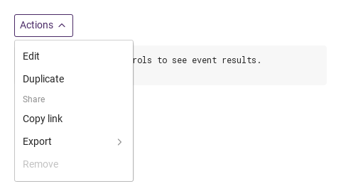
SyMenu is a list of actions: SyMenuItem rows, SyMenuGroup titled sections and SyMenuSub rows that open a nested list beside them.

Qt capture · image
Basic composition · Opened
QML code
import QtQuick
import Syidax.Core

Item {
    component EventLog: Rectangle {
        id: logBox
        property var lines: []
        implicitWidth: 440
        implicitHeight: Math.max(56, logText.implicitHeight + 24)
        radius: 4; color: Theme.semantic.backgroundBold
        function log(value) { lines = lines.slice(-3).concat([String(value)]) }
        Text {
            id: logText; x: 12; y: 12; width: parent.width - 24
            text: logBox.lines.length ? logBox.lines.join("\n") : "Interact with the controls to see event results."
            wrapMode: Text.Wrap; color: Theme.semantic.textDefault
            font.family: Theme.monoFontFamily; font.pixelSize: 12
        }
    }

    implicitWidth: Math.max(360, childrenRect.width)
    implicitHeight: childrenRect.height

    property QtObject settings: QtObject {
        id: storyArgs
        property bool checkable: false
        property string direction: "right"
        property bool disabled: false
    }

    readonly property string members: [
        "SyMenuItem { text: " + JSON.stringify("Edit") + "; value: \"edit\" }",
        "SyMenuItem { text: " + JSON.stringify("Duplicate") + "; value: \"duplicate\" }",
        "SyMenuGroup {",
        "    title: " + JSON.stringify("Share"),
        "    SyMenuItem { text: " + JSON.stringify("Copy link") + "; value: \"link\" }",
        "    SyMenuSub {",
        "        title: " + JSON.stringify("Export"),
        "        SyMenuItem { text: \"PDF\"; value: \"pdf\" }",
        "        SyMenuItem { text: \"CSV\"; value: \"csv\" }",
        "    }",
        "}",
        "SyMenuItem { text: " + JSON.stringify("Remove") + "; value: \"remove\"; disabled: true }"
    ].join("\n")

    Column {
        spacing: 12
        SyDropdown { id: exampleControl1; 
            title: "Actions"
            SyMenu {
                checkable: storyArgs.checkable
                direction: storyArgs.direction
                disabled: storyArgs.disabled
                onItemSelected: (detail) => output.log(detail.value)
                SyMenuItem { text: "Edit"; value: "edit" }
                SyMenuItem { text: "Duplicate"; value: "duplicate" }
                SyMenuGroup {
                    title: "Share"
                    SyMenuItem { text: "Copy link"; value: "link" }
                    SyMenuSub { id: exampleControl2; 
                        title: "Export"
                        SyMenuItem { text: "PDF"; value: "pdf" }
                        SyMenuItem { text: "CSV"; value: "csv" }
                    }
                }
                SyMenuItem { text: "Remove"; value: "remove"; disabled: true }
            }
        }
        EventLog { id: output }
    }

}

02 trigger · position

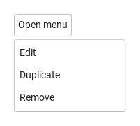
Declared inside a control that reports hovered — here a SyButton — the menu takes no space of its own and opens as a popup anchored to that control.

Qt capture · image
trigger · position · Opened
QML code
import QtQuick
import Syidax.Core

Item {
    implicitWidth: Math.max(360, childrenRect.width)
    implicitHeight: childrenRect.height
    // Focused Gallery routes: keep only the selected API and its prerequisites.

    id: story
    property QtObject settings: QtObject {
        id: storyArgs
        property string trigger: "hover"
        property string position: "bottomLeft"
    }

    readonly property string label: (storyArgs.trigger === "contextmenu" ? "Right-click me" : "Open menu")

    Item {
        width: 360
        height: 160
        SyButton {
            anchors.centerIn: parent
            text: story.label
            SyMenu { id: featureTarget0;
                trigger: storyArgs.trigger
                position: storyArgs.position
                SyMenuItem { text: "Edit"; value: "edit" }
                SyMenuItem { text: "Duplicate"; value: "duplicate" }
                SyMenuItem { text: "Remove"; value: "remove" }
            }
        }
    }
}

03 selectable · checkable · disabled · loading

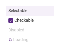
Each SyMenuItem has text (its label), value (what a pick reports) and four state switches.

Qt capture · image
selectable · checkable · disabled · loading · Opened
QML code
import QtQuick
import Syidax.Core

Item {
    implicitWidth: Math.max(360, childrenRect.width)
    implicitHeight: childrenRect.height
    // Focused Gallery routes: keep only the selected API and its prerequisites.
    id: featureStory

    SyMenu { id: exampleControl1; 
        SyMenuItem { id: featureTarget0; text: "Selectable"; value: "a"; selectable: true; select: true }
        SyMenuItem { id: featureTarget1; text: "Checkable"; value: "b"; checkable: true; checked: true }
        SyMenuItem { id: featureTarget2; text: "Disabled"; value: "c"; disabled: true }
        SyMenuItem { id: featureTarget3; text: "Loading"; value: "d"; loading: true }
    }
}

04 opened · itemSelected · itemChecked

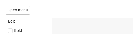
SyMenu has three signals.

Qt capture · image
opened · itemSelected · itemChecked · Opened
QML code
import QtQuick
import Syidax.Core

Item {
    component EventLog: Rectangle {
        id: logBox
        property var lines: []
        implicitWidth: 440
        implicitHeight: Math.max(56, logText.implicitHeight + 24)
        radius: 4; color: Theme.semantic.backgroundBold
        function log(value) { lines = lines.slice(-3).concat([String(value)]) }
        Text {
            id: logText; x: 12; y: 12; width: parent.width - 24
            text: logBox.lines.length ? logBox.lines.join("\n") : "Interact with the controls to see event results."
            wrapMode: Text.Wrap; color: Theme.semantic.textDefault
            font.family: Theme.monoFontFamily; font.pixelSize: 12
        }
    }

    implicitWidth: Math.max(360, childrenRect.width)
    implicitHeight: childrenRect.height
    // Focused Gallery routes: keep only the selected API and its prerequisites.
    id: featureStory


    Column {
        spacing: 12
        SyButton {
            text: "Open menu"
            SyMenu { id: exampleControl1; 
                trigger: "click"
                onOpened: (state) => { if (true) { output.log(("opened: %1").arg(state)) } }
                onItemSelected: (detail) => { if (true) { output.log(("itemSelected: %1").arg(detail.value)) } }
                onItemChecked: (detail) => { if (true) { output.log(("itemChecked: %1 %2").arg(detail.value).arg(detail.checked)) } }
                SyMenuItem { text: "Edit"; value: "edit" }
                SyMenuItem { text: "Bold"; value: "bold"; checkable: true }
            }
        }
        EventLog { id: output }
    }
}

05 setOpen · setClose · toggle · setSelectableAllItems · clearSelectedItem

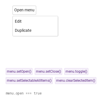
setOpen() opens the popup and emits opened(true); it is ignored while the menu is disabled (and the host control must be enabled).

Qt capture · image
setOpen · setClose · toggle · setSelectableAllItems · clearSelectedItem · Opened
QML code
import QtQuick
import Syidax.Core

Item {
    implicitWidth: Math.max(360, childrenRect.width)
    implicitHeight: childrenRect.height
    // Focused Gallery routes: keep only the selected API and its prerequisites.
    id: featureStory

    Column {
        spacing: 24
        Item {
            width: 560; height: 220
            SyButton {
                x: 24; y: 24
 text: "Open menu"; SyMenu { id: menu; trigger: "click"; SyMenuItem { text: "Edit"; value: "edit" } SyMenuItem { text: "Duplicate"; value: "duplicate" } } }
        }
        Flow {
            objectName: "exampleCommands"

            width: 460
            spacing: 8
            SyButton { id: exampleControl1;  visible: true; text: "menu.setOpen()"; variant: "secondary"; size: "small"; onClicked: menu.setOpen() }
            SyButton { id: exampleControl2;  visible: true; text: "menu.setClose()"; variant: "secondary"; size: "small"; onClicked: menu.setClose() }
            SyButton { id: exampleControl3;  visible: true; text: "menu.toggle()"; variant: "secondary"; size: "small"; onClicked: menu.toggle() }
            SyButton { id: exampleControl4;  visible: true; text: "menu.setSelectableAllItems()"; variant: "secondary"; size: "small"; onClicked: menu.setSelectableAllItems() }
            SyButton { id: exampleControl5;  visible: true; text: "menu.clearSelectedItem()"; variant: "secondary"; size: "small"; onClicked: menu.clearSelectedItem() }
        }
        Text {
            text: "menu.open === " + menu.open
            font.family: Theme.monoFontFamily
            font.pixelSize: 12
            color: Theme.semantic.textSubtle
        }
    }
}

06 Checkable menu items

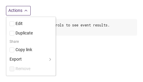
Checkable menu items, configured with checkable.

Qt capture · image
Checkable menu items · Opened
QML code
import QtQuick
import Syidax.Core

Item {
    component EventLog: Rectangle {
        id: logBox
        property var lines: []
        implicitWidth: 440
        implicitHeight: Math.max(56, logText.implicitHeight + 24)
        radius: 4; color: Theme.semantic.backgroundBold
        function log(value) { lines = lines.slice(-3).concat([String(value)]) }
        Text {
            id: logText; x: 12; y: 12; width: parent.width - 24
            text: logBox.lines.length ? logBox.lines.join("\n") : "Interact with the controls to see event results."
            wrapMode: Text.Wrap; color: Theme.semantic.textDefault
            font.family: Theme.monoFontFamily; font.pixelSize: 12
        }
    }

    implicitWidth: Math.max(360, childrenRect.width)
    implicitHeight: childrenRect.height

    property QtObject settings: QtObject {
        id: storyArgs
        property bool checkable: true
        property string direction: "right"
        property bool disabled: false
    }

    readonly property string members: [
        "SyMenuItem { text: " + JSON.stringify("Edit") + "; value: \"edit\" }",
        "SyMenuItem { text: " + JSON.stringify("Duplicate") + "; value: \"duplicate\" }",
        "SyMenuGroup {",
        "    title: " + JSON.stringify("Share"),
        "    SyMenuItem { text: " + JSON.stringify("Copy link") + "; value: \"link\" }",
        "    SyMenuSub {",
        "        title: " + JSON.stringify("Export"),
        "        SyMenuItem { text: \"PDF\"; value: \"pdf\" }",
        "        SyMenuItem { text: \"CSV\"; value: \"csv\" }",
        "    }",
        "}",
        "SyMenuItem { text: " + JSON.stringify("Remove") + "; value: \"remove\"; disabled: true }"
    ].join("\n")

    Column {
        spacing: 12
        SyDropdown { id: exampleControl1; 
            title: "Actions"
            SyMenu {
                checkable: storyArgs.checkable
                direction: storyArgs.direction
                disabled: storyArgs.disabled
                onItemSelected: (detail) => output.log(detail.value)
                SyMenuItem { text: "Edit"; value: "edit" }
                SyMenuItem { text: "Duplicate"; value: "duplicate" }
                SyMenuGroup {
                    title: "Share"
                    SyMenuItem { text: "Copy link"; value: "link" }
                    SyMenuSub { id: exampleControl2; 
                        title: "Export"
                        SyMenuItem { text: "PDF"; value: "pdf" }
                        SyMenuItem { text: "CSV"; value: "csv" }
                    }
                }
                SyMenuItem { text: "Remove"; value: "remove"; disabled: true }
            }
        }
        EventLog { id: output }
    }

}

07 Submenus open left

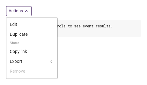
Submenus open left, configured with direction.

Qt capture · image
Submenus open left · Opened
QML code
import QtQuick
import Syidax.Core

Item {
    component EventLog: Rectangle {
        id: logBox
        property var lines: []
        implicitWidth: 440
        implicitHeight: Math.max(56, logText.implicitHeight + 24)
        radius: 4; color: Theme.semantic.backgroundBold
        function log(value) { lines = lines.slice(-3).concat([String(value)]) }
        Text {
            id: logText; x: 12; y: 12; width: parent.width - 24
            text: logBox.lines.length ? logBox.lines.join("\n") : "Interact with the controls to see event results."
            wrapMode: Text.Wrap; color: Theme.semantic.textDefault
            font.family: Theme.monoFontFamily; font.pixelSize: 12
        }
    }

    implicitWidth: Math.max(360, childrenRect.width)
    implicitHeight: childrenRect.height

    property QtObject settings: QtObject {
        id: storyArgs
        property bool checkable: false
        property string direction: "left"
        property bool disabled: false
    }

    readonly property string members: [
        "SyMenuItem { text: " + JSON.stringify("Edit") + "; value: \"edit\" }",
        "SyMenuItem { text: " + JSON.stringify("Duplicate") + "; value: \"duplicate\" }",
        "SyMenuGroup {",
        "    title: " + JSON.stringify("Share"),
        "    SyMenuItem { text: " + JSON.stringify("Copy link") + "; value: \"link\" }",
        "    SyMenuSub {",
        "        title: " + JSON.stringify("Export"),
        "        SyMenuItem { text: \"PDF\"; value: \"pdf\" }",
        "        SyMenuItem { text: \"CSV\"; value: \"csv\" }",
        "    }",
        "}",
        "SyMenuItem { text: " + JSON.stringify("Remove") + "; value: \"remove\"; disabled: true }"
    ].join("\n")

    Column {
        spacing: 12
        SyDropdown { id: exampleControl1; 
            title: "Actions"
            SyMenu {
                checkable: storyArgs.checkable
                direction: storyArgs.direction
                disabled: storyArgs.disabled
                onItemSelected: (detail) => output.log(detail.value)
                SyMenuItem { text: "Edit"; value: "edit" }
                SyMenuItem { text: "Duplicate"; value: "duplicate" }
                SyMenuGroup {
                    title: "Share"
                    SyMenuItem { text: "Copy link"; value: "link" }
                    SyMenuSub { id: exampleControl2; 
                        title: "Export"
                        SyMenuItem { text: "PDF"; value: "pdf" }
                        SyMenuItem { text: "CSV"; value: "csv" }
                    }
                }
                SyMenuItem { text: "Remove"; value: "remove"; disabled: true }
            }
        }
        EventLog { id: output }
    }

}

08 Disabled menu

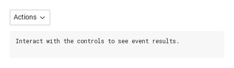
Disabled menu, configured with disabled.

Qt capture · image
Disabled menu · Result
Default execution
QML code
import QtQuick
import Syidax.Core

Item {
    component EventLog: Rectangle {
        id: logBox
        property var lines: []
        implicitWidth: 440
        implicitHeight: Math.max(56, logText.implicitHeight + 24)
        radius: 4; color: Theme.semantic.backgroundBold
        function log(value) { lines = lines.slice(-3).concat([String(value)]) }
        Text {
            id: logText; x: 12; y: 12; width: parent.width - 24
            text: logBox.lines.length ? logBox.lines.join("\n") : "Interact with the controls to see event results."
            wrapMode: Text.Wrap; color: Theme.semantic.textDefault
            font.family: Theme.monoFontFamily; font.pixelSize: 12
        }
    }

    implicitWidth: Math.max(360, childrenRect.width)
    implicitHeight: childrenRect.height

    property QtObject settings: QtObject {
        id: storyArgs
        property bool checkable: false
        property string direction: "right"
        property bool disabled: true
    }

    readonly property string members: [
        "SyMenuItem { text: " + JSON.stringify("Edit") + "; value: \"edit\" }",
        "SyMenuItem { text: " + JSON.stringify("Duplicate") + "; value: \"duplicate\" }",
        "SyMenuGroup {",
        "    title: " + JSON.stringify("Share"),
        "    SyMenuItem { text: " + JSON.stringify("Copy link") + "; value: \"link\" }",
        "    SyMenuSub {",
        "        title: " + JSON.stringify("Export"),
        "        SyMenuItem { text: \"PDF\"; value: \"pdf\" }",
        "        SyMenuItem { text: \"CSV\"; value: \"csv\" }",
        "    }",
        "}",
        "SyMenuItem { text: " + JSON.stringify("Remove") + "; value: \"remove\"; disabled: true }"
    ].join("\n")

    Column {
        spacing: 12
        SyDropdown {
            title: "Actions"
            SyMenu {
                checkable: storyArgs.checkable
                direction: storyArgs.direction
                disabled: storyArgs.disabled
                onItemSelected: (detail) => output.log(detail.value)
                SyMenuItem { text: "Edit"; value: "edit" }
                SyMenuItem { text: "Duplicate"; value: "duplicate" }
                SyMenuGroup {
                    title: "Share"
                    SyMenuItem { text: "Copy link"; value: "link" }
                    SyMenuSub {
                        title: "Export"
                        SyMenuItem { text: "PDF"; value: "pdf" }
                        SyMenuItem { text: "CSV"; value: "csv" }
                    }
                }
                SyMenuItem { text: "Remove"; value: "remove"; disabled: true }
            }
        }
        EventLog { id: output }
    }

}

API 85

Hover or select an item for its QML example and copy button.

Properties · SyMenu

PropertyTypeDefaultDescription
list (default property)—The rows declared inside: SyMenuItem, SyMenuSub and SyMenuGroup, in order
boolfalseThe popup state. Set it to open or close from a binding (no opened signal), read it to know; the popup keeps it in sync. No visible effect inline
boolfalseEvery row gets a check box and reports itemChecked instead of itemSelected
string"bottomLeft"Popup placement: bottomLeft · bottomRight · topLeft · topRight; flips when there is no room. Ignored inline
string"hover"What opens the popup: hover · click · contextmenu (a right click). Ignored inline
string"right"The side submenus open on: right · left
boolfalseEvery row and submenu inert; setOpen() and the right-click trigger refused
string"inline"inline or popup — decided from where the menu is declared; do not set it
boolfalsetrue once mode is decided (one event-loop turn after creation)
real160The width every row takes: the widest row, at least 160
var[]The collected rows — read items() instead

Properties · SyMenuItem

PropertyTypeDefaultDescription
list (default property)—Items placed after the text (an icon, a shortcut hint)
string""The label; reported as label in the signal detail. Hidden when empty
string""What a pick reports
boolfalseInert and greyed
boolfalseA small spinner before the text; inert
boolfalseA pick stays highlighted (select); one highlighted row per menu
boolfalseThe highlight: set by a pick, cleared by the next pick elsewhere or clearSelectedItem(). Drawn only with selectable
boolfalseA check box before the text; a pick toggles checked and reports itemChecked
boolfalseThe check box state
string (read-only)—Same as text
bool (read-only)—disabled, loading, or the menu is disabled
bool (read-only)—selectable && select — the highlight is drawn
bool (read-only)—checkable on the row or on the menu
bool (read-only)—The pointer is over the row
bool (read-only)—the row has keyboard focus
varnullThe owning SyMenu (set by the menu)

Properties · SyMenuSub

PropertyTypeDefaultDescription
list (default property)—The rows of the submenu (items, groups, further submenus)
string""The row text
boolfalseThe submenu state; set it to open or close, read it to know
string"hover"hover (closes 150 ms after the pointer leaves) · click
boolfalseThe row inert; the submenu cannot open
bool (read-only)—Whether the submenu is showing
bool (read-only)—disabled on the row or on the menu
bool (read-only)—Pointer over the row
bool (read-only)—keyboard focus
varnullThe owning SyMenu (set by the menu)

Properties · SyMenuGroup

PropertyTypeDefaultDescription
list (default property)—The rows under the title
string""The section title (12 px); the title row is omitted when empty
varnullThe owning SyMenu (set by the menu)

Methods

MethodDescription
Opens the popup and emits opened(true). Ignored while disabled; the host control must be enabled. Inline: only sets open and emits
Closes the popup and emits opened(false). Works while disabled
setClose() when open, else setOpen()
Sets selectable: true on every SyMenuItem, nested ones included
Sets select: false on every SyMenuItem — the highlight goes; checked is untouched
Returns the SyMenuItem and SyMenuSub rows in declaration order, flattened through groups and submenus
What a click does: pick, or toggle the check box. Ignored while inactive
Open (refused while disabled)
close
toggle the submenu

Signals

SignalArgumentsWhen
state: boolThe popup opened (true) or closed (false): by the trigger, a pick, Escape, a press outside, or setOpen() / setClose() / toggle() / close(). Not when open is changed from a binding. Inline: only from the methods
detail: { value, label }A plain or selectable row was picked (click, Space, Enter). Not for a checkable row, an inert row, or a disabled menu
detail: { value, label, checked }A checkable row was toggled; the popup stays open
same as aboveThe row's own signals, emitted just before the menu's

Behavior

ItemBehavior / conditions
One event-loop turn after creation the menu looks up its ancestors: if a SyDropdown, a SyMenuSub or another SyMenu holds it (however deep), it is inline; otherwise, if an ancestor within four levels reports a boolean hovered (every Core control does), that ancestor becomes the popup's anchor and the mode is popup.
true once mode is decided (one event-loop turn after creation)
The popup state. Set it to open or close from a binding (no opened signal), read it to know; the popup keeps it in sync. No visible effect inline
What opens the popup: hover · click · contextmenu (a right click). Ignored inline
Popup placement: bottomLeft · bottomRight · topLeft · topRight; flips when there is no room. Ignored inline
What a click does: pick, or toggle the check box. Ignored while inactive
A click, Space or Enter on a plain row emits the row's itemSelected(detail) and then the menu's, with detail = { value, label } (label is the row's text). A checkable row behaves differently: the click toggles checked, copies it into select, emits itemChecked({ value, label, checked }) on the row and the menu, emits no itemSelected, and leaves the popup open.
A click, Space or Enter on a plain row emits the row's itemSelected(detail) and then the menu's, with detail = { value, label } (label is the row's text). In popup mode the popup then closes (opened(false)); inline inside a dropdown, the dropdown's select(detail) runs, so the dropdown emits selected and closes.
What a pick reports
Same as text
The label; reported as label in the signal detail. Hidden when empty
The popup opened (true) or closed (false): by the trigger, a pick, Escape, a press outside, or setOpen() / setClose() / toggle() / close(). Not when open is changed from a binding. Inline: only from the methods
The highlight: set by a pick, cleared by the next pick elsewhere or clearSelectedItem(). Drawn only with selectable
A pick stays highlighted (select); one highlighted row per menu
The check box state
A checkable row behaves differently: the click toggles checked, copies it into select, emits itemChecked({ value, label, checked }) on the row and the menu, emits no itemSelected, and leaves the popup open.
Every row gets a check box and reports itemChecked instead of itemSelected
Every row and submenu inert; setOpen() and the right-click trigger refused
A small spinner before the text; inert
Inert and greyed
Opens the popup and emits opened(true). Ignored while disabled; the host control must be enabled. Inline: only sets open and emits
The row text
The side submenus open on: right · left
Whether the submenu is showing
Returns the SyMenuItem and SyMenuSub rows in declaration order, flattened through groups and submenus
The width every row takes: the widest row, at least 160
Tab reaches the rows. On a focused row Up / Down move to the previous / next enabled row (wrapping), Space / Enter pick, Escape closes the menu. On a focused submenu row Right opens it, Left or Escape closes it, Space / Enter toggle it.
setClose() works while disabled, setOpen() does not.

Keyboard

ItemBehavior / conditions
SyDropdown hosts an inline menu under a titled box; SyButton is the usual popup host; SyNav is the sidebar counterpart for navigation.