QML
← All components

Panel

Divide a workspace into resizable panels, with nested layouts and collapsible regions.

import Syidax.Core.Panel

Supported QML types

TypeDefinition / role
Titled content region with pin, collapse, close and optional header actions.
Arranges panels, shares available space and provides resize splitters.

Learn by example

Previews are images of native Qt runs. Use the buttons below each image to view a result.

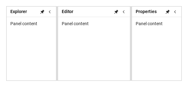
01 Basic composition

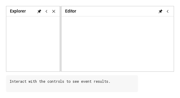
Resizable regions with independent pin, collapse, close and grip controls.

Qt capture · image
Basic composition · Default
Default execution
QML code
import QtQuick
import Syidax.Core

Item {
    implicitWidth: Math.max(360, childrenRect.width)
    implicitHeight: childrenRect.height
    id: story

    property QtObject settings: QtObject {
        id: storyArgs
        property string orientation: "horizontal"
        property int gripSize: 4
        property bool resizable: true
        property bool disabled: false
        property bool resizeHandleVisible: true
    }


    SyPanelGroup {
        width: 560
        height: 240
        orientation: storyArgs.orientation
        gripSize: storyArgs.gripSize
        resizable: storyArgs.resizable
        disabled: storyArgs.disabled
        resizeHandleVisible: storyArgs.resizeHandleVisible
        SyPanel { title: "Explorer"; preferredSize: 160; Text { x: 12; y: 12; text: "Panel content"; font.family: Theme.fontFamily; font.pixelSize: 14; color: Theme.semantic.textDefault } }
        SyPanel { title: "Editor"; Text { x: 12; y: 12; text: "Panel content"; font.family: Theme.fontFamily; font.pixelSize: 14; color: Theme.semantic.textDefault } }
        SyPanel { title: "Properties"; preferredSize: 160; Text { x: 12; y: 12; text: "Panel content"; font.family: Theme.fontFamily; font.pixelSize: 14; color: Theme.semantic.textDefault } }
    }

}

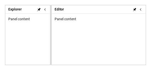
02 pinned · collapsed

Unpinning keeps a title strip; collapsing keeps only the expand button.

Qt capture · image
pinned · collapsed · Default
QML code
import QtQuick
import Syidax.Core

Item {
    implicitWidth: Math.max(360, childrenRect.width)
    implicitHeight: childrenRect.height
    // Focused Gallery routes: keep only the selected API and its prerequisites.

    id: story
    property QtObject settings: QtObject {
        id: storyArgs
        property bool pinned: true
        property bool collapsed: false
        property bool closable: false
        property bool pinnable: true
        property bool collapsible: true
        property string orientation: "horizontal"
        property string collapseDirection: "left"
        property bool headerVisible: true
        property bool pinVisible: true
        property bool collapseVisible: true
        property bool closeVisible: true
        property bool resizeHandleVisible: true
        property string pinnedIcon: ""
        property string unpinnedIcon: ""
        property string collapseIcon: ""
        property string expandIcon: ""
    }


    SyPanelGroup {
        width: 560
        height: 240
        orientation: storyArgs.orientation
        SyPanel {
            id: explorer
            title: "Explorer"
            preferredSize: 180
            panelId: "explorer"
            collapseDirection: storyArgs.collapseDirection
            headerVisible: storyArgs.headerVisible
            pinVisible: storyArgs.pinVisible
            collapseVisible: storyArgs.collapseVisible
            closeVisible: storyArgs.closeVisible
            resizeHandleVisible: storyArgs.resizeHandleVisible
            pinnedIcon: storyArgs.pinnedIcon
            unpinnedIcon: storyArgs.unpinnedIcon
            collapseIcon: storyArgs.collapseIcon
            expandIcon: storyArgs.expandIcon
            closable: storyArgs.closable
            pinnable: storyArgs.pinnable
            collapsible: storyArgs.collapsible
            Binding on pinned { value: storyArgs.pinned }
            Binding on collapsed { value: storyArgs.collapsed }
            Text { x: 12; y: 12; text: "Panel content"; font.family: Theme.fontFamily; font.pixelSize: 14; color: Theme.semantic.textDefault }
        }
        SyPanel { title: "Editor"; Text { x: 12; y: 12; text: "Panel content"; font.family: Theme.fontFamily; font.pixelSize: 14; color: Theme.semantic.textDefault } }
    }
}

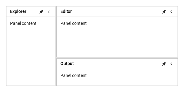
03 Nested groups

A SyPanelGroup is itself a member of a group: declare one inside another to split a column further.

Qt capture · image
Nested groups · Default
Default execution
QML code
import QtQuick
import Syidax.Core

Item {
    implicitWidth: Math.max(360, childrenRect.width)
    implicitHeight: childrenRect.height
    id: story


    SyPanelGroup {
        width: 560
        height: 260
        SyPanel { title: "Explorer"; preferredSize: 160; Text { x: 12; y: 12; text: "Panel content"; font.family: Theme.fontFamily; font.pixelSize: 14; color: Theme.semantic.textDefault } }
        SyPanelGroup {
            orientation: "vertical"
            SyPanel { title: "Editor"; Text { x: 12; y: 12; text: "Panel content"; font.family: Theme.fontFamily; font.pixelSize: 14; color: Theme.semantic.textDefault } }
            SyPanel { title: "Output"; preferredSize: 90; Text { x: 12; y: 12; text: "Panel content"; font.family: Theme.fontFamily; font.pixelSize: 14; color: Theme.semantic.textDefault } }
        }
    }
}

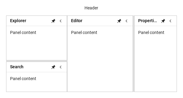
04 With SyLayout

Panels fill the regions a SyLayout gives them: the sider holds a vertical group (explorer over a 100 px search panel), the content a horizontal group (editor beside a 140 px properties panel).

Qt capture · image
With SyLayout · Default
Default execution
QML code
import QtQuick
import Syidax.Core

Item {
    implicitWidth: Math.max(360, childrenRect.width)
    implicitHeight: childrenRect.height
    id: story


    SyLayout {
        width: 560
        height: 300
        SyLayoutHeader { size: "small"; Text { anchors.centerIn: parent; text: "Header"; font.family: Theme.fontFamily; font.pixelSize: 14; color: Theme.semantic.textDefault } }
        SyLayoutSider {
            size: 200
            SyPanelGroup {
                anchors.fill: parent
                orientation: "vertical"
                SyPanel { title: "Explorer"; Text { x: 12; y: 12; text: "Panel content"; font.family: Theme.fontFamily; font.pixelSize: 14; color: Theme.semantic.textDefault } }
                SyPanel { title: "Search"; preferredSize: 100; Text { x: 12; y: 12; text: "Panel content"; font.family: Theme.fontFamily; font.pixelSize: 14; color: Theme.semantic.textDefault } }
            }
        }
        SyLayoutContent {
            SyPanelGroup {
                anchors.fill: parent
                SyPanel { title: "Editor"; Text { x: 12; y: 12; text: "Panel content"; font.family: Theme.fontFamily; font.pixelSize: 14; color: Theme.semantic.textDefault } }
                SyPanel { title: "Properties"; preferredSize: 140; Text { x: 12; y: 12; text: "Panel content"; font.family: Theme.fontFamily; font.pixelSize: 14; color: Theme.semantic.textDefault } }
            }
        }
    }
}

05 state · resize lifecycle · payload

The console records state changes after layout and resize start/progress/finish payloads.

Qt capture · image
state · resize lifecycle · payload · Default
QML code
import QtQuick
import Syidax.Core

Item {
    component EventLog: Rectangle {
        id: logBox
        property var lines: []
        implicitWidth: 440
        implicitHeight: Math.max(56, logText.implicitHeight + 24)
        radius: 4; color: Theme.semantic.backgroundBold
        function log(value) { lines = lines.slice(-3).concat([String(value)]) }
        Text {
            id: logText; x: 12; y: 12; width: parent.width - 24
            text: logBox.lines.length ? logBox.lines.join("\n") : "Interact with the controls to see event results."
            wrapMode: Text.Wrap; color: Theme.semantic.textDefault
            font.family: Theme.monoFontFamily; font.pixelSize: 12
        }
    }

    implicitWidth: Math.max(360, childrenRect.width)
    implicitHeight: childrenRect.height
    // Focused Gallery routes: keep only the selected API and its prerequisites.
    id: featureStory


    Column {
        spacing: 12
        SyPanelGroup {
            width: 560
            height: 220
            onResizeStarted: (detail) => { if (true) { output.log("resizeStarted " + JSON.stringify(detail)) } }
            onResizing: (detail) => { if (true) { output.log("resizing " + JSON.stringify(detail)) } }
            onResizeFinished: (detail) => { if (true) { output.log("resizeFinished " + JSON.stringify(detail)) } }
            onResized: (sizes) => { if (true) { output.log(("group resized: %1").arg(sizes.map(Math.round).join(" / "))) } }
            SyPanel {
                id: explorer
                panelId: "explorer"
                onPinToggled: (detail) => { if (true) { output.log("pinToggled " + JSON.stringify(detail)) } }
                onCollapseToggled: (detail) => { if (true) { output.log("collapseToggled " + JSON.stringify(detail)) } }
                title: "Explorer"; preferredSize: 180; closable: true
                onResized: (size) => { if (true) { output.log(("resized: %1 px").arg(Math.round(size))) } }
                onPinnedChanged: { if (true) { output.log(("pinned: %1").arg(pinned)) } }
                onCollapsedChanged: { if (true) { output.log(("collapsed: %1").arg(collapsed)) } }
                onShown: { if (true) { output.log("flyout shown") } }
                onHidden: { if (true) { output.log("flyout hidden") } }
                onClosed: { if (true) { output.log("closed") } }
            }
            SyPanel { panelId: "editor"; title: "Editor" }
        }
        SyButton { id: exampleControl1;  visible: !explorer.visible; size: "small"; variant: "borderless"; text: "restore"; onClicked: explorer.visible = true }
        EventLog { id: output }
    }
}

06 setPin · setCollapse · setSizes

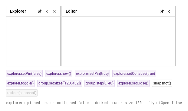
Drive the panel from an external toolbar and persist snapshot() by stable panelId.

Qt capture · image
setPin · setCollapse · setSizes · Default
QML code
import QtQuick
import Syidax.Core

Item {
    implicitWidth: Math.max(360, childrenRect.width)
    implicitHeight: childrenRect.height
    // Focused Gallery routes: keep only the selected API and its prerequisites.

    id: story
    property var savedLayout: []

    Column {
        spacing: 12
        SyPanelGroup {
            id: group
            width: 560
            height: 200
            SyPanel { id: explorer; panelId: "explorer"; title: "Explorer"; preferredSize: 180; closable: true }
            SyPanel { panelId: "editor"; title: "Editor" }
        }
        Flow {
            width: 560
            spacing: 8
            SyButton { id: exampleControl1;  visible: true; text: "explorer.setPin(false)"; variant: "secondary"; size: "small"; onClicked: explorer.setPin(false) }
            SyButton { id: exampleControl2;  visible: true; text: "explorer.show()"; variant: "secondary"; size: "small"; onClicked: explorer.show() }
            SyButton { id: exampleControl3;  visible: true; text: "explorer.setPin(true)"; variant: "secondary"; size: "small"; onClicked: explorer.setPin(true) }
            SyButton { visible: true; text: "explorer.setCollapse(true)"; variant: "secondary"; size: "small"; onClicked: explorer.setCollapse(true) }
            SyButton { visible: true; text: "explorer.toggle()"; variant: "secondary"; size: "small"; onClicked: explorer.toggle() }
            SyButton { visible: true; text: "group.setSizes([120, 432])"; variant: "secondary"; size: "small"; onClicked: group.setSizes([120, 432]) }
            SyButton { visible: true; text: "group.step(0, 40)"; variant: "secondary"; size: "small"; onClicked: group.step(0, 40) }
            SyButton { visible: true; text: "explorer.setClose()"; variant: "secondary"; size: "small"; enabled: explorer.visible; onClicked: explorer.setClose() }
            SyButton { visible: true; text: "snapshot()"; size: "small"; onClicked: story.savedLayout = group.snapshot() }
            SyButton { visible: true; text: "restore(snapshot)"; size: "small"; enabled: story.savedLayout.length > 0; onClicked: group.restore(story.savedLayout) }
            SyButton { visible: !explorer.visible; size: "small"; variant: "borderless"; text: "restore"; onClicked: explorer.visible = true }
        }
        Text {
            text: "explorer: pinned " + explorer.pinned + " · collapsed " + explorer.collapsed + " · docked " + explorer.docked + " · size " + Math.round(explorer.size) + " · flyoutOpen " + explorer.flyoutOpen
            font.family: Theme.monoFontFamily
            font.pixelSize: 12
            color: Theme.semantic.textSubtle
        }
    }
}

API 99

Hover or select an item for its QML example and copy button.

Properties

NameType / defaultDescription
Sibling panel layout: horizontal or vertical. Compare the splitter direction and resulting sizes.
Splitter grip thickness in logical pixels; it reserves space between panels.
Allows dragging or keyboard resizing of visible splitters. false keeps a visible handle locked.
Disables user interaction for this panel group. Compare pointer and keyboard input.
Shows or removes the splitter handle and its hit area. Independent from resizable.
bool · truetrue docks the panel. false leaves a title strip; click it to open the flyout and pin it again to dock. collapsed remains independent.
bool · falseHides the panel body and leaves an expand button. Expanding preserves the current pin mode.
Enables the panel close action. Close the panel, then use the sample restore action to test again.
Allows the user to change pin state. false leaves the pin control visible but disabled.
Allows the user to collapse/expand. false leaves the collapse control visible but disabled.
Edge used by the collapsed button or unpinned strip: left, right, top or bottom. Orientation still controls sibling layout.
Shows the normal header. Auto-hide title strips and collapsed restore buttons remain available.
Shows or hides the pin button without changing pinned.
Shows or hides the collapse button without changing collapsed.
Shows or hides the close control. closable must also allow closing.
Artwork used while pinned. Choose a glyph, then pin the panel to inspect it; empty uses the built-in icon.
Artwork used while unpinned. Unpin first to inspect it; empty uses the built-in icon.
Artwork for collapse. The component rotates it to match collapseDirection.
Artwork for expand. Collapse the panel to inspect it; rotation follows collapseDirection.

Methods

NameType / defaultDescription
setPin(false) unpins into a title strip; setPin(true) docks the panel again. A real state change emits pinToggled after layout.
setCollapse(true) folds the panel. Use Toggle to expand it again and repeat the comparison.
Assigns sizes to visible docked panels in order. Minimum and maximum sizes are enforced; compare the displayed panel sizes.
Unpin first, then call show() to open the flyout. Pin docks it again.
Alternates collapsed and expanded; pin state is preserved.
step(0, 40) moves the first splitter by 40 logical pixels, respecting both panels’ size constraints.
Hides the panel and emits closed once. The Restore button makes it visible for another test.
Captures panel IDs, sizes and state. Resize or fold a panel, take a snapshot, and use restore(snapshot) to compare.
Save a snapshot first, change sizes, then restore it. Restoration matches stable panel IDs and restores saved layout/state.

Signals

NameType / defaultDescription
Toggle pin in the header. Reports panelId, pinned, previousPinned, collapseDirection and source after layout.
Collapse or expand from the header. Reports current and previous collapse state after layout; a pin-only change does not emit it.
Emitted when a splitter drag or keyboard resize begins. Drag the separator; detail contains pair IDs, orientation, startSizes and source.
Emitted only as sizes actually change during resizing. Drag the separator slowly and inspect previousSizes and sizes.
Emitted on resize completion. Drag and release, or cancel with Escape; detail reports changed, cancelled, startSizes and final sizes.
Changed geometry/state only: members[{id,size,visible,docked,collapseDirection,x,y,width,height}], reason
Compatibility completion signal: the panel reports its final size; the group reports all sizes. Only actual changes emit it.
Click the panel close button. Emitted after visible becomes false; use Restore to repeat the test.
Unpin the panel, then open the title strip. Emitted when the flyout finishes showing.
Open an unpinned flyout, then dismiss it. Emitted when the flyout finishes hiding.
Property notification when pinned changes. Toggle pin in the header; read pinned in the handler. Use pinToggled for source and previous state.
Property notification when collapsed changes. Collapse/expand from the header; read collapsed in the handler.

Events

ItemBehavior / conditions
Property notification emitted when pinned changes.
Property notification emitted when collapsed changes.
property there. Detailed operation signals are additional and are not aliases of Web CustomEvents.

Events

SignalContract
Once after a real state change and group layout: panelId, pinned, previousPinned, collapseDirection, source
Same, with collapsed and previousCollapsed; never emitted just for pin changes
beforeId, afterId, orientation, startSizes, source
Only changed sizes: pair IDs, sizes, previousSizes, source
sizes, startSizes, changed, cancelled, pair IDs, source; cancellation restores the starting sizes
Changed geometry/state only: members[{id,size,visible,docked,collapseDirection,x,y,width,height}], reason
Compatibility completion signal; only actual changes and only changed panels
After visible=false; repeated close is a no-op. Migration: previously emitted before hiding
Flyout state completion, separate from pin/collapse

Events

ItemBehavior / conditions
Sources are pointer, keyboard, api, or property. Container layout uses reason: "container".
Methods do not emit operation events for an unchanged state. Initialization does not emit detailed
pin/collapse signals. Direction changes emit their notify and actual layout changes only.

Events

ItemExample calls
import QtQuick import Syidax.Core.Panel SyPanelGroup { id: regions width: 640; height: 360 property var savedLayout: [] onResizeFinished: (detail) => console.log(JSON.stringify(detail)) SyPanel { panelId: "explorer"; title: "Explorer"; preferredSize: 180 collapseDirection: "left" onPinToggled: (detail) => console.log(detail.source, detail.pinned) Text { text: "Files" } } SyPanel { panelId: "editor"; title: "Editor" } // Host toolbar: savedLayout = regions.snapshot(); regions.restore(savedLayout) }

State and controls

StateRemaining surfaceRestore
Header and bodyAlready docked
Title strip (36 px)Click, keyboard or hover opens a flyout; pin docks it
One expand button (24 × 24 px)Expand preserves the pin mode; unpinned expansion opens the flyout

State and controls

ItemBehavior / conditions
Edge used by the collapsed button or unpinned strip: left, right, top or bottom. Orientation still controls sibling layout.
left; direction exposes that resolved value.
Sibling panel layout: horizontal or vertical. Compare the splitter direction and resulting sizes.
remaining panels share the main axis. A collapsed member reserves one button's thickness in that
band and draws only its button. Multiple bands are allocated in declaration order. A standalone
panel reports a reduced implicit size; an explicitly sized host retains ownership of its outer box.
Shows or hides the pin button without changing pinned.
Shows or hides the collapse button without changing collapsed.
Shows or hides the close control. closable must also allow closing.
Shows or removes the splitter handle and its hit area. Independent from resizable.
Allows the user to change pin state. false leaves the pin control visible but disabled.
Allows the user to collapse/expand. false leaves the collapse control visible but disabled.
Allows dragging or keyboard resizing of visible splitters. false keeps a visible handle locked.
Enables the panel close action. Close the panel, then use the sample restore action to test again.
Shows the normal header. Auto-hide title strips and collapsed restore buttons remain available.
true docks the panel. false leaves a title strip; click it to open the flyout and pin it again to dock. collapsed remains independent.
Hides the panel body and leaves an expand button. Expanding preserves the current pin mode.
Both adjacent members and the group must allow a resize handle to be visible. Hidden handles have
8 px, Shift+Arrow moves 80 px, Home/End move to the feasible limits. Escape cancels a drag.
Artwork used while pinned. Choose a glyph, then pin the panel to inspect it; empty uses the built-in icon.
Artwork used while unpinned. Unpin first to inspect it; empty uses the built-in icon.
Artwork for collapse. The component rotates it to match collapseDirection.
Artwork for expand. Collapse the panel to inspect it; rotation follows collapseDirection.
URLs). Empty means the default. Pin artwork is used unchanged. Collapse artwork must point left,
expand artwork right: the component rotates both by 0°/180°/90°/−90° for left/right/top/bottom.
Icon changes do not emit operation events. Interactive icons expose accessible action names and
support Tab, Enter and Space.

Sizes and identity

ItemBehavior / conditions
Set stable, unique, nonempty panelId values for persistence and event consumers.
preferredSize Setting preferredSize returns that member to preferred sizing.
is allocated first; members without one divide the remainder. Dragged/API-sized members retain a
custom basis. Constraints are reapplied iteratively on container, min/max or visibility changes.
If minima exceed available space, minima win and the layout overflows. If all finite maxima are
maximumSize:0 means unlimited; a maximum below the minimum
sizes includes all members (hidden = 0, folded = strip/button thickness). only visible docked members in declaration order; it is not a round trip for sizes when members
Assigns sizes to visible docked panels in order. Minimum and maximum sizes are enforced; compare the displayed panel sizes.
Captures panel IDs, sizes and state. Resize or fold a panel, take a snapshot, and use restore(snapshot) to compare.
Save a snapshot first, change sizes, then restore it. Restoration matches stable panel IDs and restores saved layout/state.
pin/collapse state, direction and nested groups. Restore rejects empty/duplicate IDs before changes.