Run with --diagnose --json to check your Qt version, import path, fonts, runtime and license. No license token is printed.
The Gallery evaluation app is available now. Paid SDK sales and downloads are coming soon. The installation examples above preview the SDK workflow.
Tested Windows configurations
Native window and example smoke checks cover the versions below. Qt 6.8 is a source minimum, not a promise of tested support for every Qt release. Gallery uses software rendering.
Two complete application examples
Step-by-step captures from the running Windows applications. Play, pause and inspect each state.
Workbench: mark a task done, save changes and see release progress update.Record Manager: preserve a failed save, retry, search and confirm before deleting.
See the components in context
RibbonPanelFormTableTreeTheme
TRY IT YOURSELF
The native Gallery
Browse examples, inspect properties and switch between light and dark themes in a Windows application. The Gallery is for evaluation; commercial SDK access is separate.
The --qml path must contain the Syidax folder. Python uses qml-pure. Run from the unzipped SDK, independently of the source repository.
License is inactive or frozen
Download your QML Core certificate and pass it with --license. Web Core, Chart and Grid certificates do not activate QML. Monthly use ends at expiry. Annual licenses retain only releases covered by their update period.
Qt or plugin mismatch
Check the Qt version and architecture used to build plugins. Do not mix Python Qt bindings. qml-pure removes the compiled plugin ABI dependency.
PDF or icons missing
PDF requires the optional QtQuick.Pdf module. Other Core components remain usable without it. For icon packs and resource paths, read SDK docs/ICON-PACKS.md.
Save failure or corrupt settings
Examples write only to their application-data folder. Check permissions and disk space. Invalid JSON is backed up before reset. A failed save preserves your draft.
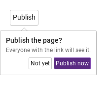
confirmText and cancelText are the labels of the two buttons — "OK" and "Cancel" by default; set them to the verbs of the decision ("Yes, publish" / "Not yet", "Delete" / "Keep").
Qt capture · image
QML code
import QtQuick
import Syidax.Core

Item {
    implicitWidth: Math.max(360, childrenRect.width)
    implicitHeight: childrenRect.height
    // Focused Gallery routes: keep only the selected API and its prerequisites.
    id: featureStory

    SyButton {
        text: "Publish"
        SyPopconfirm { id: featureTarget0;
            confirmText: "Publish now"; cancelText: "Not yet"; arrow: true
            Column {
                spacing: 4
                Text { text: "Publish the page?"; font.weight: Font.Medium; font.family: Theme.fontFamily; font.pixelSize: 14; color: Theme.popconfirm.textEnabled }
                Text { text: "Everyone with the link will see it."; color: Theme.semantic.textSubtle; font.family: Theme.fontFamily; font.pixelSize: 12 }
            }
        }
    }
}
04 selected · visibleChanged
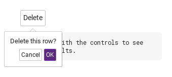
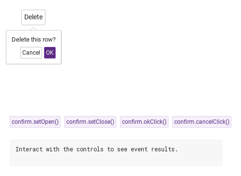
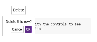
selected(choice) fires when one of the two buttons is pressed — or when okClick() / cancelClick() is called — with choice as the string "ok" or "cancel"; the popconfirm closes right after.
Qt capture · image
QML code
import QtQuick
import Syidax.Core

Item {
    component EventLog: Rectangle {
        id: logBox
        property var lines: []
        implicitWidth: 440
        implicitHeight: Math.max(56, logText.implicitHeight + 24)
        radius: 4; color: Theme.semantic.backgroundBold
        function log(value) { lines = lines.slice(-3).concat([String(value)]) }
        Text {
            id: logText; x: 12; y: 12; width: parent.width - 24
            text: logBox.lines.length ? logBox.lines.join("\n") : "Interact with the controls to see event results."
            wrapMode: Text.Wrap; color: Theme.semantic.textDefault
            font.family: Theme.monoFontFamily; font.pixelSize: 12
        }
    }

    implicitWidth: Math.max(360, childrenRect.width)
    implicitHeight: childrenRect.height
    // Focused Gallery routes: keep only the selected API and its prerequisites.
    id: featureStory


    Column {
        spacing: 12
        SyButton {
            text: "Delete"
            SyPopconfirm {
                id: confirm
                arrow: true
                onSelected: (choice) => { if (true) { output.log(("selected: %1").arg(choice)) } }
                onVisibleChanged: { if (true) { output.log(("visible: %1").arg(confirm.visible)) } }
                Text { text: "Delete this row?"; font.family: Theme.fontFamily; font.pixelSize: 13; color: Theme.popconfirm.textEnabled }
            }
        }
        EventLog { id: output }
    }
}
05 setOpen · setClose · okClick · cancelClick
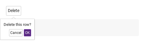
setOpen() opens the popconfirm and setClose() closes it from code, whatever the trigger; setOpen() still refuses a disabled anchor and setClose() closes even a sticky one, and neither emits selected.
The item it follows (resolved to the nearest ancestor with hovered within three levels).
bool (read-only)
—
The popconfirm is visible.
string (read-only)
—
The side after flipping, with -start / -end.
color
popconfirm tokens
The surface look.
color
subtle border
The surface look.
real
2
The surface look.
bool
true
The surface look.
real
12
Space between the content and the edge.
real
10 / 4
Base popup geometry.
bool
true
Base popup geometry.
bool
false
Base popup geometry.
read-only
—
The resolved speed, the current side, whether the anchor accepts opening, the anchor's rectangle in overlay coordinates.
read-only
—
The resolved speed, the current side, whether the anchor accepts opening, the anchor's rectangle in overlay coordinates.
read-only
—
The resolved speed, the current side, whether the anchor accepts opening, the anchor's rectangle in overlay coordinates.
read-only
—
The resolved speed, the current side, whether the anchor accepts opening, the anchor's rectangle in overlay coordinates.
Methods
Method
Description
Emits selected("ok") and closes — exactly what the OK button does; works even while closed.
Emits selected("cancel") and closes — exactly what the Cancel button does.
Cancels pending delays and opens, whatever the trigger — unless the anchor is disabled / readonly / not enabled.
Cancels pending delays and closes without selected, even when sticky.
The base popup's immediate open / close and the trigger-style toggle.
The base popup's immediate open / close and the trigger-style toggle.
The base popup's immediate open / close and the trigger-style toggle.
Re-computes the placement; automatic on anchor, size and window changes.
Signals
Signal
Arguments
When
choice: string — "ok" or "cancel"
A button was pressed, or okClick() / cancelClick() was called; the popup closes right after. Not emitted for Escape, an outside press, setClose() or the anchor toggle.
— (read visible / isOpen)
The popup opened or closed, by any path.
—
Emitted just before the popup is shown.
—
Emitted after the popup finishes its enter transition.
—
Emitted just before the popup is hidden.
—
Emitted after the popup finishes its exit transition.
Behavior
Item
Behavior / conditions
the item the popconfirm is declared in; inside a control's content it walks up at most three parents to the nearest item with a boolean hovered, so the control itself is the anchor. It is parented to the anchor and drawn in the window overlay, following the anchor.
"click" (a tap on the anchor toggles) · "none" (code only).
Cancels pending delays and opens, whatever the trigger — unless the anchor is disabled / readonly / not enabled.
Cancels pending delays and closes without selected, even when sticky.
A disabled or readonly anchor never opens it; opendelay applies to the click, and closing by any route — Escape, an outside press, close() — cancels a pending delayed open.
A disabled or readonly anchor never opens it; opendelay applies to the click, and closing by any route — Escape, an outside press, close() — cancels a pending delayed open.
A button was pressed, or okClick() / cancelClick() was called; the popup closes right after. Not emitted for Escape, an outside press, setClose() or the anchor toggle.
Emits selected("ok") and closes — exactly what the OK button does; works even while closed.
Emits selected("cancel") and closes — exactly what the Cancel button does.
The popup opened or closed, by any path.
Watch visibleChanged / closed() to notice it.
No Escape / outside-press close; the buttons and setClose() still close it.
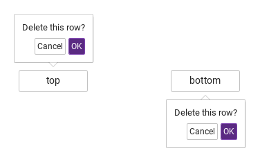
the content (the default property; give your items sizes or a Column) over a right-aligned row of two small buttons: cancelText (default style) then confirmText (primary), 4 px apart, 8 px under the content; the content is at least as wide as the buttons. 12 px padding, 2 px radius, a subtle 1 px border and a soft shadow. The surface sets no text color — use Theme.popconfirm.textEnabled.
Animation — animation: "fade" (any name other than "none") fades over animationMs (x-fast 100 · fast 150 · medium 250 · slow 350 · x-slow 500); none under Theme.reducedMotion.
Animation — animation: "fade" (any name other than "none") fades over animationMs (x-fast 100 · fast 150 · medium 250 · slow 350 · x-slow 500); none under Theme.reducedMotion.
The popconfirm is visible.
State — isOpen is the popup's visible.
Keyboard
Item
Behavior / conditions
SyModal for bigger decisions, SyPopover for information without a decision, SyTooltip for a hint; SyButton as the usual anchor and for the two buttons inside.
closable (default true) controls outside/Escape dismissal independently of sticky. OK/Cancel and setClose() remain explicit close actions even with closable=false.