QML
← All components

Progress Circular

Show the completion percentage of a task as a circular indicator.

import Syidax.Core.ProgressCircular

Supported QML types

TypeDefinition / role
Circular progress indicator with optional value text.

Learn by example

Previews are images of native Qt runs. Use the buttons below each image to view a result.

01 Basic composition

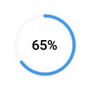
SyProgressCircular is a ring filled clockwise from the top to percent (0 … 100), with the rounded percentage in the middle.

Qt capture · image
Basic composition · Default
Default execution
QML code
import QtQuick
import Syidax.Core

Item {
    implicitWidth: Math.max(360, childrenRect.width)
    implicitHeight: childrenRect.height
    id: story

    property QtObject settings: QtObject {
        id: storyArgs
        property real percent: 65
        property string size: "medium"
        property string status: "default"
        property bool hideText: false
        property bool indeterminate: false
    }


    SyProgressCircular {
        percent: storyArgs.percent
        size: storyArgs.size
        status: storyArgs.status
        hideText: storyArgs.hideText
        indeterminate: storyArgs.indeterminate
    }

}

02 size

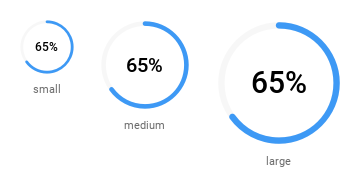
size sets the diameter: "small" 56 px, "medium" 92 px (default) and "large" 128 px.

Qt capture · image
size · Default
Default execution
QML code
import QtQuick
import Syidax.Core

pragma ComponentBehavior: Bound

Item {
    implicitWidth: Math.max(360, childrenRect.width)
    implicitHeight: childrenRect.height
    id: story
    readonly property var sizes: ["small", "medium", "large"]

    Row {
        spacing: 24
        Repeater {
            model: story.sizes
            delegate: Column {
                id: cell
                required property string modelData
                spacing: 8
                SyProgressCircular { anchors.horizontalCenter: parent.horizontalCenter; percent: 65; size: cell.modelData }
                Text { anchors.horizontalCenter: parent.horizontalCenter; text: cell.modelData; font.family: Theme.fontFamily; font.pixelSize: 11; color: Theme.semantic.textSubtle }
            }
        }
    }
}

03 status

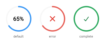
Compare the configuration and result of status.

Qt capture · image
status · Default
Default execution
QML code
import QtQuick
import Syidax.Core

pragma ComponentBehavior: Bound

Item {
    implicitWidth: Math.max(360, childrenRect.width)
    implicitHeight: childrenRect.height
    id: story
    readonly property var statuses: ["default", "error", "complete"]

    Row {
        spacing: 24
        Repeater {
            model: story.statuses
            delegate: Column {
                id: cell
                required property string modelData
                spacing: 8
                SyProgressCircular { anchors.horizontalCenter: parent.horizontalCenter; percent: cell.modelData === "complete" ? 100 : 65; status: cell.modelData }
                Text { anchors.horizontalCenter: parent.horizontalCenter; text: cell.modelData; font.family: Theme.fontFamily; font.pixelSize: 11; color: Theme.semantic.textSubtle }
            }
        }
    }
}

04 segment

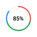
segment draws the fill as consecutive colored arcs.

Qt capture · image
segment · Default
Default execution
QML code
import QtQuick
import Syidax.Core

Item {
    implicitWidth: Math.max(360, childrenRect.width)
    implicitHeight: childrenRect.height

    SyProgressCircular {
        percent: 85
        segment: [{ percent: 30, status: "error" }, { percent: 70, status: "complete" }, { percent: 85 }]
    }
}

05 indeterminate

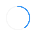
indeterminate: true is for work of unknown length: the number (or glyph) and any segment arcs are hidden and a 144° arc — 40 % of the ring — in the current status color turns a full circle every second.

Qt capture · image
indeterminate · Default
QML code
import QtQuick
import Syidax.Core

Item {
    implicitWidth: Math.max(360, childrenRect.width)
    implicitHeight: childrenRect.height
    property QtObject settings: QtObject {
        id: storyArgs
        property bool indeterminate: true
    }


    SyProgressCircular { size: "small"; percent: 40; indeterminate: storyArgs.indeterminate }
}

06 changed · getValue

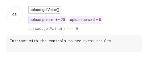
changed(percent) fires whenever the clamped value changes — once per change, with the clamped number: setting percent to 150 reports 100, and a second 150 reports nothing because value did not move.

Qt capture · image
changed · getValue · Default
QML code
import QtQuick
import Syidax.Core

Item {
    component EventLog: Rectangle {
        id: logBox
        property var lines: []
        implicitWidth: 440
        implicitHeight: Math.max(56, logText.implicitHeight + 24)
        radius: 4; color: Theme.semantic.backgroundBold
        function log(value) { lines = lines.slice(-3).concat([String(value)]) }
        Text {
            id: logText; x: 12; y: 12; width: parent.width - 24
            text: logBox.lines.length ? logBox.lines.join("\n") : "Interact with the controls to see event results."
            wrapMode: Text.Wrap; color: Theme.semantic.textDefault
            font.family: Theme.monoFontFamily; font.pixelSize: 12
        }
    }

    implicitWidth: Math.max(360, childrenRect.width)
    implicitHeight: childrenRect.height
    // Focused Gallery routes: keep only the selected API and its prerequisites.
    id: featureStory

    Column {
        spacing: 12
        Row {
            spacing: 16
            SyProgressCircular {
                id: upload
                size: "small"
                onChanged: (percent) => { if (true) { output.log(("changed: %1%").arg(percent)) } }
            }
            Column {
                anchors.verticalCenter: parent.verticalCenter
                spacing: 8
            SyButton { id: exampleControl1;  visible: true; text: "upload.getValue()"; size: "small"; onClicked: output.log("getValue() → " + upload.getValue()) }
                Row {
                    spacing: 8
                    SyButton { id: exampleControl2;  text: "upload.percent += 25"; variant: "secondary"; size: "small"; onClicked: upload.percent += 25 }
                    SyButton { id: exampleControl3;  text: "upload.percent = 0"; variant: "secondary"; size: "small"; onClicked: upload.percent = 0 }
                }
                Text {
                    text: "upload.getValue() === " + upload.getValue()
                    font.family: Theme.monoFontFamily
                    font.pixelSize: 12
                    color: Theme.semantic.textSubtle
                }
            }
        }
        EventLog { id: output }
    }
}

07 Completed ring

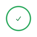
Completed ring, configured with percent, status.

Qt capture · image
Completed ring · Result
Default execution
QML code
import QtQuick
import Syidax.Core

Item {
    implicitWidth: Math.max(360, childrenRect.width)
    implicitHeight: childrenRect.height
    id: story

    property QtObject settings: QtObject {
        id: storyArgs
        property real percent: 100
        property string size: "medium"
        property string status: "complete"
        property bool hideText: false
        property bool indeterminate: false
    }


    SyProgressCircular {
        percent: storyArgs.percent
        size: storyArgs.size
        status: storyArgs.status
        hideText: storyArgs.hideText
        indeterminate: storyArgs.indeterminate
    }

}

08 Indeterminate progress

Indeterminate progress, configured with indeterminate.

Qt capture · image
Indeterminate progress · Result
Default execution
QML code
import QtQuick
import Syidax.Core

Item {
    implicitWidth: Math.max(360, childrenRect.width)
    implicitHeight: childrenRect.height
    id: story

    property QtObject settings: QtObject {
        id: storyArgs
        property real percent: 65
        property string size: "medium"
        property string status: "default"
        property bool hideText: false
        property bool indeterminate: true
    }


    SyProgressCircular {
        percent: storyArgs.percent
        size: storyArgs.size
        status: storyArgs.status
        hideText: storyArgs.hideText
        indeterminate: storyArgs.indeterminate
    }

}

API 32

Hover or select an item for its QML example and copy button.

Properties

PropertyTypeDefaultDescription
real0The progress; clamped to 0 … 100 into value.
var (list or string)[]Cumulative stops [{ percent, status }, …] or that as a JSON string; sorted ascending, drawn as consecutive arcs, cut at percent when it is above 0 (at 0 the stops define the fill).
string"default""default" · "error" · "complete" — the ring color and the middle glyph.
boolfalseHide the number and the status glyph.
string"medium""small" 56 · "medium" 92 · "large" 128 px — the diameter; stroke and text scale with it.
string""The accessible name ("Progress" when empty); no visual tooltip.
boolfalseTurning 40 % arc instead of the fill; hides the number, glyph and segment arcs.
real (read-only)—The clamped percent.
real (read-only)—The geometry for the current size.
real (read-only)—The number's font size and the glyph box for the current size.
color (read-only)—The ring color for status.
var (read-only)—The parsed parts { percent, status } and the arcs { start, sweep, status } in percent.

Methods

MethodDescription
Returns the clamped percent (real, 0 … 100) — the same as value. No arguments; works in every state.
Returns the ring color for a status name ("default" · "error" · "complete"); used for the segment arcs.

Signals

SignalArgumentsWhen
percent: real — the clamped value, 0 … 100Whenever value changes. Not emitted when percent moves without changing the clamped value, nor for status, size, segment or indeterminate.

Behavior

ItemBehavior / conditions
The clamped percent.
The progress; clamped to 0 … 100 into value.
Whenever value changes. Not emitted when percent moves without changing the clamped value, nor for status, size, segment or indeterminate.
"default" · "error" · "complete" — the ring color and the middle glyph.
Hide the number and the status glyph.
Turning 40 % arc instead of the fill; hides the number, glyph and segment arcs.
Cumulative stops [{ percent, status }, …] or that as a JSON string; sorted ascending, drawn as consecutive arcs, cut at percent when it is above 0 (at 0 the stops define the fill).
"small" 56 · "medium" 92 · "large" 128 px — the diameter; stroke and text scale with it.
The accessible name ("Progress" when empty); no visual tooltip.

Keyboard

ItemBehavior / conditions
The progress; clamped to 0 … 100 into value.
"default" · "error" · "complete" — the ring color and the middle glyph.
Whenever value changes. Not emitted when percent moves without changing the clamped value, nor for status, size, segment or indeterminate.
Returns the clamped percent (real, 0 … 100) — the same as value. No arguments; works in every state.