QML
← All components

Ribbon

Organize application commands into tabs and groups, with prominent actions and compact button columns.

import Syidax.Core.Ribbon

Supported QML types

TypeDefinition / role
Root command surface that manages tabs, selection, collapse state and aggregated command events.
One ribbon tab containing command groups; tabId identifies it and title labels its header.
Labelled horizontal group of commands inside a tab, with an optional details launcher.
Stacks commands vertically, equalizing their widths and centering the stack in a group.
Command button with an icon or image; supports Action, check state and commandId event identification.
Explicit horizontal or vertical separator placed between commands.

Learn by example

Previews are images of native Qt runs. Use the buttons below each image to view a result.

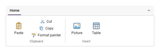
01 Large commands and vertical stacks

Place a button directly in a group; use SyRibbonColumn for stacked commands.

Qt capture · image
Large commands and vertical stacks · Preview
Default execution
QML code
import QtQuick
import QtQuick.Controls as Controls
import Syidax.Core

SyRibbon {
    width: 520
    SyRibbonTab {
        tabId: "home"; title: "Home"
        SyRibbonGroup {
            title: "Clipboard"
            SyRibbonButton { text: "Paste"; imageSource: Icons.ribbonPaste }
            SyRibbonColumn {
                SyRibbonButton { text: "Cut"; icon.source: Icons.ribbonCut }
                SyRibbonButton { text: "Copy"; icon.source: Icons.ribbonCopy }
                SyRibbonButton { text: "Format painter"; icon.source: Icons.ribbonFormatPainter }
            }
        }
        SyRibbonGroup {
            title: "Insert"
            SyRibbonButton { text: "Picture"; imageSource: Icons.ribbonPicture }
            SyRibbonButton { text: "Table"; imageSource: Icons.ribbonTable }
        }
    }
}

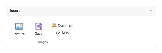
02 Image sizes and colored icons

Colored artwork keeps its colors; imageWidth and imageHeight control custom image size.

Qt capture · image
Image sizes and colored icons · Preview
Default execution
QML code
import QtQuick
import QtQuick.Controls as Controls
import Syidax.Core

SyRibbon {
    width: 520
    SyRibbonTab {
        tabId: "insert"; title: "Insert"
        SyRibbonGroup {
            title: "Images"
            SyRibbonButton {
                text: "Picture"
                imageSource: Icons.ribbonPicture
                imageWidth: 40; imageHeight: 32
                imageFillMode: Image.PreserveAspectFit
            }
            SyRibbonButton { text: "Save"; icon.source: Icons.ribbonSave }
            SyRibbonColumn {
                SyRibbonButton { text: "Comment"; icon.source: Icons.ribbonComment }
                SyRibbonButton { text: "Link"; icon.source: Icons.ribbonLink }
            }
        }
    }
}

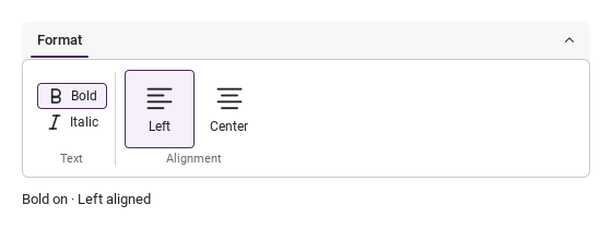
03 Toggle and exclusive selection

Toggle Bold independently; select only one alignment at a time.

Qt capture · image
Toggle and exclusive selection · Bold + left
QML code
import QtQuick
import QtQuick.Controls as Controls
import Syidax.Core

Column {
    width: 520; spacing: 12
    SyRibbon {
        width: parent.width
        SyRibbonTab {
            tabId: "format"; title: "Format"
            SyRibbonGroup {
                title: "Text"
                SyRibbonColumn {
                    SyRibbonButton { id: bold; text: "Bold"; icon.source: Icons.ribbonBold; checkable: true; checked: true }
                    SyRibbonButton { text: "Italic"; icon.source: Icons.ribbonItalic; checkable: true }
                }
            }
            SyRibbonGroup {
                title: "Alignment"
                Row {
                    SyRibbonButton { id: left; text: "Left"; icon.source: Icons.ribbonAlignLeft; checkable: true; autoExclusive: true; checked: true }
                    SyRibbonButton { id: center; text: "Center"; icon.source: Icons.ribbonAlignCenter; checkable: true; autoExclusive: true }
                }
            }
        }
    }
    Text {
        text: (bold.checked ? "Bold on" : "Bold off") + " · " + (left.checked ? "Left aligned" : "Center aligned")
        color: Theme.semantic.textDefault; font.family: Theme.fontFamily
    }
}

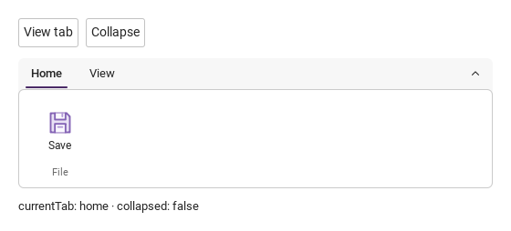
04 Switch tabs and collapse

Select the View tab, then collapse the command area while keeping tabs visible.

Qt capture · image
Switch tabs and collapse · Home
QML code
import QtQuick
import QtQuick.Controls as Controls
import Syidax.Core

Column {
    width: 520; spacing: 12
    Row {
        spacing: 8
        SyButton { text: "View tab"; onClicked: ribbon.selectTab("view", "example") }
        SyButton { text: ribbon.collapsed ? "Expand" : "Collapse"; onClicked: ribbon.setCollapsed(!ribbon.collapsed, "example") }
    }
    SyRibbon {
        id: ribbon; width: parent.width
        SyRibbonTab {
            tabId: "home"; title: "Home"
            SyRibbonGroup { title: "File"; SyRibbonButton { text: "Save"; icon.source: Icons.ribbonSave } }
        }
        SyRibbonTab {
            tabId: "view"; title: "View"
            SyRibbonGroup { title: "Display"; SyRibbonButton { text: "Grid"; icon.source: Icons.ribbonGrid; checkable: true; checked: true } }
        }
    }
    Text {
        text: "currentTab: " + ribbon.currentTab + " · collapsed: " + ribbon.collapsed
        color: Theme.semantic.textDefault; font.family: Theme.fontFamily
    }
}

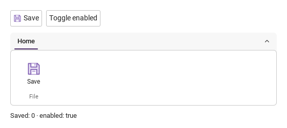
05 One Action, two entry points

The toolbar button, ribbon and Ctrl+S share the same action and enabled state.

Qt capture · image
One Action, two entry points · Ready
QML code
import QtQuick
import QtQuick.Controls as Controls
import Syidax.Core

Column {
    id: demo; width: 520; spacing: 12
    property int saves: 0
    Controls.Action {
        id: saveAction; text: "Save"; shortcut: "Ctrl+S"
        icon.source: Icons.ribbonSave
        onTriggered: demo.saves += 1
    }
    Row {
        spacing: 8
        SyButton { id: toolbarSave; action: saveAction }
        SyButton { text: "Toggle enabled"; onClicked: saveAction.enabled = !saveAction.enabled }
    }
    SyRibbon {
        width: parent.width
        SyRibbonTab {
            tabId: "home"; title: "Home"
            SyRibbonGroup { title: "File"; SyRibbonButton { id: ribbonSave; commandId: "save"; action: saveAction } }
        }
    }
    Text {
        text: "Saved: " + demo.saves + " · enabled: " + saveAction.enabled
        color: Theme.semantic.textDefault; font.family: Theme.fontFamily
    }
}

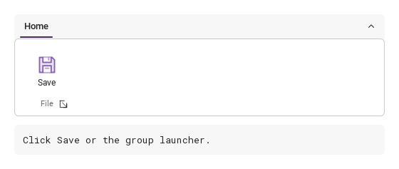
06 Command and group events

Save reports its command, tab and group IDs. The group launcher reports a separate event.

Qt capture · image
Command and group events · Ready
QML code
import QtQuick
import QtQuick.Controls as Controls
import Syidax.Core

Column {
    id: demo; width: 520; spacing: 12
    property string result: "Click Save or the group launcher."
    SyRibbon {
        width: parent.width
        onCommandTriggered: detail => demo.result = "commandTriggered\n" + JSON.stringify({commandId: detail.commandId, tabId: detail.tabId, groupId: detail.groupId})
        onGroupRequested: detail => demo.result = "groupRequested\n" + JSON.stringify(detail)
        SyRibbonTab {
            tabId: "home"; title: "Home"
            SyRibbonGroup {
                id: fileGroup; groupId: "file"; title: "File"; launcherVisible: true
                SyRibbonButton { id: save; commandId: "save"; text: "Save"; icon.source: Icons.ribbonSave }
            }
        }
    }
    Rectangle {
        width: parent.width; height: eventText.implicitHeight + 24
        color: Theme.semantic.backgroundBold; radius: 6
        Text {
            id: eventText; x: 12; y: 12; width: parent.width - 24
            text: demo.result; wrapMode: Text.WrapAnywhere
            color: Theme.semantic.textDefault; font.family: Theme.monoFontFamily
        }
    }
}

API 77

Hover or select an item for its QML example and copy button.

SyRibbon · Properties

NameType / defaultDescription
list · []Default content: declare SyRibbonTab children here.
string · ""Selected tabId. An unavailable value falls back to the first available tab.
var · read-onlyRegistered SyRibbonTab instances in declaration order.
read-only · nullSelected tab and its index; null / -1 when no tab is available.
read-only · -1Selected tab and its index; null / -1 when no tab is available.
bool · falseHides the command area and keeps the tab headers visible.
bool · trueShows the collapse/expand button; does not set collapsed.
bool · falseBlocks user interaction with the ribbon.
string · "Ribbon"Accessible name of the ribbon.
string · "Collapse ribbon"Accessible labels of the collapse/expand control; replace for the app language.
string · "Expand ribbon"Accessible labels of the collapse/expand control; replace for the app language.
int · 160 msTransition duration; reduced motion skips transitions.
color · Theme.semantic.backgroundDefaultRibbon surface and border colors.
color · Theme.semantic.borderSubtleRibbon surface and border colors.

SyRibbonTab · Properties

NameType / defaultDescription
list · []Default content: groups belonging to this tab.
string · ""Required non-empty identifier, unique within the ribbon.
string · ""Text in the tab header.
bool · trueControls tab-header visibility and whether the tab can be selected.
bool · falseKeeps the header but makes the tab unavailable.
real · 6Padding around the groups and the gap between groups.
real · 0Padding around the groups and the gap between groups.
bool · read-onlyWhether this is the ribbon’s selected tab; visible follows selection.
real · read-onlyShared command-area height used by the groups on this tab.

SyRibbonGroup · Properties

NameType / defaultDescription
list · []Default content: buttons, columns and custom controls in horizontal declaration order.
string · ""Event identifier and the caption below the commands.
bool · automaticShows the trailing divider; automatically hidden for the last visible group.
bool · falseShows the small details launcher next to the group caption.
string · titleAccessible name for the details launcher.
real · 4Horizontal gap between declared command items.
real · read-onlyContent’s own height and the aligned command height shared with sibling groups.

SyRibbonColumn · Properties

NameType / defaultDescription
list · []Default content: commands placed in a vertical stack.
real · 0Vertical gap between visible commands; hidden commands take no space.

SyRibbonButton · Properties

NameType / defaultDescription
string · ""Identifier reported with command events.
Qt Quick Button propertiesCaption, icon and shared Action; an Action can also provide text, icon, enabled and checked state.
bool · falseEnable toggling, set the checked state, or keep one checkable sibling selected.
bool · falseDisables pointer, keyboard and trigger() interaction.
string · ""Explicit hover help; otherwise an elided caption supplies its full text.
url · ""Image URL, taking priority over icon.source and preserving original colors.
real · 28 (vertical) / 16 (horizontal)Image-box dimensions. Explicit zero hides that dimension; the layout determines the defaults.
Image.FillMode · Image.PreserveAspectFitFit, crop or stretch the image within the image box.
size · Qt.size(0, 0)Requested source-image decode size; 0 uses the source default.
bool · trueImage loading and cache options.
int · read-onlyImage loading status and progress, following the underlying QML Image.
real · read-onlyImage loading status and progress, following the underlying QML Image.

SyRibbonSeparator · Properties

NameType / defaultDescription
string · "vertical""vertical" or "horizontal" separator.
real · 72Length along the separator’s main axis.
color · Theme.semantic.borderSubtleSeparator color.

Methods

OwnerMethodResult / behavior
SyRibbonReturns true for an available tab; false for unknown, hidden or disabled tabs or a disabled ribbon. source defaults to "api".
SyRibbonSets collapsed; no return value. source defaults to "api".
SyRibbonButtonRuns the same check/Action/click sequence as a click. Returns false while hidden or disabled; otherwise true.
SyRibbonGroupEmits launchRequested and the ribbon’s groupRequested. Does nothing while hidden or disabled; no return value.

Signals

Owner / signalPayloadWhen emitted
{ tabId, previousTabId, index, source }Once after the active tab changes. No event on initialization or reassignment of the same value.
{ collapsed, source }Once after the collapse state changes; not for the initial or unchanged state.
{ commandId, tabId, groupId, text, checked, source }A ribbon command executes. A shared Action is aggregated once at the ribbon.
{ commandId, tabId, groupId, text, checked, source }A command’s checked state changes; source is "state". This is not command execution.
{ ...commandDetail, kind, value }Relays pressed, released, canceled, hovered and focused changes.
{ tabId, groupId }A group requests its details view.
{ commandId, tabId, groupId, text, checked, source }Local command event for this button.
{ commandId, tabId, groupId, text, checked, source }Local checked-state change after initialization, with source "state".
{ ...commandDetail, kind, value }Local pointer, hover and focus interaction event.
{ tabId, groupId }Local group-launcher event; use launcherVisible to show its button.

Layout and state rules

ItemBehavior
Declare tabs inside SyRibbon, groups inside each tab, and buttons or columns inside each group. Groups preserve horizontal declaration order.
An image/icon button directly in a group places its caption below; a button in a column places it beside the icon. There is no per-button size option or automatic regrouping.
SyRibbonColumn equalizes widths and centers the stack. Two commands stay in two rows, four in four. Standard QML Column and custom Row controls are also supported.
Groups share command height. Buttons center their actual icon and caption without reserving an empty second line. Long horizontal captions elide at 200 px and reveal the full text on hover.
Removing, hiding or disabling the active tab selects the first available tab; no available tab clears the selection. Use tabVisible for tab visibility, not the page’s visible state.
Tab headers use Left/Right/Home/End; command buttons use Space. Overflow scrolls horizontally and focused commands are brought into view.
Theme.reducedMotion skips transitions. Icons.ribbon* keeps colored artwork unchanged via icon.source; monochrome symbols use theme tint.
Standard QML property-change signals remain available alongside the structured ribbon signals.