QML
← All components

Spinner

Indicate that an operation is running when its completion percentage is unknown.

import Syidax.Core.Spinner

Supported QML types

TypeDefinition / role
Animated indicator for an operation in progress.

Learn by example

Previews are images of native Qt runs. Use the buttons below each image to view a result.

01 Basic composition

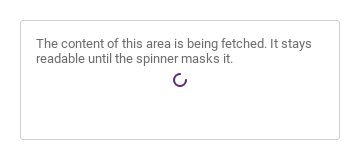
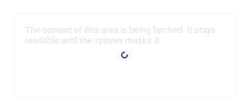
SySpinner is a turning arc that says "something is loading".

Qt capture · image
Basic composition · Default
Default execution
QML code
import QtQuick
import Syidax.Core

Item {
    implicitWidth: Math.max(360, childrenRect.width)
    implicitHeight: childrenRect.height
    id: story

    property QtObject settings: QtObject {
        id: storyArgs
        property string size: "medium"
        property string description: ""
        property bool hidden: false
        property bool inline: false
    }


    Rectangle {
        width: 320
        height: 120
        color: Theme.semantic.backgroundDefault
        border.width: 1
        border.color: Theme.semantic.borderSubtle
        radius: Foundation.borderRadiusMedium
        Text {
            x: 16
            y: 16
            width: parent.width - 32
            wrapMode: Text.WordWrap
            text: "The content of this area is being fetched. It stays readable until the spinner masks it."
            font.family: Theme.fontFamily
            font.pixelSize: 13
            color: Theme.semantic.textSubtle
        }
        SySpinner {
            anchors.centerIn: storyArgs.inline ? undefined : parent
            anchors.fill: storyArgs.inline ? parent : undefined
            size: storyArgs.size
            description: storyArgs.description
            hidden: storyArgs.hidden
            inline: storyArgs.inline
        }
    }

}

02 size

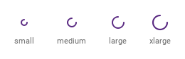
size sets the diameter of the arc: "small" 12 px, "medium" 16 px (default), "large" 20 px and "xlarge" 24 px.

Qt capture · image
size · Default
Default execution
QML code
import QtQuick
import Syidax.Core

pragma ComponentBehavior: Bound

Item {
    implicitWidth: Math.max(360, childrenRect.width)
    implicitHeight: childrenRect.height
    id: story
    readonly property var sizes: ["small", "medium", "large", "xlarge"]

    Row {
        spacing: 32
        Repeater {
            model: story.sizes
            delegate: Column {
                id: cell
                required property string modelData
                spacing: 8
                Item {
                    anchors.horizontalCenter: parent.horizontalCenter
                    width: 24
                    height: 24
                    SySpinner { anchors.centerIn: parent; size: cell.modelData }
                }
                Text { anchors.horizontalCenter: parent.horizontalCenter; text: cell.modelData; font.family: Theme.fontFamily; font.pixelSize: 11; color: Theme.semantic.textSubtle }
            }
        }
    }
}

03 description

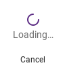
description is a line of 14 px text written 4 px under the arc, centered on it — "Loading…", "Saving your changes".

Qt capture · image
description · Default
Default execution
QML code
import QtQuick
import Syidax.Core

Item {
    implicitWidth: Math.max(360, childrenRect.width)
    implicitHeight: childrenRect.height
    property QtObject settings: QtObject {
        id: storyArgs
        property string description: "Loading…"
    }


    SySpinner {
        size: "large"
        description: storyArgs.description
        SyButton { text: "Cancel"; size: "small"; variant: "borderless" }
    }
}

04 inline

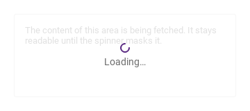
Compare the configuration and result of inline.

Qt capture · image
inline · Default
QML code
import QtQuick
import Syidax.Core

Item {
    implicitWidth: Math.max(360, childrenRect.width)
    implicitHeight: childrenRect.height
    property QtObject settings: QtObject {
        id: storyArgs
        property bool inline: true
    }


    Rectangle {
        width: 320
        height: 120
        color: Theme.semantic.backgroundDefault
        border.width: 1
        border.color: Theme.semantic.borderSubtle
        radius: Foundation.borderRadiusMedium
        Text {
            x: 16
            y: 16
            width: parent.width - 32
            wrapMode: Text.WordWrap
            text: "The content of this area is being fetched. It stays readable until the spinner masks it."
            font.family: Theme.fontFamily
            font.pixelSize: 13
            color: Theme.semantic.textSubtle
        }
        SySpinner { anchors.fill: parent; inline: storyArgs.inline; description: "Loading…" }
    }
}

05 delay

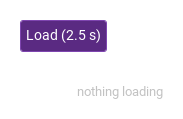
delay is the number of milliseconds the spinner stays invisible after it is created (default 0 = at once); a load that finishes sooner never shows a spinner, which avoids a distracting flash.

Qt capture · image
delay · Default
Default execution
QML code
import QtQuick
import Syidax.Core

pragma ComponentBehavior: Bound

Item {
    implicitWidth: Math.max(360, childrenRect.width)
    implicitHeight: childrenRect.height
    property QtObject settings: QtObject {
        id: storyArgs
        property int delay: 800
    }


    Column {
        spacing: 12
        SyButton {
            text: "Load (2.5 s)"
            variant: "primary"
            loading: load.running
            onClicked: load.restart()
        }
        Item {
            width: 200
            height: 56
            Loader {
                anchors.centerIn: parent
                active: load.running
                sourceComponent: SySpinner { delay: storyArgs.delay; description: "Loading…" }
            }
            Text {
                anchors.centerIn: parent
                visible: !load.running
                text: "nothing loading"
                font.family: Theme.fontFamily
                font.pixelSize: 13
                color: Theme.semantic.textSubtlest
            }
        }
        Timer { id: load; interval: 2500 }
    }
}

06 Inline loading

Inline loading, configured with inline, size.

Qt capture · image
Inline loading · Result
Default execution
QML code
import QtQuick
import Syidax.Core

Item {
    implicitWidth: Math.max(360, childrenRect.width)
    implicitHeight: childrenRect.height
    id: story

    property QtObject settings: QtObject {
        id: storyArgs
        property string size: "small"
        property string description: ""
        property bool hidden: false
        property bool inline: true
    }


    Rectangle {
        width: 320
        height: 120
        color: Theme.semantic.backgroundDefault
        border.width: 1
        border.color: Theme.semantic.borderSubtle
        radius: Foundation.borderRadiusMedium
        Text {
            x: 16
            y: 16
            width: parent.width - 32
            wrapMode: Text.WordWrap
            text: "The content of this area is being fetched. It stays readable until the spinner masks it."
            font.family: Theme.fontFamily
            font.pixelSize: 13
            color: Theme.semantic.textSubtle
        }
        SySpinner {
            anchors.centerIn: storyArgs.inline ? undefined : parent
            anchors.fill: storyArgs.inline ? parent : undefined
            size: storyArgs.size
            description: storyArgs.description
            hidden: storyArgs.hidden
            inline: storyArgs.inline
        }
    }

}

API 21

Hover or select an item for its QML example and copy button.

Properties

PropertyTypeDefaultDescription
list (default property)—Items laid out 16 px under the arc / description, centered.
string"medium""small" 12 · "medium" 16 · "large" 20 · "xlarge" 24 px — the arc's diameter.
string""14 px text under the arc; also the accessible name.
boolfalseHide the spinner (it keeps no size while hidden).
boolfalseOverlay mode: a translucent mask fills the spinner's geometry and the arc is centered on it; implicit size becomes 0.
int0Milliseconds to stay invisible after creation (or after delay is re-assigned).
real (read-only)—The arc's diameter for the current size.
bool (read-only)—!hidden and the delay has passed; visible is bound to it.
bool (read-only)—The arc is turning: shown, visible and Theme.reducedMotion off.

Methods

ItemBehavior / conditions
SySpinner declares no methods — drive it with hidden, delay or by creating it per load.

Signals

ItemBehavior / conditions
SySpinner declares no signals of its own; use the property change signals onShownChanged and onSpinningChanged.

Behavior

ItemBehavior / conditions
Visibility — visible is bound to the read-only shown = !hidden and the delay has passed. Setting visible yourself replaces that binding; prefer hidden. Motion — spinning is true while shown, visible and Theme.reducedMotion is off.
!hidden and the delay has passed; visible is bound to it.
Hide the spinner (it keeps no size while hidden).
Milliseconds to stay invisible after creation (or after delay is re-assigned).
"small" 12 · "medium" 16 · "large" 20 · "xlarge" 24 px — the arc's diameter.
14 px text under the arc; also the accessible name.
Overlay mode: a translucent mask fills the spinner's geometry and the arc is centered on it; implicit size becomes 0.
The arc is turning: shown, visible and Theme.reducedMotion off.

Keyboard

ItemBehavior / conditions
SySkeleton for layout-preserving placeholders, SyProgressBar / SyProgressCircular for known progress, SyButton (loading) for a spinner inside a button.