QML
← All components

Tabs

Switch between related content panels using a row or column of tabs.

import Syidax.Core.Tabs

Supported QML types

TypeDefinition / role
Coordinates SyTab headers and their matching SyTabContent panels.
Tab header identified by tabkey; pair it with a SyTabContent having the same name.
Content panel shown when the matching SyTab is active.

Learn by example

Previews are images of native Qt runs. Use the buttons below each image to view a result.

01 Basic composition

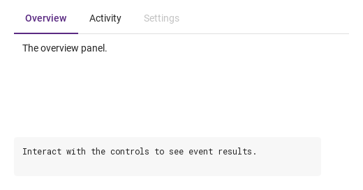
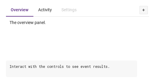
Compare the configuration and result of Basic composition.

Qt capture · image
Basic composition · Default
Default execution
QML code
import QtQuick
import Syidax.Core

Item {
    component EventLog: Rectangle {
        id: logBox
        property var lines: []
        implicitWidth: 440
        implicitHeight: Math.max(56, logText.implicitHeight + 24)
        radius: 4; color: Theme.semantic.backgroundBold
        function log(value) { lines = lines.slice(-3).concat([String(value)]) }
        Text {
            id: logText; x: 12; y: 12; width: parent.width - 24
            text: logBox.lines.length ? logBox.lines.join("\n") : "Interact with the controls to see event results."
            wrapMode: Text.Wrap; color: Theme.semantic.textDefault
            font.family: Theme.monoFontFamily; font.pixelSize: 12
        }
    }

    implicitWidth: Math.max(360, childrenRect.width)
    implicitHeight: childrenRect.height

    property QtObject settings: QtObject {
        id: storyArgs
        property string type: "line"
        property string size: "medium"
        property string position: "top"
        property string align: "left"
        property string padding: "none"
        property bool disabled: false
        property bool addNewTab: false
    }

    readonly property string members: [
        "SyTab { tabkey: \"overview\"; text: " + JSON.stringify("Overview") + " }",
        "SyTab { tabkey: \"activity\"; text: " + JSON.stringify("Activity") + " }",
        "SyTab { tabkey: \"settings\"; text: " + JSON.stringify("Settings") + "; disabled: true }",
        "SyTabContent { name: \"overview\"; Text { text: " + JSON.stringify("The overview panel.") + " } }",
        "SyTabContent { name: \"activity\"; Text { text: " + JSON.stringify("The activity panel.") + " } }",
        "SyTabContent { name: \"settings\"; Text { text: " + JSON.stringify("The settings panel.") + " } }"
    ].join("\n")

    Column {
        spacing: 12
        SyTabGroup {
            width: 480
            height: 180
            type: storyArgs.type
            size: storyArgs.size
            position: storyArgs.position
            align: storyArgs.align
            padding: storyArgs.padding
            disabled: storyArgs.disabled
            addNewTab: storyArgs.addNewTab
            onSelected: (detail) => output.log(detail.tabkey)
            SyTab { tabkey: "overview"; text: "Overview" }
            SyTab { tabkey: "activity"; text: "Activity" }
            SyTab { tabkey: "settings"; text: "Settings"; disabled: true }
            SyTabContent { name: "overview"; Text { text: "The overview panel."; padding: 12; font.family: Theme.fontFamily; font.pixelSize: 14; color: Theme.semantic.textDefault } }
            SyTabContent { name: "activity"; Text { text: "The activity panel."; padding: 12; font.family: Theme.fontFamily; font.pixelSize: 14; color: Theme.semantic.textDefault } }
            SyTabContent { name: "settings"; Text { text: "The settings panel."; padding: 12; font.family: Theme.fontFamily; font.pixelSize: 14; color: Theme.semantic.textDefault } }
        }
        EventLog { id: output }
    }

}

02 closable · manualClose · disabled

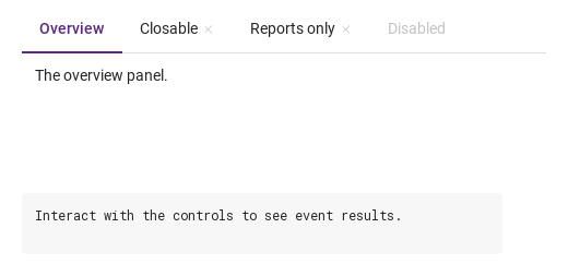
closable draws an × after a header's text (faint until hovered or active).

Qt capture · image
closable · manualClose · disabled · Default
Default execution
QML code
import QtQuick
import Syidax.Core

Item {
    component EventLog: Rectangle {
        id: logBox
        property var lines: []
        implicitWidth: 440
        implicitHeight: Math.max(56, logText.implicitHeight + 24)
        radius: 4; color: Theme.semantic.backgroundBold
        function log(value) { lines = lines.slice(-3).concat([String(value)]) }
        Text {
            id: logText; x: 12; y: 12; width: parent.width - 24
            text: logBox.lines.length ? logBox.lines.join("\n") : "Interact with the controls to see event results."
            wrapMode: Text.Wrap; color: Theme.semantic.textDefault
            font.family: Theme.monoFontFamily; font.pixelSize: 12
        }
    }

    implicitWidth: Math.max(360, childrenRect.width)
    implicitHeight: childrenRect.height
    // Focused Gallery routes: keep only the selected API and its prerequisites.
    id: featureStory


    Column {
        spacing: 12
        SyTabGroup {
            width: 480; height: 160
            onClosed: (detail) => output.log(("closed: %1").arg(detail.tabkey))
            SyTab { tabkey: "overview"; text: "Overview" }
            SyTab { id: featureTarget0; tabkey: "closable"; text: "Closable"; closable: true }
            SyTab { id: featureTarget1; tabkey: "manual"; text: "Reports only"; closable: true; manualClose: true }
            SyTab { id: featureTarget2; tabkey: "off"; text: "Disabled"; disabled: true }
            SyTabContent { name: "overview"; Text { text: "The overview panel."; padding: 12; font.family: Theme.fontFamily; font.pixelSize: 14; color: Theme.semantic.textDefault } }
            SyTabContent { name: "closable"; Text { text: "The × removes this tab."; padding: 12; font.family: Theme.fontFamily; font.pixelSize: 14; color: Theme.semantic.textDefault } }
            SyTabContent { name: "manual"; Text { text: "The × only reports; the tab stays."; padding: 12; font.family: Theme.fontFamily; font.pixelSize: 14; color: Theme.semantic.textDefault } }
        }
        EventLog { id: output }
    }
}

03 overflow

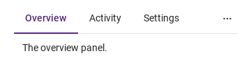
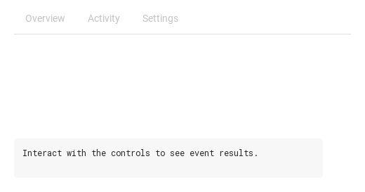
The strip lays the headers out from left to right.

Qt capture · image
overflow · Default
Default execution
QML code
import QtQuick
import Syidax.Core

Item {
    implicitWidth: Math.max(360, childrenRect.width)
    implicitHeight: childrenRect.height
    property QtObject settings: QtObject {
        id: storyArgs
        property int width: 320
    }

    readonly property var names: ["overview", "activity", "settings", "members", "billing", "history"]

    SyTabGroup {
        width: storyArgs.width
        height: 140
        SyTab { tabkey: "overview"; text: "Overview" }
        SyTab { tabkey: "activity"; text: "Activity" }
        SyTab { tabkey: "settings"; text: "Settings" }
        SyTab { tabkey: "members"; text: "Members" }
        SyTab { tabkey: "billing"; text: "Billing" }
        SyTab { tabkey: "history"; text: "History" }
        SyTabContent { name: "overview"; Text { text: "The overview panel."; padding: 12; font.family: Theme.fontFamily; font.pixelSize: 14; color: Theme.semantic.textDefault } }
    }
}

04 selected · tabSelected · closed · tabClosed · tabAdded

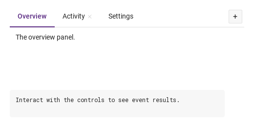
SyTabGroup has six signals:

Qt capture · image
selected · tabSelected · closed · tabClosed · tabAdded · Default
Default execution
QML code
import QtQuick
import Syidax.Core

Item {
    component EventLog: Rectangle {
        id: logBox
        property var lines: []
        implicitWidth: 440
        implicitHeight: Math.max(56, logText.implicitHeight + 24)
        radius: 4; color: Theme.semantic.backgroundBold
        function log(value) { lines = lines.slice(-3).concat([String(value)]) }
        Text {
            id: logText; x: 12; y: 12; width: parent.width - 24
            text: logBox.lines.length ? logBox.lines.join("\n") : "Interact with the controls to see event results."
            wrapMode: Text.Wrap; color: Theme.semantic.textDefault
            font.family: Theme.monoFontFamily; font.pixelSize: 12
        }
    }

    implicitWidth: Math.max(360, childrenRect.width)
    implicitHeight: childrenRect.height
    // Focused Gallery routes: keep only the selected API and its prerequisites.
    id: featureStory


    Column {
        spacing: 12
        SyTabGroup {
            width: 480; height: 160
            addNewTab: true
            onSelected: (detail) => { if (true) { output.log(("selected: %1").arg(detail.tabkey)) } }
            onTabSelected: (detail) => { if (true) { output.log(("tabSelected: %1").arg(detail.index)) } }
            onClosed: (detail) => { if (true) { output.log(("closed: %1").arg(detail.tabkey)) } }
            onTabClosed: (detail) => { if (true) { output.log(("tabClosed: %1").arg(detail.index)) } }
            onTabAdded: { if (true) { output.log("tabAdded") } }
            SyTab { tabkey: "overview"; text: "Overview" }
            SyTab { tabkey: "activity"; text: "Activity"; closable: true }
            SyTab { tabkey: "settings"; text: "Settings" }
            SyTabContent { name: "overview"; Text { text: "The overview panel."; padding: 12; font.family: Theme.fontFamily; font.pixelSize: 14; color: Theme.semantic.textDefault } }
            SyTabContent { name: "activity"; Text { text: "The activity panel."; padding: 12; font.family: Theme.fontFamily; font.pixelSize: 14; color: Theme.semantic.textDefault } }
            SyTabContent { name: "settings"; Text { text: "The settings panel."; padding: 12; font.family: Theme.fontFamily; font.pixelSize: 14; color: Theme.semantic.textDefault } }
        }
        EventLog { id: output }
    }
}

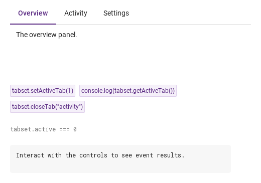
05 setActiveTab · getActiveTab · closeTab

setActiveTab(index) makes the tab at that index active and emits selected and tabSelected; it is ignored when the index is out of range or the tab is disabled.

Qt capture · image
setActiveTab · getActiveTab · closeTab · Default
QML code
import QtQuick
import Syidax.Core

Item {
    component EventLog: Rectangle {
        id: logBox
        property var lines: []
        implicitWidth: 440
        implicitHeight: Math.max(56, logText.implicitHeight + 24)
        radius: 4; color: Theme.semantic.backgroundBold
        function log(value) { lines = lines.slice(-3).concat([String(value)]) }
        Text {
            id: logText; x: 12; y: 12; width: parent.width - 24
            text: logBox.lines.length ? logBox.lines.join("\n") : "Interact with the controls to see event results."
            wrapMode: Text.Wrap; color: Theme.semantic.textDefault
            font.family: Theme.monoFontFamily; font.pixelSize: 12
        }
    }

    implicitWidth: Math.max(360, childrenRect.width)
    implicitHeight: childrenRect.height
    // Focused Gallery routes: keep only the selected API and its prerequisites.
    id: featureStory

    Column {
        spacing: 24
        SyTabGroup {
            id: tabset
            width: 480; height: 140
            SyTab { tabkey: "overview"; text: "Overview" }
            SyTab { tabkey: "activity"; text: "Activity" }
            SyTab { tabkey: "settings"; text: "Settings" }
            SyTabContent { name: "overview"; Text { text: "The overview panel."; padding: 12; font.family: Theme.fontFamily; font.pixelSize: 14; color: Theme.semantic.textDefault } }
            SyTabContent { name: "activity"; Text { text: "The activity panel."; padding: 12; font.family: Theme.fontFamily; font.pixelSize: 14; color: Theme.semantic.textDefault } }
            SyTabContent { name: "settings"; Text { text: "The settings panel."; padding: 12; font.family: Theme.fontFamily; font.pixelSize: 14; color: Theme.semantic.textDefault } }
        }
        Flow {
            width: 480
            spacing: 8
            SyButton { id: exampleControl1;  visible: true; text: "tabset.setActiveTab(1)"; variant: "secondary"; size: "small"; onClicked: tabset.setActiveTab(1) }
            SyButton { id: exampleControl2;  visible: true; text: "console.log(tabset.getActiveTab())"; variant: "secondary"; size: "small"; onClicked: output.log(tabset.getActiveTab()) }
            SyButton { id: exampleControl3;  visible: true; text: "tabset.closeTab(\"activity\")"; variant: "secondary"; size: "small"; onClicked: tabset.closeTab("activity") }
        }
        Text {
            text: "tabset.active === " + tabset.active
            font.family: Theme.monoFontFamily
            font.pixelSize: 12
            color: Theme.semantic.textSubtle
        }
        EventLog { id: output }
    }
}

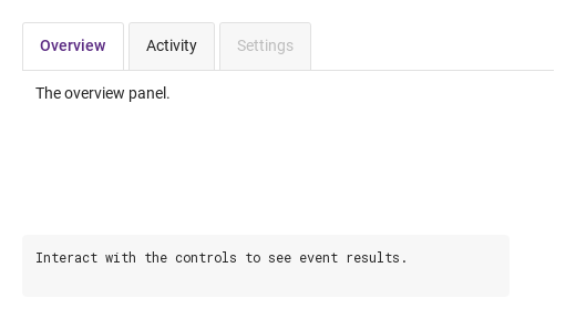
06 Card tabs

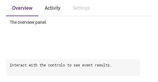
Card tabs, configured with type.

Qt capture · image
Card tabs · Result
Default execution
QML code
import QtQuick
import Syidax.Core

Item {
    component EventLog: Rectangle {
        id: logBox
        property var lines: []
        implicitWidth: 440
        implicitHeight: Math.max(56, logText.implicitHeight + 24)
        radius: 4; color: Theme.semantic.backgroundBold
        function log(value) { lines = lines.slice(-3).concat([String(value)]) }
        Text {
            id: logText; x: 12; y: 12; width: parent.width - 24
            text: logBox.lines.length ? logBox.lines.join("\n") : "Interact with the controls to see event results."
            wrapMode: Text.Wrap; color: Theme.semantic.textDefault
            font.family: Theme.monoFontFamily; font.pixelSize: 12
        }
    }

    implicitWidth: Math.max(360, childrenRect.width)
    implicitHeight: childrenRect.height

    property QtObject settings: QtObject {
        id: storyArgs
        property string type: "card"
        property string size: "medium"
        property string position: "top"
        property string align: "left"
        property string padding: "none"
        property bool disabled: false
        property bool addNewTab: false
    }

    readonly property string members: [
        "SyTab { tabkey: \"overview\"; text: " + JSON.stringify("Overview") + " }",
        "SyTab { tabkey: \"activity\"; text: " + JSON.stringify("Activity") + " }",
        "SyTab { tabkey: \"settings\"; text: " + JSON.stringify("Settings") + "; disabled: true }",
        "SyTabContent { name: \"overview\"; Text { text: " + JSON.stringify("The overview panel.") + " } }",
        "SyTabContent { name: \"activity\"; Text { text: " + JSON.stringify("The activity panel.") + " } }",
        "SyTabContent { name: \"settings\"; Text { text: " + JSON.stringify("The settings panel.") + " } }"
    ].join("\n")

    Column {
        spacing: 12
        SyTabGroup {
            width: 480
            height: 180
            type: storyArgs.type
            size: storyArgs.size
            position: storyArgs.position
            align: storyArgs.align
            padding: storyArgs.padding
            disabled: storyArgs.disabled
            addNewTab: storyArgs.addNewTab
            onSelected: (detail) => output.log(detail.tabkey)
            SyTab { tabkey: "overview"; text: "Overview" }
            SyTab { tabkey: "activity"; text: "Activity" }
            SyTab { tabkey: "settings"; text: "Settings"; disabled: true }
            SyTabContent { name: "overview"; Text { text: "The overview panel."; padding: 12; font.family: Theme.fontFamily; font.pixelSize: 14; color: Theme.semantic.textDefault } }
            SyTabContent { name: "activity"; Text { text: "The activity panel."; padding: 12; font.family: Theme.fontFamily; font.pixelSize: 14; color: Theme.semantic.textDefault } }
            SyTabContent { name: "settings"; Text { text: "The settings panel."; padding: 12; font.family: Theme.fontFamily; font.pixelSize: 14; color: Theme.semantic.textDefault } }
        }
        EventLog { id: output }
    }

}

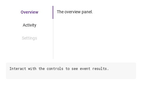
07 Vertical tabs

Vertical tabs, configured with position.

Qt capture · image
Vertical tabs · Result
Default execution
QML code
import QtQuick
import Syidax.Core

Item {
    component EventLog: Rectangle {
        id: logBox
        property var lines: []
        implicitWidth: 440
        implicitHeight: Math.max(56, logText.implicitHeight + 24)
        radius: 4; color: Theme.semantic.backgroundBold
        function log(value) { lines = lines.slice(-3).concat([String(value)]) }
        Text {
            id: logText; x: 12; y: 12; width: parent.width - 24
            text: logBox.lines.length ? logBox.lines.join("\n") : "Interact with the controls to see event results."
            wrapMode: Text.Wrap; color: Theme.semantic.textDefault
            font.family: Theme.monoFontFamily; font.pixelSize: 12
        }
    }

    implicitWidth: Math.max(360, childrenRect.width)
    implicitHeight: childrenRect.height

    property QtObject settings: QtObject {
        id: storyArgs
        property string type: "line"
        property string size: "medium"
        property string position: "left"
        property string align: "left"
        property string padding: "none"
        property bool disabled: false
        property bool addNewTab: false
    }

    readonly property string members: [
        "SyTab { tabkey: \"overview\"; text: " + JSON.stringify("Overview") + " }",
        "SyTab { tabkey: \"activity\"; text: " + JSON.stringify("Activity") + " }",
        "SyTab { tabkey: \"settings\"; text: " + JSON.stringify("Settings") + "; disabled: true }",
        "SyTabContent { name: \"overview\"; Text { text: " + JSON.stringify("The overview panel.") + " } }",
        "SyTabContent { name: \"activity\"; Text { text: " + JSON.stringify("The activity panel.") + " } }",
        "SyTabContent { name: \"settings\"; Text { text: " + JSON.stringify("The settings panel.") + " } }"
    ].join("\n")

    Column {
        spacing: 12
        SyTabGroup {
            width: 480
            height: 180
            type: storyArgs.type
            size: storyArgs.size
            position: storyArgs.position
            align: storyArgs.align
            padding: storyArgs.padding
            disabled: storyArgs.disabled
            addNewTab: storyArgs.addNewTab
            onSelected: (detail) => output.log(detail.tabkey)
            SyTab { tabkey: "overview"; text: "Overview" }
            SyTab { tabkey: "activity"; text: "Activity" }
            SyTab { tabkey: "settings"; text: "Settings"; disabled: true }
            SyTabContent { name: "overview"; Text { text: "The overview panel."; padding: 12; font.family: Theme.fontFamily; font.pixelSize: 14; color: Theme.semantic.textDefault } }
            SyTabContent { name: "activity"; Text { text: "The activity panel."; padding: 12; font.family: Theme.fontFamily; font.pixelSize: 14; color: Theme.semantic.textDefault } }
            SyTabContent { name: "settings"; Text { text: "The settings panel."; padding: 12; font.family: Theme.fontFamily; font.pixelSize: 14; color: Theme.semantic.textDefault } }
        }
        EventLog { id: output }
    }

}

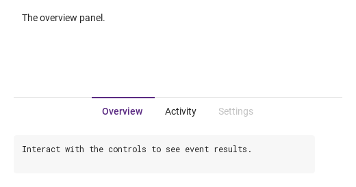
08 Bottom-centered tabs

Bottom-centered tabs, configured with position, align.

Qt capture · image
Bottom-centered tabs · Result
Default execution
QML code
import QtQuick
import Syidax.Core

Item {
    component EventLog: Rectangle {
        id: logBox
        property var lines: []
        implicitWidth: 440
        implicitHeight: Math.max(56, logText.implicitHeight + 24)
        radius: 4; color: Theme.semantic.backgroundBold
        function log(value) { lines = lines.slice(-3).concat([String(value)]) }
        Text {
            id: logText; x: 12; y: 12; width: parent.width - 24
            text: logBox.lines.length ? logBox.lines.join("\n") : "Interact with the controls to see event results."
            wrapMode: Text.Wrap; color: Theme.semantic.textDefault
            font.family: Theme.monoFontFamily; font.pixelSize: 12
        }
    }

    implicitWidth: Math.max(360, childrenRect.width)
    implicitHeight: childrenRect.height

    property QtObject settings: QtObject {
        id: storyArgs
        property string type: "line"
        property string size: "medium"
        property string position: "bottom"
        property string align: "center"
        property string padding: "none"
        property bool disabled: false
        property bool addNewTab: false
    }

    readonly property string members: [
        "SyTab { tabkey: \"overview\"; text: " + JSON.stringify("Overview") + " }",
        "SyTab { tabkey: \"activity\"; text: " + JSON.stringify("Activity") + " }",
        "SyTab { tabkey: \"settings\"; text: " + JSON.stringify("Settings") + "; disabled: true }",
        "SyTabContent { name: \"overview\"; Text { text: " + JSON.stringify("The overview panel.") + " } }",
        "SyTabContent { name: \"activity\"; Text { text: " + JSON.stringify("The activity panel.") + " } }",
        "SyTabContent { name: \"settings\"; Text { text: " + JSON.stringify("The settings panel.") + " } }"
    ].join("\n")

    Column {
        spacing: 12
        SyTabGroup {
            width: 480
            height: 180
            type: storyArgs.type
            size: storyArgs.size
            position: storyArgs.position
            align: storyArgs.align
            padding: storyArgs.padding
            disabled: storyArgs.disabled
            addNewTab: storyArgs.addNewTab
            onSelected: (detail) => output.log(detail.tabkey)
            SyTab { tabkey: "overview"; text: "Overview" }
            SyTab { tabkey: "activity"; text: "Activity" }
            SyTab { tabkey: "settings"; text: "Settings"; disabled: true }
            SyTabContent { name: "overview"; Text { text: "The overview panel."; padding: 12; font.family: Theme.fontFamily; font.pixelSize: 14; color: Theme.semantic.textDefault } }
            SyTabContent { name: "activity"; Text { text: "The activity panel."; padding: 12; font.family: Theme.fontFamily; font.pixelSize: 14; color: Theme.semantic.textDefault } }
            SyTabContent { name: "settings"; Text { text: "The settings panel."; padding: 12; font.family: Theme.fontFamily; font.pixelSize: 14; color: Theme.semantic.textDefault } }
        }
        EventLog { id: output }
    }

}

09 Add tab action

Add tab action, configured with addNewTab.

Qt capture · image
Add tab action · Result
Default execution
QML code
import QtQuick
import Syidax.Core

Item {
    component EventLog: Rectangle {
        id: logBox
        property var lines: []
        implicitWidth: 440
        implicitHeight: Math.max(56, logText.implicitHeight + 24)
        radius: 4; color: Theme.semantic.backgroundBold
        function log(value) { lines = lines.slice(-3).concat([String(value)]) }
        Text {
            id: logText; x: 12; y: 12; width: parent.width - 24
            text: logBox.lines.length ? logBox.lines.join("\n") : "Interact with the controls to see event results."
            wrapMode: Text.Wrap; color: Theme.semantic.textDefault
            font.family: Theme.monoFontFamily; font.pixelSize: 12
        }
    }

    implicitWidth: Math.max(360, childrenRect.width)
    implicitHeight: childrenRect.height

    property QtObject settings: QtObject {
        id: storyArgs
        property string type: "line"
        property string size: "medium"
        property string position: "top"
        property string align: "left"
        property string padding: "none"
        property bool disabled: false
        property bool addNewTab: true
    }

    readonly property string members: [
        "SyTab { tabkey: \"overview\"; text: " + JSON.stringify("Overview") + " }",
        "SyTab { tabkey: \"activity\"; text: " + JSON.stringify("Activity") + " }",
        "SyTab { tabkey: \"settings\"; text: " + JSON.stringify("Settings") + "; disabled: true }",
        "SyTabContent { name: \"overview\"; Text { text: " + JSON.stringify("The overview panel.") + " } }",
        "SyTabContent { name: \"activity\"; Text { text: " + JSON.stringify("The activity panel.") + " } }",
        "SyTabContent { name: \"settings\"; Text { text: " + JSON.stringify("The settings panel.") + " } }"
    ].join("\n")

    Column {
        spacing: 12
        SyTabGroup {
            width: 480
            height: 180
            type: storyArgs.type
            size: storyArgs.size
            position: storyArgs.position
            align: storyArgs.align
            padding: storyArgs.padding
            disabled: storyArgs.disabled
            addNewTab: storyArgs.addNewTab
            onSelected: (detail) => output.log(detail.tabkey)
            SyTab { tabkey: "overview"; text: "Overview" }
            SyTab { tabkey: "activity"; text: "Activity" }
            SyTab { tabkey: "settings"; text: "Settings"; disabled: true }
            SyTabContent { name: "overview"; Text { text: "The overview panel."; padding: 12; font.family: Theme.fontFamily; font.pixelSize: 14; color: Theme.semantic.textDefault } }
            SyTabContent { name: "activity"; Text { text: "The activity panel."; padding: 12; font.family: Theme.fontFamily; font.pixelSize: 14; color: Theme.semantic.textDefault } }
            SyTabContent { name: "settings"; Text { text: "The settings panel."; padding: 12; font.family: Theme.fontFamily; font.pixelSize: 14; color: Theme.semantic.textDefault } }
        }
        EventLog { id: output }
    }

}

10 Disabled tabs

Disabled tabs, configured with disabled.

Qt capture · image
Disabled tabs · Result
Default execution
QML code
import QtQuick
import Syidax.Core

Item {
    component EventLog: Rectangle {
        id: logBox
        property var lines: []
        implicitWidth: 440
        implicitHeight: Math.max(56, logText.implicitHeight + 24)
        radius: 4; color: Theme.semantic.backgroundBold
        function log(value) { lines = lines.slice(-3).concat([String(value)]) }
        Text {
            id: logText; x: 12; y: 12; width: parent.width - 24
            text: logBox.lines.length ? logBox.lines.join("\n") : "Interact with the controls to see event results."
            wrapMode: Text.Wrap; color: Theme.semantic.textDefault
            font.family: Theme.monoFontFamily; font.pixelSize: 12
        }
    }

    implicitWidth: Math.max(360, childrenRect.width)
    implicitHeight: childrenRect.height

    property QtObject settings: QtObject {
        id: storyArgs
        property string type: "line"
        property string size: "medium"
        property string position: "top"
        property string align: "left"
        property string padding: "none"
        property bool disabled: true
        property bool addNewTab: false
    }

    readonly property string members: [
        "SyTab { tabkey: \"overview\"; text: " + JSON.stringify("Overview") + " }",
        "SyTab { tabkey: \"activity\"; text: " + JSON.stringify("Activity") + " }",
        "SyTab { tabkey: \"settings\"; text: " + JSON.stringify("Settings") + "; disabled: true }",
        "SyTabContent { name: \"overview\"; Text { text: " + JSON.stringify("The overview panel.") + " } }",
        "SyTabContent { name: \"activity\"; Text { text: " + JSON.stringify("The activity panel.") + " } }",
        "SyTabContent { name: \"settings\"; Text { text: " + JSON.stringify("The settings panel.") + " } }"
    ].join("\n")

    Column {
        spacing: 12
        SyTabGroup {
            width: 480
            height: 180
            type: storyArgs.type
            size: storyArgs.size
            position: storyArgs.position
            align: storyArgs.align
            padding: storyArgs.padding
            disabled: storyArgs.disabled
            addNewTab: storyArgs.addNewTab
            onSelected: (detail) => output.log(detail.tabkey)
            SyTab { tabkey: "overview"; text: "Overview" }
            SyTab { tabkey: "activity"; text: "Activity" }
            SyTab { tabkey: "settings"; text: "Settings"; disabled: true }
            SyTabContent { name: "overview"; Text { text: "The overview panel."; padding: 12; font.family: Theme.fontFamily; font.pixelSize: 14; color: Theme.semantic.textDefault } }
            SyTabContent { name: "activity"; Text { text: "The activity panel."; padding: 12; font.family: Theme.fontFamily; font.pixelSize: 14; color: Theme.semantic.textDefault } }
            SyTabContent { name: "settings"; Text { text: "The settings panel."; padding: 12; font.family: Theme.fontFamily; font.pixelSize: 14; color: Theme.semantic.textDefault } }
        }
        EventLog { id: output }
    }

}

11 Large tab controls

Large tab controls, configured with size.

Qt capture · image
Large tab controls · Result
Default execution
QML code
import QtQuick
import Syidax.Core

Item {
    component EventLog: Rectangle {
        id: logBox
        property var lines: []
        implicitWidth: 440
        implicitHeight: Math.max(56, logText.implicitHeight + 24)
        radius: 4; color: Theme.semantic.backgroundBold
        function log(value) { lines = lines.slice(-3).concat([String(value)]) }
        Text {
            id: logText; x: 12; y: 12; width: parent.width - 24
            text: logBox.lines.length ? logBox.lines.join("\n") : "Interact with the controls to see event results."
            wrapMode: Text.Wrap; color: Theme.semantic.textDefault
            font.family: Theme.monoFontFamily; font.pixelSize: 12
        }
    }

    implicitWidth: Math.max(360, childrenRect.width)
    implicitHeight: childrenRect.height

    property QtObject settings: QtObject {
        id: storyArgs
        property string type: "line"
        property string size: "large"
        property string position: "top"
        property string align: "left"
        property string padding: "none"
        property bool disabled: false
        property bool addNewTab: false
    }

    readonly property string members: [
        "SyTab { tabkey: \"overview\"; text: " + JSON.stringify("Overview") + " }",
        "SyTab { tabkey: \"activity\"; text: " + JSON.stringify("Activity") + " }",
        "SyTab { tabkey: \"settings\"; text: " + JSON.stringify("Settings") + "; disabled: true }",
        "SyTabContent { name: \"overview\"; Text { text: " + JSON.stringify("The overview panel.") + " } }",
        "SyTabContent { name: \"activity\"; Text { text: " + JSON.stringify("The activity panel.") + " } }",
        "SyTabContent { name: \"settings\"; Text { text: " + JSON.stringify("The settings panel.") + " } }"
    ].join("\n")

    Column {
        spacing: 12
        SyTabGroup {
            width: 480
            height: 180
            type: storyArgs.type
            size: storyArgs.size
            position: storyArgs.position
            align: storyArgs.align
            padding: storyArgs.padding
            disabled: storyArgs.disabled
            addNewTab: storyArgs.addNewTab
            onSelected: (detail) => output.log(detail.tabkey)
            SyTab { tabkey: "overview"; text: "Overview" }
            SyTab { tabkey: "activity"; text: "Activity" }
            SyTab { tabkey: "settings"; text: "Settings"; disabled: true }
            SyTabContent { name: "overview"; Text { text: "The overview panel."; padding: 12; font.family: Theme.fontFamily; font.pixelSize: 14; color: Theme.semantic.textDefault } }
            SyTabContent { name: "activity"; Text { text: "The activity panel."; padding: 12; font.family: Theme.fontFamily; font.pixelSize: 14; color: Theme.semantic.textDefault } }
            SyTabContent { name: "settings"; Text { text: "The settings panel."; padding: 12; font.family: Theme.fontFamily; font.pixelSize: 14; color: Theme.semantic.textDefault } }
        }
        EventLog { id: output }
    }

}

12 Padded tab content

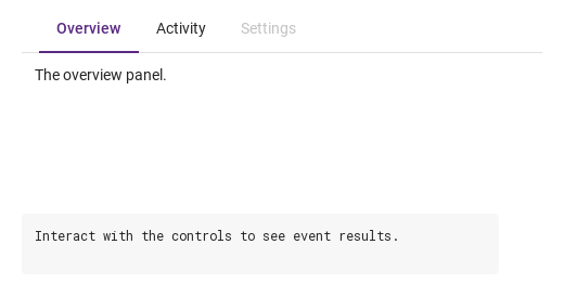
Padded tab content, configured with padding.

Qt capture · image
Padded tab content · Result
Default execution
QML code
import QtQuick
import Syidax.Core

Item {
    component EventLog: Rectangle {
        id: logBox
        property var lines: []
        implicitWidth: 440
        implicitHeight: Math.max(56, logText.implicitHeight + 24)
        radius: 4; color: Theme.semantic.backgroundBold
        function log(value) { lines = lines.slice(-3).concat([String(value)]) }
        Text {
            id: logText; x: 12; y: 12; width: parent.width - 24
            text: logBox.lines.length ? logBox.lines.join("\n") : "Interact with the controls to see event results."
            wrapMode: Text.Wrap; color: Theme.semantic.textDefault
            font.family: Theme.monoFontFamily; font.pixelSize: 12
        }
    }

    implicitWidth: Math.max(360, childrenRect.width)
    implicitHeight: childrenRect.height

    property QtObject settings: QtObject {
        id: storyArgs
        property string type: "line"
        property string size: "medium"
        property string position: "top"
        property string align: "left"
        property string padding: "large"
        property bool disabled: false
        property bool addNewTab: false
    }

    readonly property string members: [
        "SyTab { tabkey: \"overview\"; text: " + JSON.stringify("Overview") + " }",
        "SyTab { tabkey: \"activity\"; text: " + JSON.stringify("Activity") + " }",
        "SyTab { tabkey: \"settings\"; text: " + JSON.stringify("Settings") + "; disabled: true }",
        "SyTabContent { name: \"overview\"; Text { text: " + JSON.stringify("The overview panel.") + " } }",
        "SyTabContent { name: \"activity\"; Text { text: " + JSON.stringify("The activity panel.") + " } }",
        "SyTabContent { name: \"settings\"; Text { text: " + JSON.stringify("The settings panel.") + " } }"
    ].join("\n")

    Column {
        spacing: 12
        SyTabGroup {
            width: 480
            height: 180
            type: storyArgs.type
            size: storyArgs.size
            position: storyArgs.position
            align: storyArgs.align
            padding: storyArgs.padding
            disabled: storyArgs.disabled
            addNewTab: storyArgs.addNewTab
            onSelected: (detail) => output.log(detail.tabkey)
            SyTab { tabkey: "overview"; text: "Overview" }
            SyTab { tabkey: "activity"; text: "Activity" }
            SyTab { tabkey: "settings"; text: "Settings"; disabled: true }
            SyTabContent { name: "overview"; Text { text: "The overview panel."; padding: 12; font.family: Theme.fontFamily; font.pixelSize: 14; color: Theme.semantic.textDefault } }
            SyTabContent { name: "activity"; Text { text: "The activity panel."; padding: 12; font.family: Theme.fontFamily; font.pixelSize: 14; color: Theme.semantic.textDefault } }
            SyTabContent { name: "settings"; Text { text: "The settings panel."; padding: 12; font.family: Theme.fontFamily; font.pixelSize: 14; color: Theme.semantic.textDefault } }
        }
        EventLog { id: output }
    }

}

API 88

Hover or select an item for its QML example and copy button.

Properties · SyTabGroup

PropertyTypeDefaultDescription
list (default property)—The SyTab headers and SyTabContent panels declared inside, in order
list—Items placed at the right end of the strip (horizontal only)
intfirst enabledThe active header's index; set it to switch silently, read it to know. −1 when no header is enabled
string"line"line (2 px marker) · card (bordered cards)
string"medium"Header height and text: small 36 / 12 px · medium 44 / 14 px · large 52 / 16 px
string"top"The strip's side: top · bottom · left · right (left / right: a 160 px rail, no folding)
string"left"left · center — centering applies while every header fits
string"none"Space before the first header: none 0 · small 8 · medium 12 · large 16 px
boolfalseEvery header and the + button inert
boolfalseA 28 px + button after extra that emits tabAdded()
boolfalseHeaders can be dragged along the strip to reorder them (not while the group is disabled); ordered fires on release
var[]The collected headers
var[]panels, in order (maintained by the group)
var[]The headers currently folded into the ⋯ list
var (read-only)[]The tabkeys in the order set by a drag or reorder(), kept across re-collects ([] = declaration order; maintained by the group)
read-only—position is left / right · 160 · the header height in px · the padding in px

Properties · SyTab

PropertyTypeDefaultDescription
list (default property)—Items placed after the text (before the ×)
string""The header's key; its panel is the SyTabContent with the same name
string""The label (hidden when empty)
boolfalseAn × after the text that closes the tab
boolfalseThe × only reports closed; the tab stays until setClose(true) / closeTab()
boolfalseGreyed, inert; never the default active tab
bool · int · string—Set by the group: whether this header is active, its index, and the group's look
bool (read-only)—disabled on the header or on the group
bool (read-only)—Pointer over the header
bool (read-only)—keyboard focus
varnullThe owning group (set by the group)

Properties · SyTabContent

PropertyTypeDefaultDescription
list (default property)—The panel's items
string""Pairs the panel with the SyTab whose tabkey equals it
boolfalseSet by the group: the panel is the visible one
boolfalseThe panel is dimmed to 50 % and its items ignore input

Additional properties

NameType / defaultDescription
Tab-strip width in logical pixels. Reduce it to move excess tabs into overflow.

Methods

MethodDescription
Activates the header at index and emits selected + tabSelected; ignored for an unknown index or a disabled header
Returns active (int)
Finds the header by tabkey (string) or index (number) and calls its setClose(true): reports and removes it, even with manualClose or disabled. Unknown: nothing
Moves the header at from to to (indices in tabs), re-indexes the headers, keeps active on the same header and emits ordered; ignored when an index is out of range or from equals to
What a click does: activates the tab and reports. Ignored while disabled
Emits closed; removes the tab unless manualClose without force. Without force a disabled tab does nothing

Signals

SignalArgumentsWhen
detail: { tabkey, index }A header became active by a click, Space / Enter, the arrow keys, the ⋯ list or setActiveTab(). Not when active is set from a binding
detail: { index, value }Same moment, right after selected; value is the tabkey
detail: { tabkey, index }A tab's × was clicked (enabled tab), or setClose() / closeTab() ran — also under manualClose, where the tab stays
detail: { index, value }Same moment, right after closed
—The + button was clicked (addNewTab); not while the group is disabled
tabsA drag (isDraggable) was released after headers swapped places, or reorder() ran; tabs holds the new order
detail: { tabkey, index }The header's own signals, just before the group's

Behavior

ItemBehavior / conditions
The active header's index; set it to switch silently, read it to know. −1 when no header is enabled
active is an index into the headers in declaration order. It starts at the first enabled header (or −1 when none is enabled); an active that points past the end or at a disabled header is replaced by the first enabled one when the group collects its children. A click, Space or Enter on an enabled header, Left / Right (or Up / Down) on a focused header, a pick in the ⋯ list, or setActiveTab(index) makes a header active and emits selected({ tabkey, index }) then tabSelected({ index, value }). Setting active from a binding switches silently. The panel whose name equals the active header's tabkey is visible; the others are hidden. The × calls setClose(false): the tab emits closed({ tabkey, index }); then, unless manualClose, the group removes the header and its panel, re-indexes the remaining headers, clamps active to the last index (the header now at that index is active) and emits closed and tabClosed({ index, value }).
Activates the header at index and emits selected + tabSelected; ignored for an unknown index or a disabled header
A header became active by a click, Space / Enter, the arrow keys, the ⋯ list or setActiveTab(). Not when active is set from a binding
Same moment, right after selected; value is the tabkey
Pairs the panel with the SyTab whose tabkey equals it
The header's key; its panel is the SyTabContent with the same name
The label (hidden when empty)
An × after the text that closes the tab
Header height and text: small 36 / 12 px · medium 44 / 14 px · large 52 / 16 px
line (2 px marker) · card (bordered cards)
type: "line" draws a 2 px marker on the content side of the active header and a 1 px rule along the strip; type: "card" draws every header as a bordered card, rounded on the outer side, 4 px apart.
Space before the first header: none 0 · small 8 · medium 12 · large 16 px
Items placed at the right end of the strip (horizontal only)
A 28 px + button after extra that emits tabAdded()
The + button was clicked (addNewTab); not while the group is disabled
The headers currently folded into the ⋯ list
left · center — centering applies while every header fits
Headers can be dragged along the strip to reorder them (not while the group is disabled); ordered fires on release
A drag (isDraggable) was released after headers swapped places, or reorder() ran; tabs holds the new order
Moves the header at from to to (indices in tabs), re-indexes the headers, keeps active on the same header and emits ordered; ignored when an index is out of range or from equals to
With isDraggable: true (and the group not disabled) a header can be dragged along the strip: crossing a neighbour's middle swaps the two, and ordered(tabs) fires once on release with the headers in the new order. reorder(from, to) (indices in tabs) moves a header from code and emits ordered too. type, size and position changes re-collect the headers; tabs and contents are rebuilt then (in the order tabOrder remembers when headers were reordered).
The tabkeys in the order set by a drag or reorder(), kept across re-collects ([] = declaration order; maintained by the group)
Emits closed; removes the tab unless manualClose without force. Without force a disabled tab does nothing
The × calls setClose(false): the tab emits closed({ tabkey, index }); then, unless manualClose, the group removes the header and its panel, re-indexes the remaining headers, clamps active to the last index (the header now at that index is active) and emits closed and tabClosed({ index, value }).
The × only reports closed; the tab stays until setClose(true) / closeTab()
Same moment, right after closed
Finds the header by tabkey (string) or index (number) and calls its setClose(true): reports and removes it, even with manualClose or disabled. Unknown: nothing
Every header and the + button inert
Tab-strip width in logical pixels. Reduce it to move excess tabs into overflow.
Give the group a width and a height (its implicit size is 480 × strip + panels).
Tab reaches the enabled headers. On a focused header Left / Up go to the previous enabled header, Right / Down to the next (wrapping; the move activates it), Space / Enter select it.
The strip's side: top · bottom · left · right (left / right: a 160 px rail, no folding)
type, size and position changes re-collect the headers; tabs and contents are rebuilt then (in the order tabOrder remembers when headers were reordered).

Keyboard

ItemBehavior / conditions
SyGlobalHeader hosts SyTab headers in the app bar; SyCollapse folds sections in place; SyNav moves between screens.