Run with --diagnose --json to check your Qt version, import path, fonts, runtime and license. No license token is printed.
The Gallery evaluation app is available now. Paid SDK sales and downloads are coming soon. The installation examples above preview the SDK workflow.
Tested Windows configurations
Native window and example smoke checks cover the versions below. Qt 6.8 is a source minimum, not a promise of tested support for every Qt release. Gallery uses software rendering.
Two complete application examples
Step-by-step captures from the running Windows applications. Play, pause and inspect each state.
Workbench: mark a task done, save changes and see release progress update.Record Manager: preserve a failed save, retry, search and confirm before deleting.
See the components in context
RibbonPanelFormTableTreeTheme
TRY IT YOURSELF
The native Gallery
Browse examples, inspect properties and switch between light and dark themes in a Windows application. The Gallery is for evaluation; commercial SDK access is separate.
The --qml path must contain the Syidax folder. Python uses qml-pure. Run from the unzipped SDK, independently of the source repository.
License is inactive or frozen
Download your QML Core certificate and pass it with --license. Web Core, Chart and Grid certificates do not activate QML. Monthly use ends at expiry. Annual licenses retain only releases covered by their update period.
Qt or plugin mismatch
Check the Qt version and architecture used to build plugins. Do not mix Python Qt bindings. qml-pure removes the compiled plugin ABI dependency.
PDF or icons missing
PDF requires the optional QtQuick.Pdf module. Other Core components remain usable without it. For icon packs and resource paths, read SDK docs/ICON-PACKS.md.
Save failure or corrupt settings
Examples write only to their application-data folder. Check permissions and disk space. Invalid JSON is backed up before reset. A failed save preserves your draft.
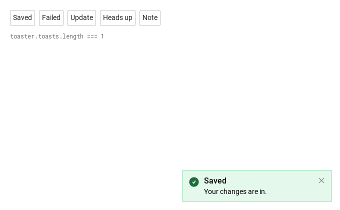
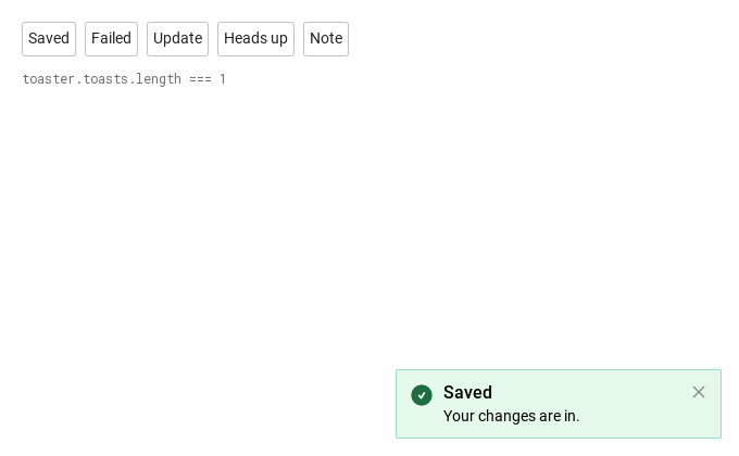
SyToastItem is the card itself, declared by hand instead of made by a host: open: true shows it as soon as it is created and open: false (or close()) dismisses it.
Qt capture · image
Default execution
QML code
import QtQuick
import Syidax.Core

Item {
    implicitWidth: Math.max(360, childrenRect.width)
    implicitHeight: childrenRect.height
    // Focused Gallery routes: keep only the selected API and its prerequisites.
    id: featureStory

    Column {
        spacing: 12
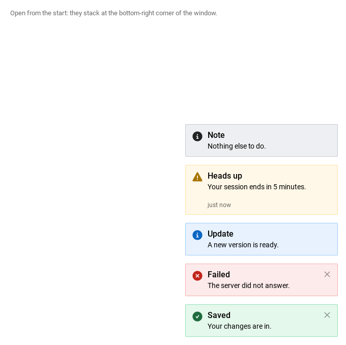
        SyToastItem { id: featureTarget0; visible: true; open: true; variant: "success"; title: "Saved"; message: "Your changes are in."; closable: true }
        SyToastItem { id: featureTarget1; visible: true; open: true; variant: "error"; title: "Failed"; message: "The server did not answer."; closable: true }
        SyToastItem { id: featureTarget2; visible: true; open: true; variant: "info"; title: "Update"; message: "A new version is ready." }
        SyToastItem { id: featureTarget3; visible: true; open: true; variant: "warning"; title: "Heads up"; message: "Your session ends in 5 minutes."; footer: Text { text: "just now"; font.family: Theme.fontFamily; font.pixelSize: 12; color: Theme.toast.timestampTextEnabled } }
        SyToastItem { id: featureTarget4; visible: true; open: true; variant: "neutral"; title: "Note"; message: "Nothing else to do."; icon: SyIcon { source: Icons.toastInfo; size: "xxlarge"; anchors.centerIn: parent } }
        Text {
            text: "Open from the start: they stack at the bottom-right corner of the window."
            font.family: Theme.fontFamily
            font.pixelSize: 13
            color: Theme.semantic.textSubtle
        }
    }
}
03 created · closed
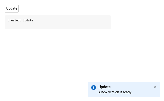
Two signals, on two types.
Qt capture · image
QML code
import QtQuick
import Syidax.Core

Item {
    component EventLog: Rectangle {
        id: logBox
        property var lines: []
        implicitWidth: 440
        implicitHeight: Math.max(56, logText.implicitHeight + 24)
        radius: 4; color: Theme.semantic.backgroundBold
        function log(value) { lines = lines.slice(-3).concat([String(value)]) }
        Text {
            id: logText; x: 12; y: 12; width: parent.width - 24
            text: logBox.lines.length ? logBox.lines.join("\n") : "Interact with the controls to see event results."
            wrapMode: Text.Wrap; color: Theme.semantic.textDefault
            font.family: Theme.monoFontFamily; font.pixelSize: 12
        }
    }

    implicitWidth: Math.max(360, childrenRect.width)
    implicitHeight: childrenRect.height
    // Focused Gallery routes: keep only the selected API and its prerequisites.
    id: featureStory


    Column {
        spacing: 12
        SyToast {
            id: toaster
            duration: 2000
            onCreated: (item) => { if (true) { {
                output.log(("created: %1").arg(item.title))
                item.closed.connect(() => output.log(("closed: %1").arg(item.title)))
            } } }
        }
        SyButton { id: exampleControl1;  text: "Update"; onClicked: toaster.createInfoToast({ header: "Update", body: "A new version is ready.", closable: true }) }
        EventLog { id: output }
    }
}
Milliseconds until it closes itself; 0 = stays. Paused while hovered, restarted in full on leave.
bool
false
Newest nearest the corner — applies to the whole corner once any item there sets it.
string
"none"
Entrance animation and speed (see Behavior).
string
"fast"
Entrance animation and speed (see Behavior).
bool
false
Destroy the item after it closes; SyToast sets it on made toasts.
real
0
Distance from the corner along the edge; written by ToastStack.
bool (read-only)
—
The card is on screen (true from present until the exit finished).
real (read-only)
—
The card's current height.
bool (read-only)
—
Which edges the corner touches.
bool (read-only)
—
Which edges the corner touches.
int (read-only)
—
The resolved animation duration (0 for "none" or reduced motion).
read-only
—
The theme colors and icon for variant.
read-only
—
The theme colors and icon for variant.
read-only
—
The theme colors and icon for variant.
read-only
—
The theme colors and icon for variant.
read-only
—
The theme colors and icon for variant.
Properties · ToastStack (singleton)
Property
Type
Default
Description
var
[]
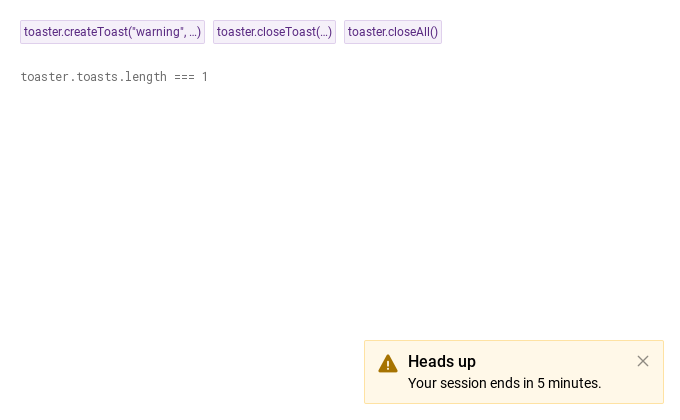
Every open SyToastItem in the window, from every host and hand-declared, in show order.
Methods
Method
Description
Makes, shows and returns a SyToastItem. variant: "success" · "error" · "info" · "warning" · "neutral". option (all fields optional, may be omitted): header, body, footer (text), icon (url), position, closable, duration, animation, animationSpeed.
createToast with the variant filled in; same option, same return.
createToast with the variant filled in; same option, same return.
createToast with the variant filled in; same option, same return.
createToast with the variant filled in; same option, same return.
createToast with the variant filled in; same option, same return.
Closes that item (item.close()); null / undefined is ignored. Works for any SyToastItem, not only this host's.
Closes every open item this host made.
Set open to true / false.
Set open to true / false.
Register, unregister and re-stack; items call these themselves — you only need layout() after changing latestTop on open items.
Register, unregister and re-stack; items call these themselves — you only need layout() after changing latestTop on open items.
Register, unregister and re-stack; items call these themselves — you only need layout() after changing latestTop on open items.
Signals
Signal
Arguments
When
item: SyToastItem — the item just made
After a create*Toast call made and showed the item. Not for hand-declared items.
—
The card is gone: after the ×, the clock, close(), closeToast / closeAll or open = false, and after the exit fade. Not emitted if the item was never shown. A made item is destroyed right after.
Behavior
Item
Behavior / conditions
Makes, shows and returns a SyToastItem. variant: "success" · "error" · "info" · "warning" · "neutral". option (all fields optional, may be omitted): header, body, footer (text), icon (url), position, closable, duration, animation, animationSpeed.
The 16 px header line; hidden when empty.
The 14 px body; hidden when empty.
"bottomRight" · "bottomLeft" · "topRight" · "topLeft" — the corner.
Adds the × that calls close().
Milliseconds until it closes itself; 0 = stays. Paused while hovered, restarted in full on leave.
Making a toast — createToast(variant, option) creates a SyToastItem as a child of the host with title = option.header, message = option.body, position = option.position (or "bottomRight" — the host has no position default), closable = option.closable === true, duration / animation / animationSpeed from the option or else from the host, latestTop always from the host, and disposable: true.
Making a toast — createToast(variant, option) creates a SyToastItem as a child of the host with title = option.header, message = option.body, position = option.position (or "bottomRight" — the host has no position default), closable = option.closable === true, duration / animation / animationSpeed from the option or else from the host, latestTop always from the host, and disposable: true.
Newest nearest the corner — applies to the whole corner once any item there sets it.
Destroy the item after it closes; SyToast sets it on made toasts.
The made items still open, in creation order (newest last). Hand-declared items are not in it.
After a create*Toast call made and showed the item. Not for hand-declared items.
Closes that item (item.close()); null / undefined is ignored. Works for any SyToastItem, not only this host's.
Closes every open item this host made.
The card is gone: after the ×, the clock, close(), closeToast / closeAll or open = false, and after the exit fade. Not emitted if the item was never shown. A made item is destroyed right after.
true presents the card, false dismisses it.
open — on a SyToastItem, open: true presents the card and false dismisses it; show() / close() set it.
open — on a SyToastItem, open: true presents the card and false dismisses it; show() / close() set it.
a 300 px wide panel in the window overlay (above everything), 16 px from the two edges of its corner, offset along the edge by the stack. The item itself is invisible where it is declared, so positioners skip it.
Default duration (ms) of made toasts; 0 = they stay.
Items drawn in the 24 × 24 px icon box; the way to give a neutral toast an icon.
icon box · column (title 16 px medium, message 14 px, declared content, footer row with 16 px above it) · × — 12 px padding, 8 px between the parts; title and message wrap.
Keyboard
Item
Behavior / conditions
SyInlineMessage for feedback on one control, SyBannerMessage for a persistent page-wide notice, SyModal for messages that need an answer, SyIcon / Icons.toast* for custom icons.