Run with --diagnose --json to check your Qt version, import path, fonts, runtime and license. No license token is printed.
The Gallery evaluation app is available now. Paid SDK sales and downloads are coming soon. The installation examples above preview the SDK workflow.
Tested Windows configurations
Native window and example smoke checks cover the versions below. Qt 6.8 is a source minimum, not a promise of tested support for every Qt release. Gallery uses software rendering.
Two complete application examples
Step-by-step captures from the running Windows applications. Play, pause and inspect each state.
Workbench: mark a task done, save changes and see release progress update.Record Manager: preserve a failed save, retry, search and confirm before deleting.
See the components in context
RibbonPanelFormTableTreeTheme
TRY IT YOURSELF
The native Gallery
Browse examples, inspect properties and switch between light and dark themes in a Windows application. The Gallery is for evaluation; commercial SDK access is separate.
The --qml path must contain the Syidax folder. Python uses qml-pure. Run from the unzipped SDK, independently of the source repository.
License is inactive or frozen
Download your QML Core certificate and pass it with --license. Web Core, Chart and Grid certificates do not activate QML. Monthly use ends at expiry. Annual licenses retain only releases covered by their update period.
Qt or plugin mismatch
Check the Qt version and architecture used to build plugins. Do not mix Python Qt bindings. qml-pure removes the compiled plugin ABI dependency.
PDF or icons missing
PDF requires the optional QtQuick.Pdf module. Other Core components remain usable without it. For icon packs and resource paths, read SDK docs/ICON-PACKS.md.
Save failure or corrupt settings
Examples write only to their application-data folder. Check permissions and disk space. Invalid JSON is backed up before reset. A failed save preserves your draft.
Show a brief hint beside a control when it is hovered or focused.
import Syidax.Core.Tooltip
Supported QML types
Type
Definition / role
Brief contextual hint anchored to a target on hover or focus.
Learn by example
Previews are images of native Qt runs. Use the buttons below each image to view a result.
01 Basic composition
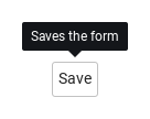
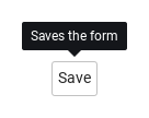
SyTooltip is a small dark label that floats next to the item it is declared in — declare it inside a button, an icon or a field and that item becomes its anchor.
import QtQuick
import Syidax.Core

Item {
    implicitWidth: Math.max(360, childrenRect.width)
    implicitHeight: childrenRect.height
    // Focused Gallery routes: keep only the selected API and its prerequisites.
    id: featureStory

    Row {
        spacing: 16
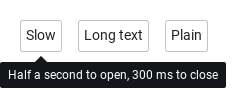
        SyButton { text: "Slow"; SyTooltip { id: featureTarget0; content: "Half a second to open, 300 ms to close"; opendelay: 500; closedelay: 300 } }
        SyButton { text: "Long text"; SyTooltip { id: featureTarget1; content: "The content of this area is being fetched. It stays readable until the spinner masks it."; maxWidth: 220 } }
        SyButton { text: "Plain"; SyTooltip { id: featureTarget2; content: "No arrow, fades in"; hideArrow: true; animation: "fade"; animationSpeed: "slow" } }
    }
}
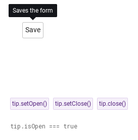
05 setOpen · setClose · close
setOpen() opens the tooltip and setClose() closes it from code, whatever the trigger — both cancel a pending delay timer, and setOpen() still refuses a disabled or readonly anchor.
The item it follows; resolved to the nearest ancestor with hovered within three levels.
bool (read-only)
—
The tooltip is visible.
string (read-only)
—
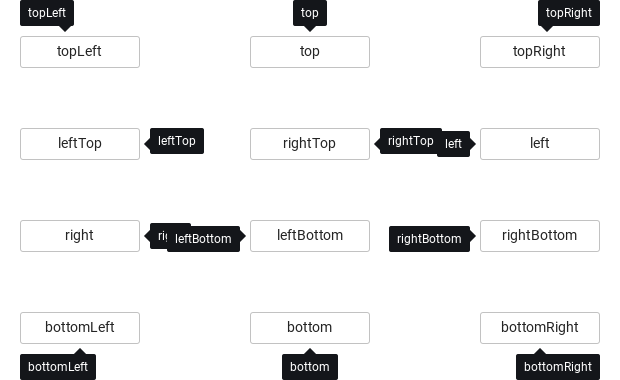
The side after flipping: top · bottom · left · right, optionally -start / -end.
bool
!hideArrow
The base popup's arrow switch; bound to hideArrow.
color
tooltip tokens
The surface look; override only for a custom style.
color
transparent
The surface look; override only for a custom style.
real
2
The surface look; override only for a custom style.
bool
false
The surface look; override only for a custom style.
real
10 / 4
Base popup geometry: distance to the anchor, side flipping, anchor-width matching.
bool
true
Base popup geometry: distance to the anchor, side flipping, anchor-width matching.
bool
false
Base popup geometry: distance to the anchor, side flipping, anchor-width matching.
read-only
—
The resolved speed, the current side, whether the anchor accepts opening, the anchor's rectangle in overlay coordinates.
read-only
—
The resolved speed, the current side, whether the anchor accepts opening, the anchor's rectangle in overlay coordinates.
read-only
—
The resolved speed, the current side, whether the anchor accepts opening, the anchor's rectangle in overlay coordinates.
read-only
—
The resolved speed, the current side, whether the anchor accepts opening, the anchor's rectangle in overlay coordinates.
Methods
Method
Description
Cancels pending delays and opens, whatever the trigger — unless the anchor is disabled / readonly / not enabled.
Cancels pending delays and closes, even when sticky.
The base popup's close: hides at once and cancels a pending opendelay (as Escape and an outside press do).
The base popup's open: opens even on a non-interactive anchor; no delay.
setClose() when open, otherwise a trigger-style open request (delays and anchor checks apply).
Re-computes the placement; called automatically on anchor, size and window changes.
Signals
Item
Behavior / conditions
Emitted just before the popup is shown.
Emitted after the popup finishes its enter transition.
Emitted just before the popup is hidden.
Emitted after the popup finishes its exit transition.
Property notification emitted when visible changes.
Property notification emitted when isOpen changes.
Behavior
Item
Behavior / conditions
The item it follows; resolved to the nearest ancestor with hovered within three levels.
Interactive anchor — the tooltip opens only while the anchor is enabled and neither disabled nor readonly is true on it.
Cancels pending delays and opens, whatever the trigger — unless the anchor is disabled / readonly / not enabled.
"hover" · "click" · "focus" · "none".
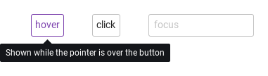
trigger — hover: opens on pointer enter, closes on leave; while the pointer is on the tooltip itself a pending close is held (useful with closedelay). Delays — opendelay / closedelay in ms; an opposite event during a pending delay cancels it.
Cancels pending delays and closes, even when sticky.
The base popup's open: opens even on a non-interactive anchor; no delay.
setClose() when open, otherwise a trigger-style open request (delays and anchor checks apply).
Delays — opendelay / closedelay in ms; an opposite event during a pending delay cancels it.
The base popup's close: hides at once and cancels a pending opendelay (as Escape and an outside press do).
Never closes by itself; only setClose() / close().
The side after flipping: top · bottom · left · right, optionally -start / -end.
The text; n breaks lines.
Maximum text width in pixels, also limited by the window. Long help wraps automatically; 0 explicitly disables wrapping.
Drop the arrow (the tooltip then sits 4 px from the anchor instead of 10 px).
Animation — animation: "fade" (any name other than "none" fades) runs opacity transitions on open and close over animationMs; none under Theme.reducedMotion.
Animation — animation: "fade" (any name other than "none" fades) runs opacity transitions on open and close over animationMs; none under Theme.reducedMotion.
The tooltip is visible.
State — isOpen is the popup's visible.
Emitted just before the popup is shown.
Emitted after the popup finishes its enter transition.
Emitted just before the popup is hidden.
Emitted after the popup finishes its exit transition.
Keyboard
Item
Behavior / conditions
SyPopover for content with items, SyPopconfirm for a question with buttons, SyInlineMessage for field feedback; SyButton and SyIcon as typical anchors.